End of an era: The Pokataroo Branch

These are the last photos I took on film, with a craptacular Kodak camera. The old Pokataroo Branch of the north western railway in New South Wales terminated about five kilometres from where I used to live. The old railway station was opened in 1906 as Collarendabri, before being renamed to Collarendebri East, then finally Pokataroo in 1919. The line leading to Pokataroo station closed in 1974, after flood damage.

At the time these were taken, which I believe was 1998, the terminus was still visible. The buffer stop at the end of the line was still standing, the rural station platform rotted and leaning to one side. At the far end of the platform, the base of an old crane.

Close up of some rails and sleepers.

If you like, click "read more" for a couple of newer photos of the railroad remants around Pokataroo, including the crane base and the old rail bridge.

The old crane base near the Poktaroo platform.
Looking back toward Pokataroo township (approximately four houses) from the station's location.
The old Pokataroo rail bridge.
Looking toward Pokataroo atop the old rail bridge.

If you're into this kind of thing, you can find some information about the Pokataroo Branch on NSWrail.net. There're some cool photos if you click on the "photographs" tab, including some of the platform, and one from the '70s of the station building when it was still in-tact.

Also, I'm a nerd. Don't judge me.

Vintage Photo Extravaganza

I recently posted an article about smartphone apps like Hipstamatic and Instragram, and how they're ruining the originality of photography. I'm about to be spectacularly hypocritical and backtrack over a great deal of what I said. There's a caveat, though. All of the pictures I'm about to post are original, and deliberately edited. I have a huge collection of photographs. I take photos of crap constantly. I have a lot of photos that I like, but I just don't like enough to do anything with. Photos of things, photos of places, photos of the sky. Lots of photos of, just, stuff, really. On their own, none of them stand up to scrutiny. I've posted a few on DeviantART, and some of them have been successfully received. Balanced Barbs, Probably Unsafe and No Sense of Time are a few examples of images that aren't widely hated. Generally, if I post these pictures, they sink to the bottom of the pile, and I eventually delete them because they just end up as clutter.

I'm going to shamelessly self-indulge, now, and post a shit-ton of them all at once. They kind of function as a collection. Put them all together and they get a weird nostalgic feel to them, with their cross-processed filters and Hipstamatic flavour.

So, without further ado, here's a LOT of little pictures. Click "Read more" to, uh, read more. Although I suppose it's more looking at pictures than reading. Click on the images to embiggen. Enjoy!

Vintage photo effects

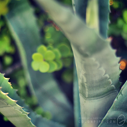
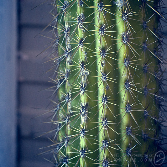
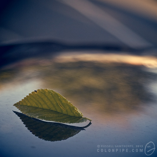
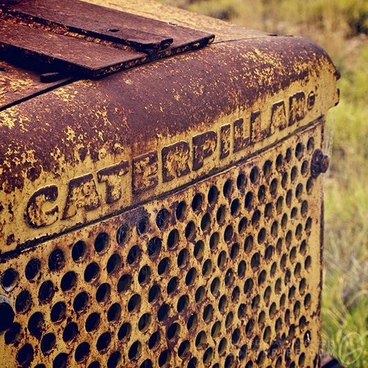
I've been screwing around with various "vintage effect" iPhone apps, including Hipstamatic, Instagram and a few others of significantly lesser quality. I've started to form the germs of opinions about these apps, and I'm going to attempt to put those opinions into coherent sentences. First, lets explore the apps.

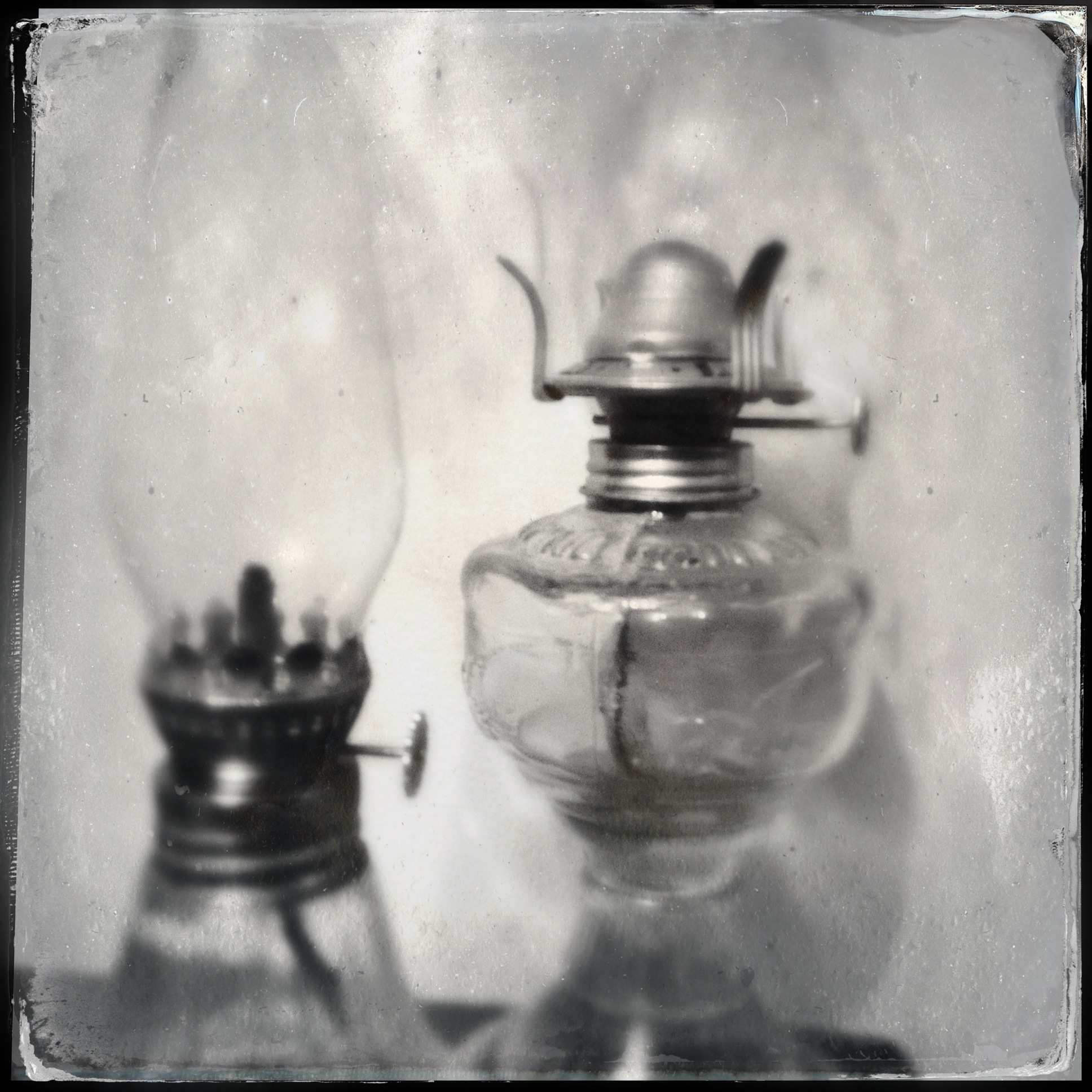
Hipstamatic is an "emulator" of the Hipstamatic 100 camera, a possibly fictional camera that sold very few units in the 1980s. Functionally, it's the equivalent of an Instamatic hand-held camera.

The software includes a bunch of effects in the guise of "films", "lenses" and "flashes". Additional effects can be purchased for a nominal fee.

Films give a range of grain, border and colour effects. Lenses give depth of field (faked, of course), focus anomalies and light leaks. Flashes overlay a coloured gel to the image, while also invoking the iPhone 4+'s built-in LED flash.

These three classes of effect can be used as intended, or mixed and matched by means of your own preferences, or random chance. Shaking the unit mixes all three effects randomly, leading to the need to take each photo several times, shaking between, to ensure you don't snag one of the myriad less desirable combinations of effects.

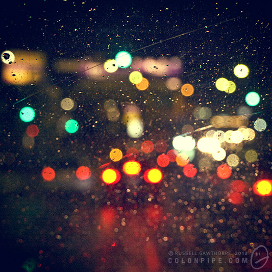
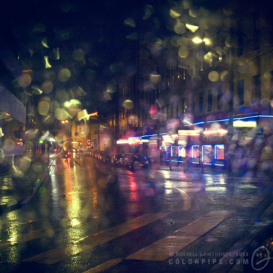
And oh, yes indeed, they can be undesirable. Horrific combinations can be achieved by combining lens and film effects centuries apart in design. The 1990s film that borders your image with coloured sellotape is particularly horrifying, coupled with an antique Tinto lens it's truly ghastly. Tri-coloured flashes are atrocious. The Salvador Dali film and lens combination is designed solely to pop up occasionally and make you swear loudly as it ruins otherwise good photographs with its peculiar overlaid effects.

An utterly rare example of the Salvador Dali effects actually contributing to an interesting image, rather than ruining it like vinegar on your breakfast cereal.

Instagram is a different animal entirely, geared primarily toward image sharing. The sharing engine -- recently bought by Facebook for one gazillion dollars and the subject of much privacy concern after a misread alteration to its terms of service gave the allusion the company would sell your soul with your photographs to the nearest punter -- is not the part I'm concerned with today. The effects and filters, though, are.

Like Hipstamatic, Instagram offers the ability to whack on a bunch of effects. The image border and overall colour alterations are handled within a single "film" option, with about twenty different choices at time of writing, with the option to kill the border, auto-enhance the image and apply circular or "tilt shift" depth-of-field effects.

As a result of the way they're constructed, both of these apps have a different effect on your photography. Hipstamatic places the quality of your end result largely in the hands of the Gods, while Instagram gives you the ability to rub various kinds of funk on an otherwise ordinary image to make it look good enough to pollute your friends' Instagram feeds.

The issue I have with these apps is that they tend to remove the onus of responsibility from the photographer, instead allowing the person pressing the button to either blame the filters and effects for ruining an otherwise decent photo, or entirely taking self-credit for a stultifyingly boring image enhanced pointlessly with vintage funk sebum.

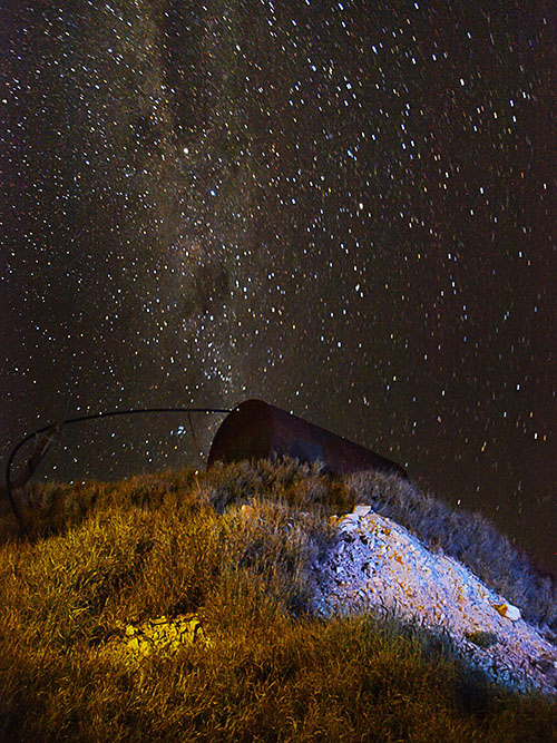
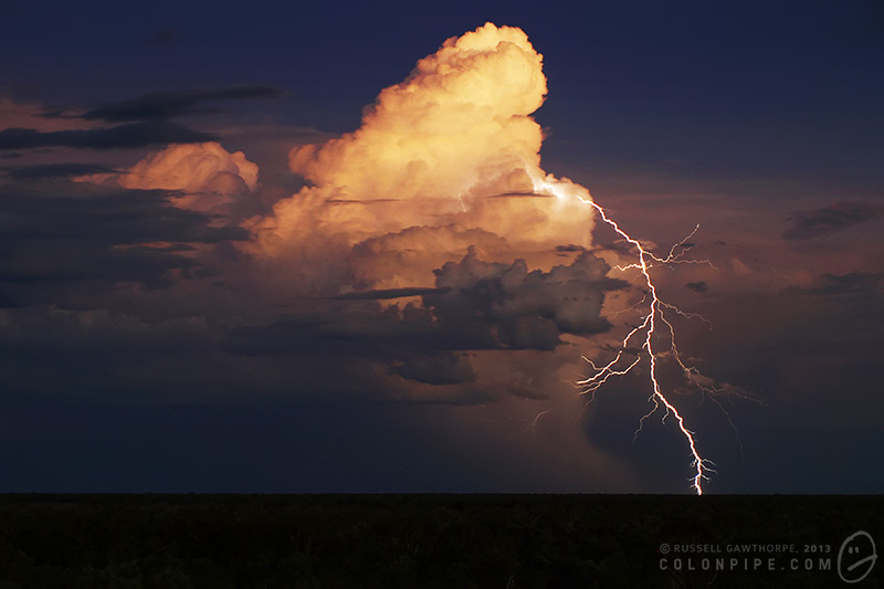
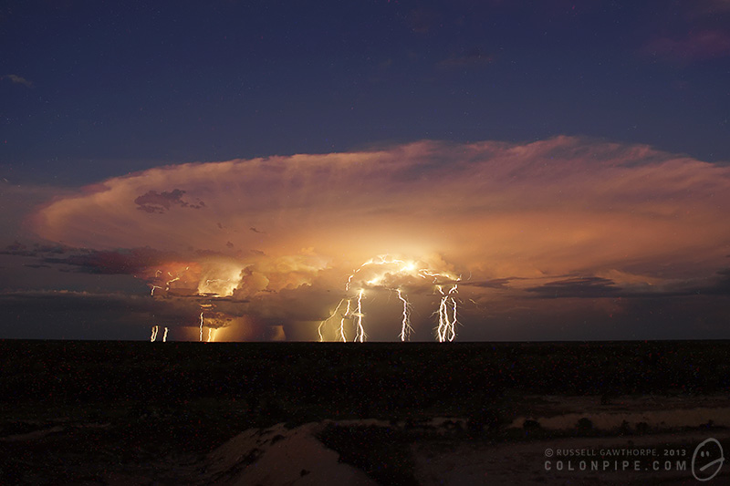
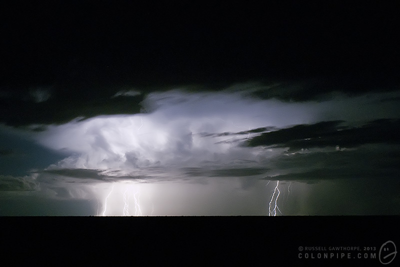
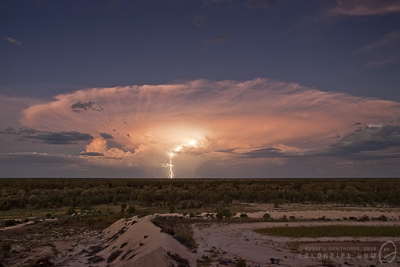
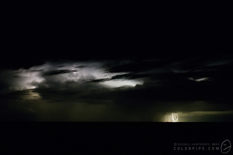
I once owned an Olympus point-and-shoot camera, a mJu-300. It was awesome. I actually used it to take some of my earliest lightning photographs, many of which were perfectly cromulent photographs. The camera's functions were so minimal that the only way I could take photographs of lightning was to set the camera to "party" mode, so it was expecting dark environments, turn off the flash, and hope that the ambient light was dull enough to allow it to expose for a full four seconds. I had no ability to control the aperture (f-stop) or ISO. (Although in hindsight, the little bugger of a camera had a minimum ISO of 80, which would be splendiferous on a DSLR.)

Many of the photographs I took with it, however, were not so great. This little camera gave me a super power, though: I could blame the camera. I had no controls to mess with. I had no options that could improve the image. While I could always criticise my skills in Photoshop, there was no way I could have produced more information in any of the photos I took, because there was literally nothing I could do to make them "better".

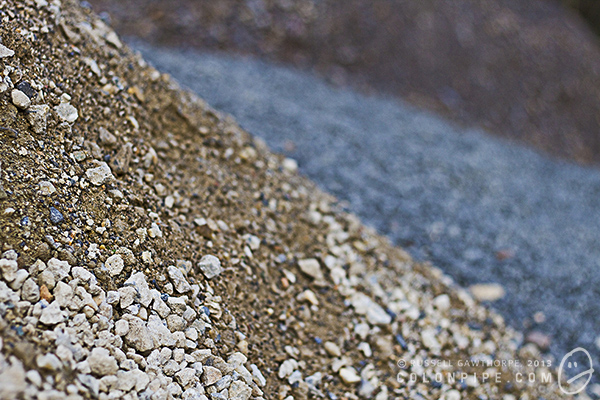
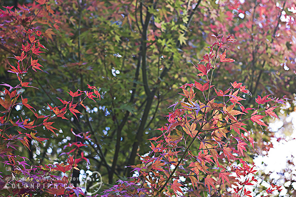
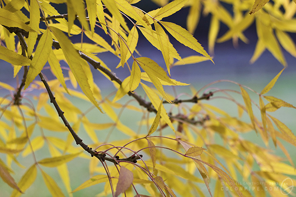
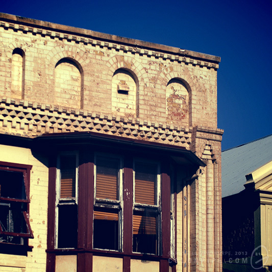
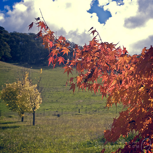
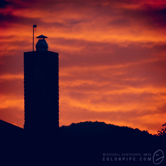
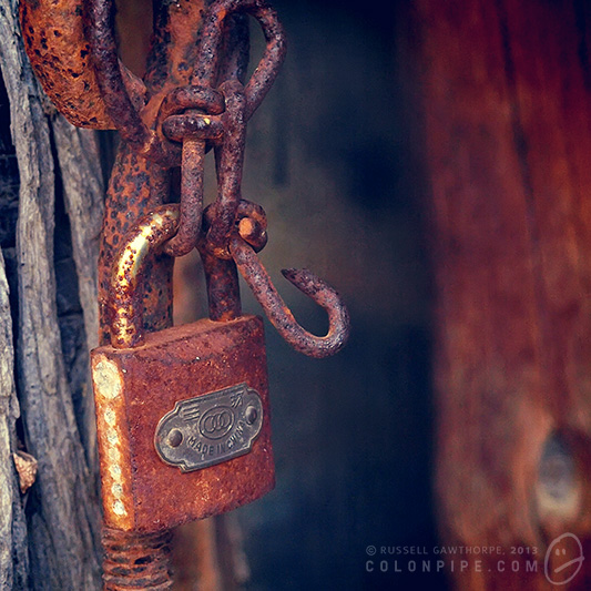
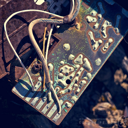
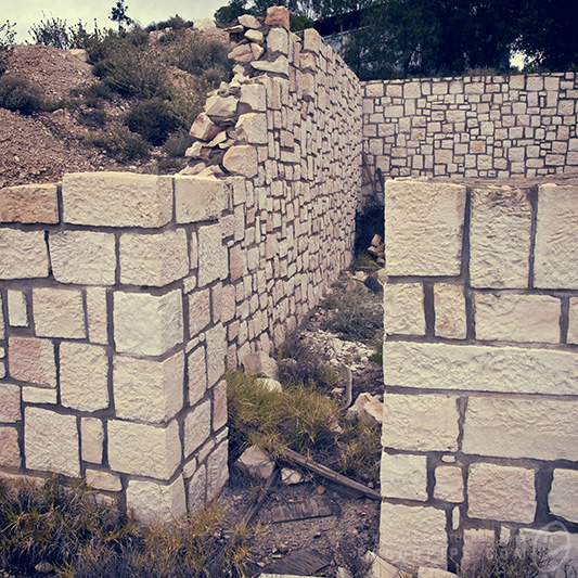
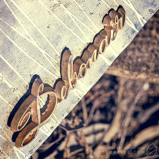
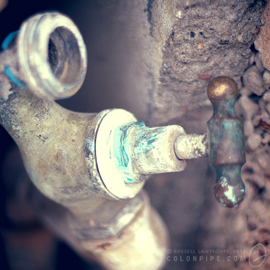
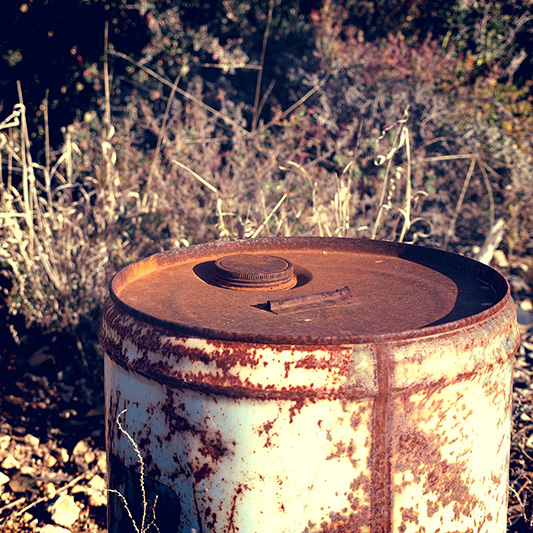
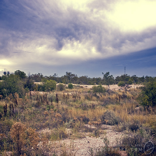
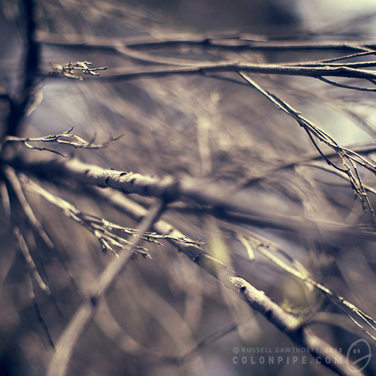
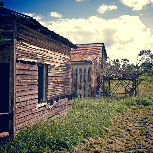
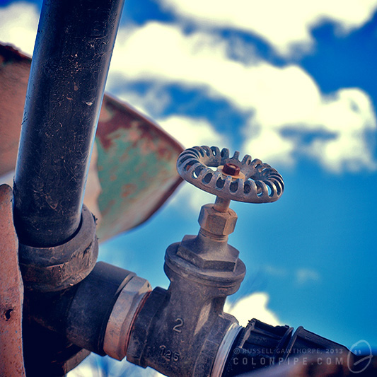
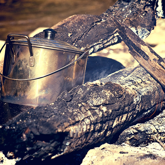
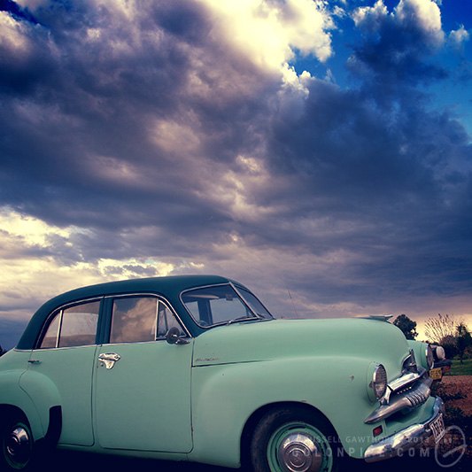
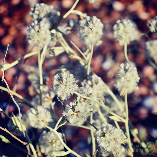
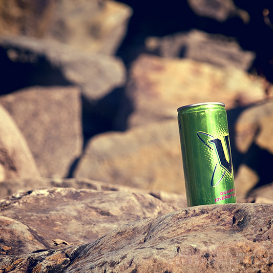
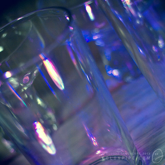
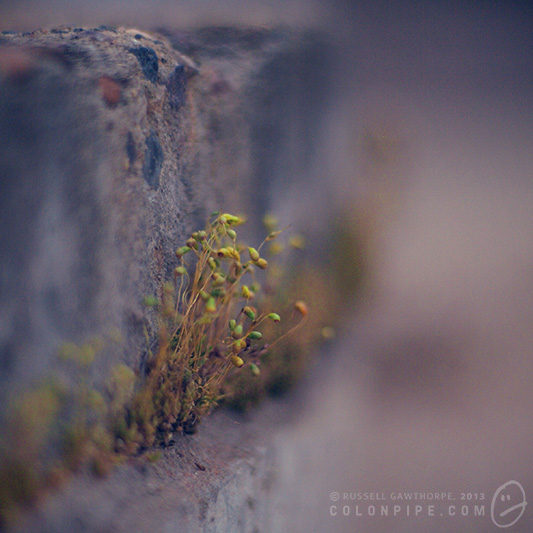
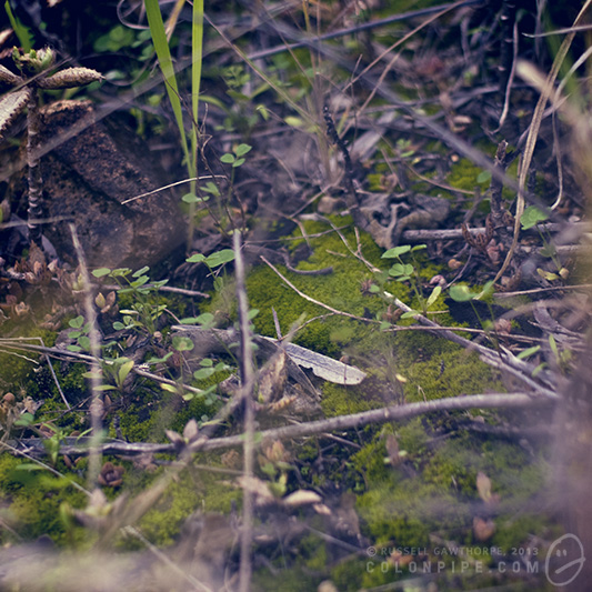
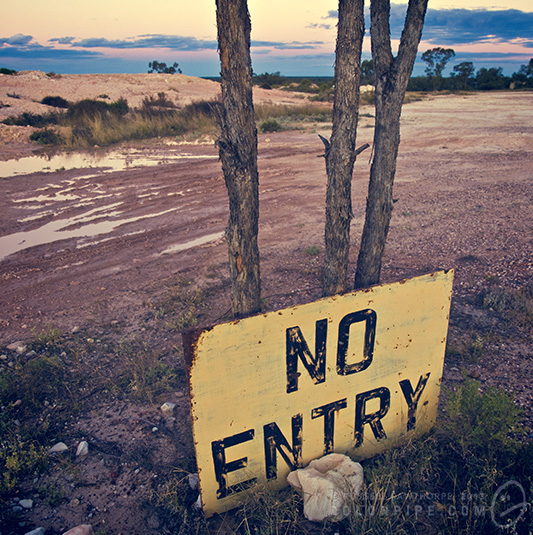
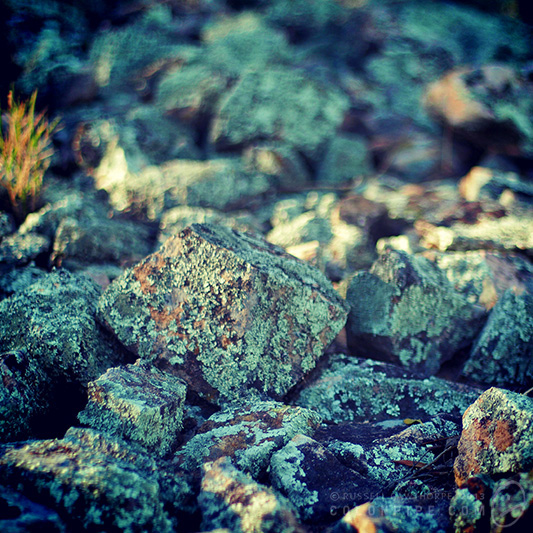
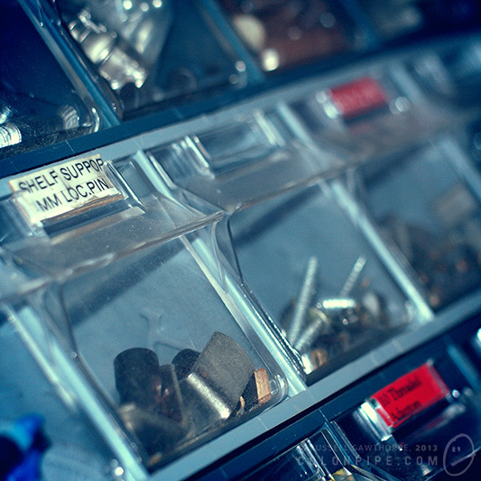
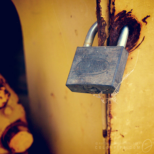
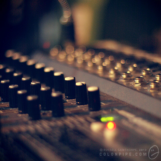
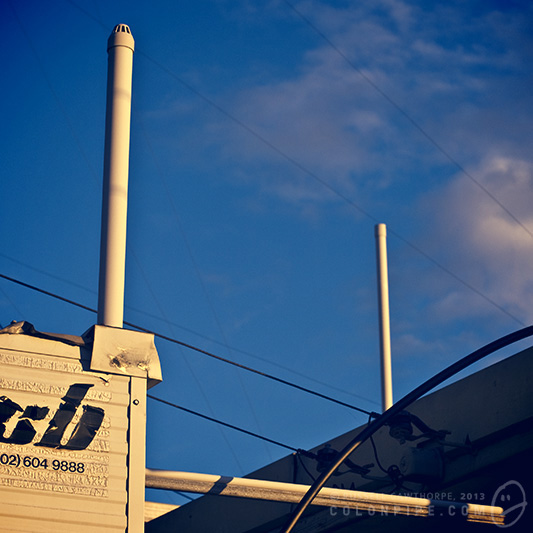
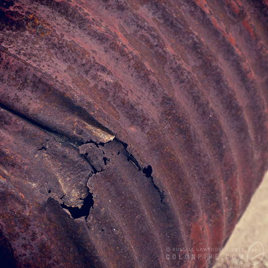
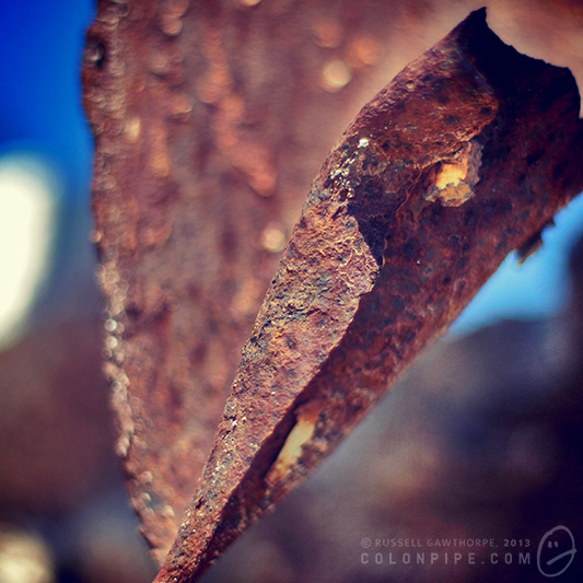
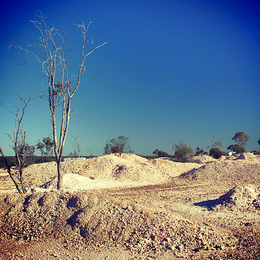
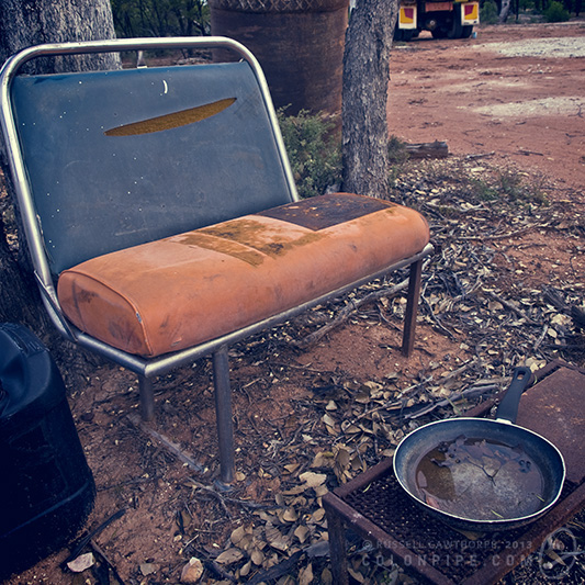
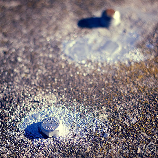
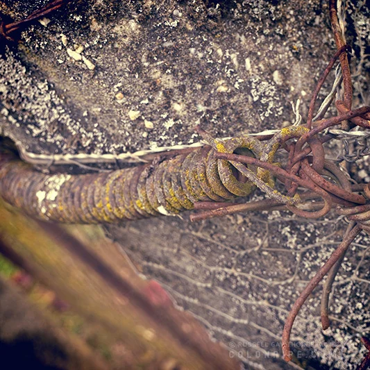
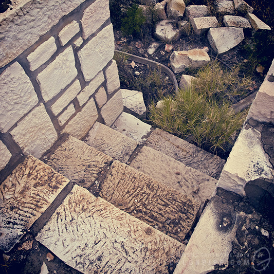
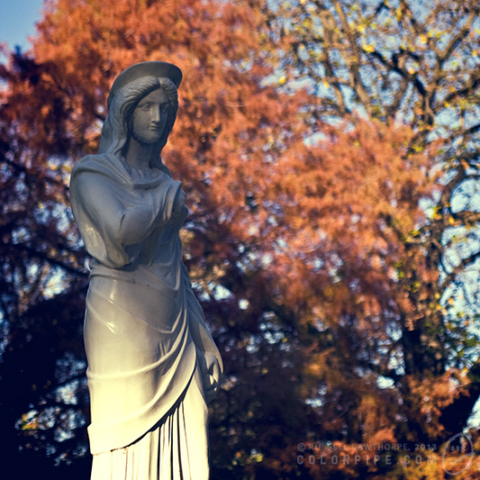
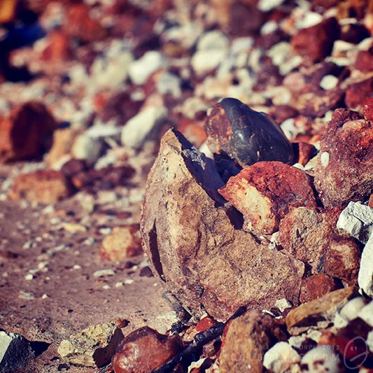
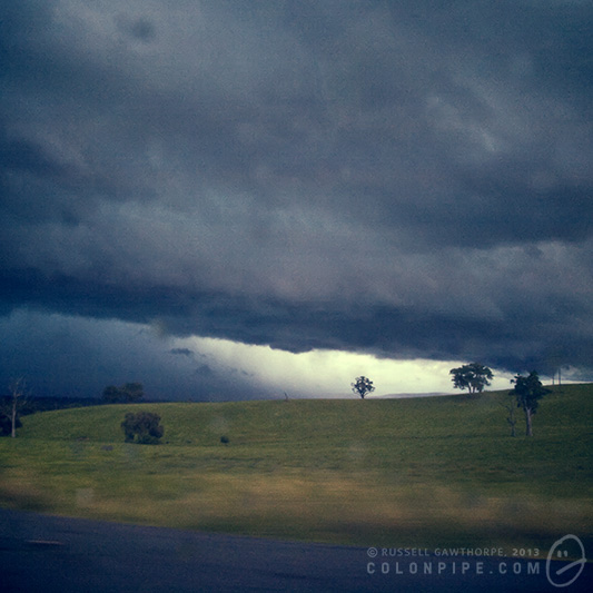
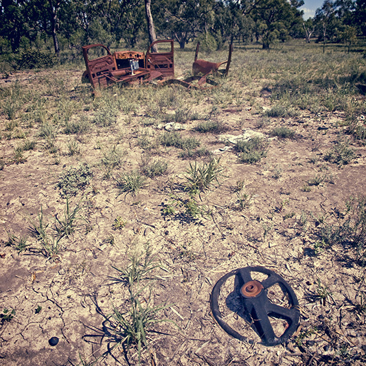
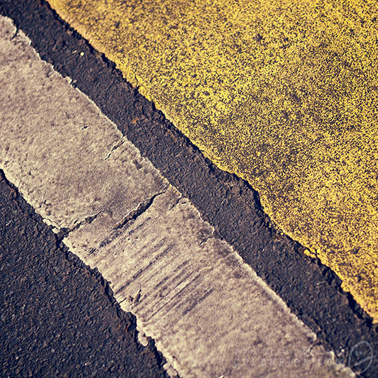
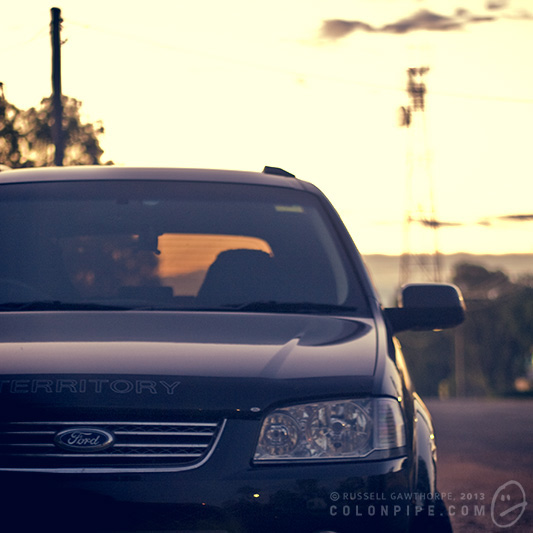
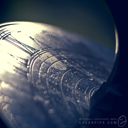
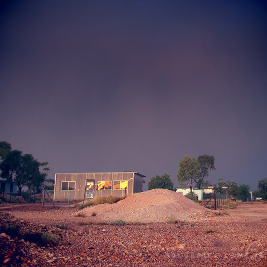
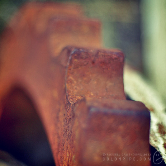
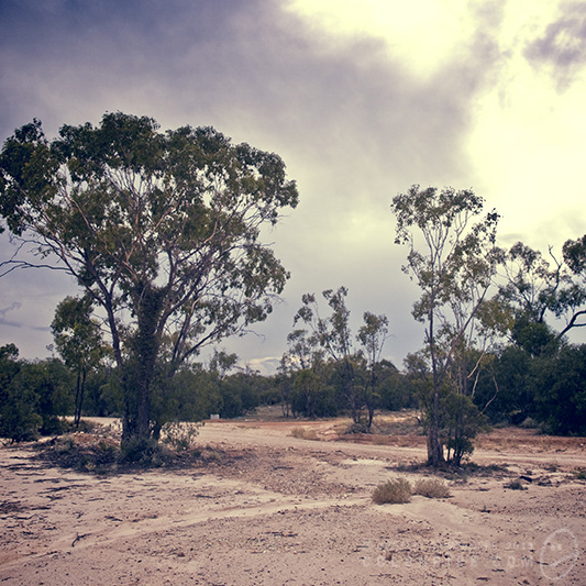
Hipstamatic and Instagram are much of the same. They're a point of blame, and a source of false credit. They're cool, don't get me wrong. Many of the images look awesome. I'm really fond of the recently released Tintype set, with daguerrotype and colourised tintype films, which look amazing. I'll also continue to use them, simply for the virtue that they tend to make otherwise boring photos interesting.

Daguerrotype effects on an appropriately vintage subject actually look pretty cool.

I'm going to make a concerted effort never to feel pleased with the result of a Hipstamatic or Instagram photograph, though. It just doesn't seem right.

50mm lens experiments and shenanigans.

Decided to do some hands-on tests so I could see for myself the difference in crop factors and lens quality between the Olympus OM 50mm f1.8 and the Canon EF 50mm f1.8 II lenses. This post contains a lot of images and may be boring if you're not into camera lenses and pixel scrutinising -- hit the jump if you're interested in the results.

These shots demonstrate the difference in crop factor (focal length multiplier) between the Canon APS-C and Olympus Four Thirds sensor sizes. I've scaled the bottom image down to the same "size" as the top one, clearly demonstrating the difference between the Canon (1.6x) and Olympus (1.84x) crops.

Never realised how much was actually lost using a Four Thirds sensor.

Two shots from the Olympus E-510, comparing a 50mm zoom on my telephoto lens (the only other lens I have capable of a 50mm focal length) and "50mm" on the old OM legacy lens.

When I first bought the old OM lens and adaptor, one of the things I had read about was a considerably different focal length resulting on the 4/3 cameras, but this demonstrates that the difference is actually quite minor.

Yes, I realise the top photo is overexposed.

Olympus vs. Canon 50mm f1.8 lenses.

There's a lot of criticism of the Canon lens for having pretty nasty bokeh (out of focus areas) because of its five-bladed aperture, but all in all, it's not too bad, in my opinion. The OM lens loses some sharpness, which is to be expected, but I think I still prefer its result. I find that the Canon 50mm tends to get less pronounced glowing edges on the highlight hotspots.

Same test, same lens, different aperture. Reduced to f4.0, the Canon EF 50mm's bokeh looks significantly nastier than the Olympus OM 50mm's, at least in my opinion. There seems to be a tiny bit of light leaking around the aperture blades on the Canon, making the corners of the highlight hotspots quite harsh, really accentuating the five aperture blades. At the same camera settings, the Canon's image at f4.0 is undoubtedly sharper, though.

Direct comparison between the Olympus and Canon 50mm lenses. All in all, the difference for this kind of image is pretty insignificant. Auto white balance seems to have thrown a yellow cast to the Canon photo.

OM, pros: - $50 from Ebay + $5-$35 for adaptor - More pleasing bokeh. - Quality construction, from the days where stuff was made properly, ergo: sturdier lens. (Lens mount/adaptor, not so much, though) - Very trendy

OM, cons: - Adaptor is atrocious, but for this I can blame someone on Ebay from Hong Kong - Image slightly less sharp than Canon - No auto focus function

Canon, pros: - $90 - Auto focus - Sharper image - Ludicrously lightweight - Adaptor not required, obviously

Canon, cons: - While autofocus exists, it sounds like it's grinding up Legos inside there - Very cheap construction; very cheap lens

Overall, I think I still prefer the Olympus OM 50mm lens. The Canon one just seems utterly disposable in comparison.

It's Orb-vious

Some "paranormal" phenomenon can't be easily explained. Some can. I suddenly feel compelled to explain one. Orbs.

The usual story behind orb encounters is that a would-be ghost hunter, or some other kind of believer in orbish things will traipse through a "haunted" location taking happy snaps with their point-and-click digital camera. Upon viewing their photographs, they will more often than not find several of the photos are festooned with round objects, usually with hard glowing edges and often with tiny details inside of them.

There are a bunch of potential paranormal explanations for the spots -- ghosts, spirits, fairies. The description usually depends on the location, and what one expects to find there.

The reality is much more boring, though. The glowing items are just dust motes illuminated by the camera's on-board flash, hovering somewhere outside of the camera's focal plane. The hot-spots created in the photograph by out-of-focus illuminated debris are called circles of confusion.

Usually, these kinds of photos are only taken with cheaper point-and-click style digital cameras. The location of the on-board flash on these cameras is the cause behind the tendency for "orbs" to appear in the photos. The closer the flash sits to the lens of the camera, the more accurately the reflected light bounces back into the camera's lens. Digital SLR cameras do not capture as many artefacts of this kind, because the on-board flash is positioned further away from the lens.

The focal plane is the vertical slice of the universe at the correct distance from the camera's lens to be in focus given the camera's shooting settings. For a camera with a wide aperture (f-stop), the focal plane will be narrower, a smaller aperture will produce a deeper focal plane. Adjusting the camera's aperture controls two things: The depth of field (focal distance) and the amount of light that is allowed onto the camera's sensor. A wider aperture means more light, but a shallower depth of field. Point-and-click cameras, when used at night, will usually automatically open the aperture as wide as possible and adjust all available settings to allow the best possible photographs at night, the implications of which are that the camera is then set up to perfectly capture orbs!

Dust motes, insects and rain will produce orbs in varying quantities. While "circle of confusion" is the term for an individual hotspot, the collective term for the effect is bokeh, a Japanese word describing the qualities of the out-of-focus parts of a photograph.

Bokeh from Christmas lights.

Quality bokeh in a photograph is desirable, and can be achieved by using prime lenses with stupidly low f-stops. The above photograph is bokeh produced by Christmas lights at f-1.8. The lights closer to the camera produce larger circles of confusion than lights further away.

Here are some fun links, from the pro-orb side of the fence, just for shits and giggles:

Some crazy talk about how orbs are ghosts -- I'm particularly fond of the footnote on this one, which pretty much debunks all of the paragraphs above it with a bit of "oh, but they're often just dust, too". Some more crazy talk -- I've included this one because the sentence "No one has the true answer to this question yet" makes me want to slap people for lack of research. orbs.net -- this place has literally ones of photos of illuminated dust particles, all of which look eerily (if you'll pardon the inappropriate adverb) similar to my examples above. Must be ghosts! This article includes the advice to turn your flash off if you want to photograph orbs without the interference of dust particles. Desire to slap is still high, but at least it's some progress! Apparently some orbs are energy, and energy is spirit. I was under the impression that energy was energy. The law of conservation of energy insists that energy can't be created or destroyed, only transformed. I guess it can be transformed into spirits, and therefore into orbs. Or not.

So. Orbs. Just dust. Next please.

Lightning and Sunsets and Rainbows and Mammatus, Oh My

The storms that appeared in northern New South Wales around the 28-29th of January, 2009 were pretty spectacular. Among their features: lightning, awesome sunset formations, mammatus, a rainbow, crepuscular rays, opportunities for lengthy exposures, clear starry skies surrounding. Among the other photos below, I also took "From the Top" on the 29th, which was featured as a Daily Deviation on DeviantART on the 9th of April, 2009. From the Top