Once a nerd: Clarisworks flashback

I've recently started playing around with software emulation of old Mac operating systems. One of my first Macs was a Quadra knock-off* running System 7.5, so I was pretty happy to fire up Basilisk II and see what it could do. While my primary objective was to play Prince of Persia and Indiana Jones and the Last Crusade, I ended up booting up Clarisworks 3.0 for a bit of nostalgic desktop publishing.

When I was 14, I took it upon myself to publish a magazine/newspaper thing. It was a financial disaster, and it certainly did my social life no favours, but hey. It was something to do. Most of it, such as it was, was made in Clarisworks. Yay, Clarisworks.

clarisworks

* When I say "Quadra knock-off", it was a Performa 580CD. It was a weird model that sat in-between the standard Quadras (the "real" Macs of the time) and the utterly bizarre Macintosh TV. The Macintosh TV was meant to be a kind of bridge between the personal computer and home entertainment, kind of like the AppleTV would eventually become, but it was a total failure. It was even designed with a black casing, to give the illusion that it's an appliance, and not a beige computer. The Performa 580CD had the same casing as the Macintosh TV, but in standard beige, and somewhat similar AV capabilities (no built-in TV tuner, just AV inputs). Unfortunately, it had sod all processing power and storage space, so it was pretty useless at anything involving AV. Its video input capabilities were limited to 320x240 pixel footage at a stonkingly low frame rate.

Hasta la vista: Fake Lego Terminator toys

I like Lego. Lego is awesome. I also like that Lego, the company, has made a moral decision not to create military-based playsets. This decision has left the market open for Lego’s opposition to fill the void, which has lead to such things as Mega Bloks’ Halo playsets, Kre-o’s Transformers and Star Trek licenses, and Brickarms, a company dedicated to making authentic Lego-sized weapons for your minifigs. A company I’ve never heard of, Best-Lock, has now produced a small series of military sets based on the Terminator franchise (possibly as a result of the franchise’s ownership being in a state of phenomenal flux as we speak). They’re not the greatest quality, but you can’t get any other Lego clone products with the Terminator name on the box, so let’s give them a chance.

Before I tear them apart, I’m going to be kind and point out that they were very cheap. I paid no more than three dollars for each set. Admittedly, this was from The Reject Shop, where all good products go to die, but I can’t imagine the retail price for them was significantly higher. Even at double the price, they’re dirt cheap for the quantity of Lego-compatible pieces they contain.

The (very) unassuming package.

The box is unassuming. I picked up two models, the Hunter Killer, and the Hunter Killer aerial. The company’s logo is quite disappointing. The choice of Arial Rounded as a font is questionable at best. The design of the package, in general, is chaotic and uncoordinated. It’s also not particularly colourful, which while appropriate for the franchise, is questionable for a toy package design.

Click "read more" to....read more!

Multiple Hunter-Killers.

The box for the Hunter Killer (the non-aerial variant) features a couple of artificial red laser beams.

Inside. (Jesus Christ, I'm doing an unboxing.)

Inside the boxes, the pieces are packaged in plastic bags with some stickers on a sheet. The instructions are loose inside the box.

Pieces. So many pieces.

All of the pieces in the set are cast in the same colour, a kind of gun-metal grey.

It's like IKEA, but with less allen keys.

The instructions are easy to follow, but are far from the quality standard of Lego instructions.

It's so close to Lego, but yet so far.

The pieces are interesting. They’re similar to Lego. Most of the pieces serve the same function as a comparable Lego piece. Many of them have slightly differing engineering, such as the round plate pieces, which have additional reinforcements on the underside. The small 90-degree fold pieces with two studs on each side seem unique to Best-Lock.

If nothing else, Lego’s competitors often stand a chance of producing a random significant piece that serves a purpose no official Lego piece was created for. The odds of this are decreasing daily, as Lego makes more and more unique pieces, particularly for its licensed sets (Lord of the Rings, The Lone Ranger, Teenage Mutant Ninja Turtles, etc, and -- of course -- Star Wars).

These pieces will be handy if you ever need to build a tripod-mounted gun cylinder...thing.

Here are some of the unique pieces you won’t find in Lego -- the gun turret comes in three parts, a tripod, the gun itself, and a small ammunition belt that clips on in a similar style to a minifig’s gripping hand. The round piece with the flared bottom connects to a piece with an upright, making a large, spinning turntable piece.

GET TO DAH CHOPPAH

The Terminator figure is quite detailed. It’s also quite fragile. The arms are articulated at the shoulders and forearms, the legs only at the hip. The head rotates. The hands don’t grip anything particularly well, and placing the awkwardly shaped minigun into its pincers is more of a balancing act than a satisfying job.

I don't think he'll fit inside.

Here’s a size and quality comparison of the Terminator figure alongside a genuine Lego Creator set. While the creator set was never intended to be the correct scale for a minifig, you can still get a reasonable idea of the size of the scrawny Terminator in comparison to Lego pieces.

I think the Terminator is aiming at his own plane..thing.

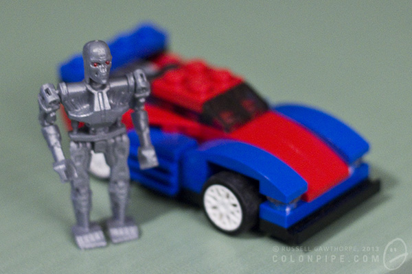
This is the completed model of the Hunter Killer aerial, with the terminator swinging his minigun alongside. The pieces have a mottled sheen to them, as evident on the sloped pieces that make up the HK’s front end.

Quality workmanship.

You can see here that some of the pieces connect together quite poorly. Some of them simply don’t like each other, while some of them have obvious flashing problems from the way they’ve been moulded. You can see numerous moulding problems in this photo.

There's a certain level of "number five is alive" to this model.

This is the other Hunter Killer. The non-aerial one. If nothing else, the track system is very cool. It looks good, and within reason, it works as you push the thing along the table. The dog-leg in the tracks at the bottom, where it tucks up between the main wheels, is a bit of a design flaw. The piece holding the track up is simply a small cylinder with a cap on it, and it has a tendency to fly off when the track moves, or simply fall off periodically from the tension of the rubber track. The little cones that make up the turrets on either side of the machine don’t seem to click in particularly well, and fall off often, also.

The kits come with stickers to add panel detail and markings to the vehicles, but I haven’t added them as I’ll probably be taking the units apart again when I run out of shelf space. I’m quite confident that the stickers are actually intended to be structural, and will stop a lot of the connection problems with the main components of the vehicle bodies. I’m fairly sure Lego’s official sets do not employ load-bearing stickers as part of their design.

Final verdict for the Terminator Best-Lock construction kits: They were very cheap, the quality is no better than “okay”, and they’re a piece of licensed Terminator merchandise. I don’t feel that I’ve wasted my money.

It adds up: Girl takes calculator to prom

I don't usually share and link stuff, but hey. Here's a little article about a girl and her calculator. Her calculator isn't haunted, but I won't hold that against her. She took her Texas Instruments model 84 calculator to prom. As her date. Yeah. Turns out she even made it a little tuxedo, and everything. Repeat after me: "Aww."

Love that vignette!

Sourced from Geekologie, Unrealitymag and a bunch of other sites. Here's the original tumblrism, from ishipitlikeups (and her calculator).

Twitter: Gibson & Atwood like Heroes, disagree about clothing choices

It's been a while since the Heroes of Science gathered any attention, so I was surprised to be informed that William Gibson and Margaret Atwood had a brief discussion about them over Twitter:

..I did say it was a brief discussion.

Extra love to the others who joined in on the conversation to point out the lack of women in the original image. Check out the FAQ for reasoning behind this, and also check out the sequel for more scientists (and more women!).

Thanks for your continuing support, folks!

(Thanks to Derek for the tip.)

15 minutes of slight recognition: MacFormat

Here I am, back in the late '90s, critcising Apple in MacFormat magazine's letters section: MacFormatIncidentally, at some point in the past couple of decades, they fixed both of those pronunciation problems. I'd like to think I had a part in that. I'm an alpha-tester from way back.


The Haunted Calculator

Every morning, for the past few months, I've needed to use a calculator. The calculator in question is a vintage early-1980s model Sanyo CX 2630 solar powered beast. You can read about its awesome functions at these two extremely nerdy websites: calculator.org and mycalcdb. It has all the functions you'd expect of a calculator, not the least of which is that being solar powered, it hasn't required new batteries since the Red Hot Chili Peppers released Under the Bridge. As an aside, it delights me to no end that there are websites dedicated to the minutiae of vintage calculators. The internet is a haven for anoraks. This particular calculator has issues, though. It adds just fine. Subtracts perfectly. It even handles multiplication and division with aplomb. While I haven't needed to use the function, I have the utmost confidence in its ability to calculate a square root and store the results in its memory. The thing that worries me about this calculator is

THE FREAKING THING IS HAUNTED.

Tucked away in a dark drawer, devoid of fluorescent "solar" power, its twenty year old batteries fail, and it loses its mind. Grasping at the last vestiges of its consciousness, it types a garbled message, leaving it on the screen for me to wonder about the next morning.

21

I've kept a log. Every time it's left me a message, I've recorded it. The original purpose of this project was simply to see if it was ever the same. Was the message similar, day in and day out? Was it just random crap? (Hint: probably!) Was there a hidden logic?

I'll let you decide. Big gallery to follow, with commentary. Hit the jump.

Vintage photo effects

I've been screwing around with various "vintage effect" iPhone apps, including Hipstamatic, Instagram and a few others of significantly lesser quality. I've started to form the germs of opinions about these apps, and I'm going to attempt to put those opinions into coherent sentences. First, lets explore the apps.

Hipstamatic is an "emulator" of the Hipstamatic 100 camera, a possibly fictional camera that sold very few units in the 1980s. Functionally, it's the equivalent of an Instamatic hand-held camera.

The software includes a bunch of effects in the guise of "films", "lenses" and "flashes". Additional effects can be purchased for a nominal fee.

Films give a range of grain, border and colour effects. Lenses give depth of field (faked, of course), focus anomalies and light leaks. Flashes overlay a coloured gel to the image, while also invoking the iPhone 4+'s built-in LED flash.

These three classes of effect can be used as intended, or mixed and matched by means of your own preferences, or random chance. Shaking the unit mixes all three effects randomly, leading to the need to take each photo several times, shaking between, to ensure you don't snag one of the myriad less desirable combinations of effects.

And oh, yes indeed, they can be undesirable. Horrific combinations can be achieved by combining lens and film effects centuries apart in design. The 1990s film that borders your image with coloured sellotape is particularly horrifying, coupled with an antique Tinto lens it's truly ghastly. Tri-coloured flashes are atrocious. The Salvador Dali film and lens combination is designed solely to pop up occasionally and make you swear loudly as it ruins otherwise good photographs with its peculiar overlaid effects.

An utterly rare example of the Salvador Dali effects actually contributing to an interesting image, rather than ruining it like vinegar on your breakfast cereal.

Instagram is a different animal entirely, geared primarily toward image sharing. The sharing engine -- recently bought by Facebook for one gazillion dollars and the subject of much privacy concern after a misread alteration to its terms of service gave the allusion the company would sell your soul with your photographs to the nearest punter -- is not the part I'm concerned with today. The effects and filters, though, are.

Like Hipstamatic, Instagram offers the ability to whack on a bunch of effects. The image border and overall colour alterations are handled within a single "film" option, with about twenty different choices at time of writing, with the option to kill the border, auto-enhance the image and apply circular or "tilt shift" depth-of-field effects.

As a result of the way they're constructed, both of these apps have a different effect on your photography. Hipstamatic places the quality of your end result largely in the hands of the Gods, while Instagram gives you the ability to rub various kinds of funk on an otherwise ordinary image to make it look good enough to pollute your friends' Instagram feeds.

The issue I have with these apps is that they tend to remove the onus of responsibility from the photographer, instead allowing the person pressing the button to either blame the filters and effects for ruining an otherwise decent photo, or entirely taking self-credit for a stultifyingly boring image enhanced pointlessly with vintage funk sebum.

I once owned an Olympus point-and-shoot camera, a mJu-300. It was awesome. I actually used it to take some of my earliest lightning photographs, many of which were perfectly cromulent photographs. The camera's functions were so minimal that the only way I could take photographs of lightning was to set the camera to "party" mode, so it was expecting dark environments, turn off the flash, and hope that the ambient light was dull enough to allow it to expose for a full four seconds. I had no ability to control the aperture (f-stop) or ISO. (Although in hindsight, the little bugger of a camera had a minimum ISO of 80, which would be splendiferous on a DSLR.)

Many of the photographs I took with it, however, were not so great. This little camera gave me a super power, though: I could blame the camera. I had no controls to mess with. I had no options that could improve the image. While I could always criticise my skills in Photoshop, there was no way I could have produced more information in any of the photos I took, because there was literally nothing I could do to make them "better".

Hipstamatic and Instagram are much of the same. They're a point of blame, and a source of false credit. They're cool, don't get me wrong. Many of the images look awesome. I'm really fond of the recently released Tintype set, with daguerrotype and colourised tintype films, which look amazing. I'll also continue to use them, simply for the virtue that they tend to make otherwise boring photos interesting.

Daguerrotype effects on an appropriately vintage subject actually look pretty cool.

I'm going to make a concerted effort never to feel pleased with the result of a Hipstamatic or Instagram photograph, though. It just doesn't seem right.

50mm lens experiments and shenanigans.

Decided to do some hands-on tests so I could see for myself the difference in crop factors and lens quality between the Olympus OM 50mm f1.8 and the Canon EF 50mm f1.8 II lenses. This post contains a lot of images and may be boring if you're not into camera lenses and pixel scrutinising -- hit the jump if you're interested in the results.

These shots demonstrate the difference in crop factor (focal length multiplier) between the Canon APS-C and Olympus Four Thirds sensor sizes. I've scaled the bottom image down to the same "size" as the top one, clearly demonstrating the difference between the Canon (1.6x) and Olympus (1.84x) crops.

Never realised how much was actually lost using a Four Thirds sensor.

Two shots from the Olympus E-510, comparing a 50mm zoom on my telephoto lens (the only other lens I have capable of a 50mm focal length) and "50mm" on the old OM legacy lens.

When I first bought the old OM lens and adaptor, one of the things I had read about was a considerably different focal length resulting on the 4/3 cameras, but this demonstrates that the difference is actually quite minor.

Yes, I realise the top photo is overexposed.

Olympus vs. Canon 50mm f1.8 lenses.

There's a lot of criticism of the Canon lens for having pretty nasty bokeh (out of focus areas) because of its five-bladed aperture, but all in all, it's not too bad, in my opinion. The OM lens loses some sharpness, which is to be expected, but I think I still prefer its result. I find that the Canon 50mm tends to get less pronounced glowing edges on the highlight hotspots.

Same test, same lens, different aperture. Reduced to f4.0, the Canon EF 50mm's bokeh looks significantly nastier than the Olympus OM 50mm's, at least in my opinion. There seems to be a tiny bit of light leaking around the aperture blades on the Canon, making the corners of the highlight hotspots quite harsh, really accentuating the five aperture blades. At the same camera settings, the Canon's image at f4.0 is undoubtedly sharper, though.

Direct comparison between the Olympus and Canon 50mm lenses. All in all, the difference for this kind of image is pretty insignificant. Auto white balance seems to have thrown a yellow cast to the Canon photo.

OM, pros: - $50 from Ebay + $5-$35 for adaptor - More pleasing bokeh. - Quality construction, from the days where stuff was made properly, ergo: sturdier lens. (Lens mount/adaptor, not so much, though) - Very trendy

OM, cons: - Adaptor is atrocious, but for this I can blame someone on Ebay from Hong Kong - Image slightly less sharp than Canon - No auto focus function

Canon, pros: - $90 - Auto focus - Sharper image - Ludicrously lightweight - Adaptor not required, obviously

Canon, cons: - While autofocus exists, it sounds like it's grinding up Legos inside there - Very cheap construction; very cheap lens

Overall, I think I still prefer the Olympus OM 50mm lens. The Canon one just seems utterly disposable in comparison.

Remembering the Space Age

I very much regret having been born 20 years too late to truly appreciate the space program(s), and their effect on society. I grew up in the era where Star Wars was so much cooler than our actual astronauts. I grew up in the era where the space program was waning into ubiquity, no longer a frontier to be challenged as much as a scientific chore to be begrudgingly satisfied. In the '80s, we did develop the Space Shuttle, the first re-usable spacecraft. But we'd already been there, just not in such a nice plane. Obviously, now we were able to come back in the same plane, not a glorified bucket with a parachute on, but still. It was nothing new.

Regardless, I love the space age, the space race, the moon missions, all that jazz. I love that people have dedicated their lives to it, in many cases quite literally.

I've been doing a bit of research recently, and I've discovered that the world (and another one, we'll get there in a moment) is full of little (and not so little) memorials to people who've died while pursuing mankind's greatest adventure. I've compiled a little list. Please bear in mind that this is not a "top ten", and these aren't ranked. Because they're freakin' memorials. That's just rude. Having said that, though, the last one is really cool.

The Space Mirror

The Astronaut Memorial, at the John F. Kennedy Space Center in Florida, is a gigantic polished granite block bearing the names of 24 astronauts who have died. The astronauts names are arranged in a logical scattering, and are cut entirely through the block, so light can shine in from behind and illuminate them.

Originally, the entire thing was on a giant rotating mechanism with a tracker to keep it facing the right direction for the sun to make the names glow, but the mechanism failed in 1997, and a decision was made not to repair it, as the phenomenal amount  of money needed to repair it was deemed better used for education. Which I heartily agree with.

Laika

Laika was the first dog in space. In 1957, she became the first living creature to orbit the earth. No provision was made in her crude spacecraft, Sputnik II, for her to return safely to Earth -- rather, she was intended to be euthanised by poisoned food after completing a few successful orbits. During the launch sequence, a malfunction caused part of the heat control system to fail, which unfortunately lead to Laika only surviving a few hours into the first orbit.

Laika, fittingly, has two memorials. One with her fellow cosmonauts, at the Monument to Conqueror's of Space, and one on her own, standing atop a rocketship near the Moscow Military Medicine Institute. You can see a picture here.

Speaking of memorials to Laika the space dog, if you're into crying volumes of tears, here's Rockleetist's English-language cover of the Hatsune Miku song "Laika". If you like dogs, it's pretty torturous.

Monument to the Conquerors of Space

This 110m-tall stylised titanium spire lives in Moscow, behind the Memorial Museum of Astronautics. The thing is actually a curved obelisk, shaped like the exhaust plume of a rocket, with a rocketship sat atop. The whole thing is plated in titanium. At its base, a statue of Konstantin Tsiolkovsky, one of the pioneers of astronautics.

Cape Canaveral Air Force Station Launch Complex 34

The Apollo 1 launch platform (also used for Apollo 7) remains in living memory of the three astronauts who were lost in the Apollo 1 fire in 1967 -- Gus Grissom, Ed White and Roger Chaffee.

You probably remember the concrete structure from its appearance in the film Armageddon.

Apollo 1 Launch Platform

The Fallen Astronaut

By far the coolest, and possibly most emotional memorial to lost astronauts is the three-inch-tall aluminium spacefarer left on the surface of the moon by Apollo 15 in 1971. Here's the Wikipedia page about it.

The statue was created by a guy called Paul Van Hoeydonck, and it now resides in Hadley Rille on the lunar surface.

The Fallen Astronaut

Paddling about

I've recently obtained an iPad, which leaves me with the quandary of exactly what the hell to use it for. This is illustrated in my first evening of having the new toy, wherein I spent a great deal of time sitting on the couch with it, using it to search the internet for "uses for an iPad". There's something so alarmingly meta in that, it hurts my head just thinking about it.

The Incredible Expanding Macbook Battery(s), Part 3

Just when you thought it was safe to go back into the laptop -- here's Part 3. (Part one and part two are here.) This is my replacement Macbook battery, which, like its predecessor, expanded like popcorn, and was left sitting about to do its thing.

photo


Yeah, I'm aware that it's probably stupid to leave a damaged lithium ion battery laying about your house. I don't care, though, largely because I left it laying about as a result of being phenomenally careless and forgetful. It's my experiment, you can just observe the (harmless, evidently) results.

I didn't buy a third one. I bought an iMac instead.

The Incredible Expanding Macbook Battery, Part 2

If you're following the story (here's Part 1), I had a Macbook battery that expanded like one of those dinosaurs you put in water that, uh, expand. If you're curious -- and I know you are -- this is what happens to the expanding cell after about a year.

It's like a balloon. Full of lithium. And death.

It's completely expanded to about eight times its original thickness. Should I have kept it? Probably not. Do I have any regrets? Not really.

It's gone now, though.

Imagine the damage this would have done to a laptop that was, say, in storage. I guess this is why they tell you to remove the batteries if you're sticking it in the cupboard for a while. I suppose they couldn't bring themselves to complete the instruction with "..otherwise it'll bloat like a Looney Tunes character, destroying your expensive technology".

Just to clarify the ludicrousness of this failing battery issues -- this is a $150 battery. It's not a double-A.

Sigh.

Here's part three.

The Incredible Expanding Macbook Battery

So, there I was, using my Macbook. I noticed it was rocking about a bit, like there was a small coin or something underneath it -- nothing unusual, as my desk is often messy and stuff creeps under things all the time. I fish around under there, but there's nothing there. I carry on, but it still rocks around on something. I switch the Macbook off, and flip it over, only to find that the edge of the battery is sticking up a bit.

Up-sticking battery edge.

I did a bit of googling, and discovered that this is not only "normal", but it's something so normal Apple refuses to acknowledge or compensate its existence. Macbook batteries just do this. Every so often they just shrug and go "Y'know what, screw this cruel world. I'm going to expand like a piece of popcorn and I might just take this laptop with me."

As the cell in the battery expands, it pushes on the nearby components of the computer. In the case of my particular model of Macbook, the first victims are the Airport cart and RAM, followed by everything else.

I popped the battery out and shoved it in a drawer, ordering another one from Apple's online store, as there was clearly no way of claiming the thing under any kind of warranty or insurance.

New battery arrived. All good. More to come. Stay tuned.

Here's part two, and part three.

Yarr: Pirated Star Trek: TNG DVDs

I bought these because they were cheap. I bought these because I thought they were official. I mean, lots of stuff is officially released in Asia. However, I discovered once I’d bid on this item on Ebay that Star Trek: The Next Generation was never released officially in Asia. So these are not for real. Which is readily apparent when you examine them. I write this article not for sympathy, and certainly not to promote these DVDs. I write this article to warn others away from Asian import DVDs, particularly when Star Trek is concerned.

Here are the signs that will pretty much guarantee what you buy of Ebay will disappoint you:

1. Item is described as having “Asian text on discs and some menus”. In the case of ST:TNG DVDs, there’s no Asian text on the menus. The discs and boxes are loaded with it. I don’t have a problem with Asian text on the boxes or menus, however we must remember that Paramount has never licensed Asian releases of Star Trek on DVD.

2. Auction item claims DVDs will be shipped out specific to your region. Actually, they’ll be shipped out with no region encoding whatsoever, and will play on any DVD player on the planet. Due to the formalities and realities of international trade, virtually all official DVDs are region encoded.

3. No photo of the item is provided on the auction. This is because the Asian knock-off DVDs ship in hideous cardboard boxes and look so blatantly fake you’d never buy them otherwise. (And we’ve already established I’m an idiot for buying these DVDs.)

So, what’s all the fuss about, anyway? Lets examine the booty! Yarr!

The box.

This is the absolutely gorgeous box that ST:TNG Season Five comes in! I bought all seven seasons, and they progress through vile primary colours as the series spans out (pink, purple, green, blue, turquoise, brown and orange if you’re curious). I’ve only opened season five as I own official copies of seasons one to four already. I may not open any more of them, as they have an unpleasant stench of that weird glue elaborate Asian cardboard packaging is always sealed with. It’s worth noting the text looks absolutely nothing like the real ST:TNG logo. Hmm.

The box, open.

We’ve established the boxes are cardboard. For some reason, every single thing ever made in Asia always seems to be packaged in an over-the-top cardboard case, usually complete with metal hinges and clips, or a magnetic seal, and often some kind of canvassy fabric covering it. To be honest, I don’t mind these types of boxes. I think they’re classy, in a weird way. The boxes the ST:TNG DVDs are shipped in are not so classy, though.

The inside is covered with gold paper, and the lip of the case is held closed with magnets set behind the paper. The DVDs live in a recess in the box.

Inside. Be glad this is not smell-o-internet.

The discs themselves are packaged in incredibly cheap plastic pouches. Season five is arranged with two sets of three discs in individual thin pouches which are then wedged tightly into a third, thicker pouch. A third thick pouch houses the remaining disc. There is no booklet containing the episode names for the season, as per the official DVD sets. The inside of the cover has a crappy black and white picture of the Trek crew that has most of their faces cut off.

Gene Roddenbery (sic) would not be pleased!

One of the discs, note blobby disfiguration at 11 o’clock.

I suppose you could forgive the packaging if the discs were of decent quality, right? Well, not this time. The discs themselves have several flaws. Worst of all of these are the extremely obvious malformations around the edges (inside and out) of the discs. These look like a result of either heat damage (unlikely) or the use of extremely cheap, poor quality discs (ka-ching!).

I keep using the phrase “you could forgive these things if“, but it all comes down to this, really: You could forgive all of these things IF….the DVDs worked properly.

Do they? What do you reckon? Place your bets!

Of course they don’t!

Copyright notice. How thorough.

Episode menu for season 5, disc 7. Works great until..

You select the last episode, and the menus for it vanish!

Selecting the last episode of the last disc, which is the disc with only two episodes and a bunch of special features, presents an issue. There’re no menu items visible. The DVD arrow thing (shown as a red semi-circle hovering to the far left of “mission logs” in the third picture above) cruises around the screen, but you have no idea what you’re selecting. Which is incredibly convenient. This is obviously a flaw in the DVD duplication process, where they’ve evidently used the same software from the other four episode discs for the last disc. The copyright notice is included, but the language selection screen is absent.

So that’s about it, really.

Almost.

There’s one other minor issue.

It’s not really that important, I suppose.

But it annoys me ever-so-slightly.

Wanna know what it is?

Oh, alright.

EVERY FOURTH EPISODE HAS NO ENDING.

No biggie.

Technology, communication, independence.

I yearn for the days when you could go for an evening walk without a phone in your pocket so that God only knows who can call you to tell you something that probably has no real bearing on your life. I'm sick of seeing people in supermarkets actually call home to ask if there's any Uncle Toby's Oats in the cupboard before buying a box. Sweet Jesus, there's a thing called a shopping list. I'm sick of being sat on trains with a horde of school children, all pointlessly SMS-ing each other and calling each other from feet away. I was on a train once, and bore witness to a foursome of teenage girls -marrying- their mobile phones to each other..replete with one phone regaling the other trio with a digitised desecration of the Wedding March, followed by the four phones - including the self-proclaimed minister phone - "getting it on" by means of the vibrate function. I'm not against technological dependence. I'm against communication dependence. The constant need to be in contact with people, oft cases people you don't really know to begin with. After all, that's what internet addiction really is, in most cases. I'm not addicted to surfing the 'net and staring at site after site of potentially entertaining crap (although I concede that a lot of people probably are, and I'm not talking about pr0n...much), I'm addicted to conversing with the people I've come to know through it.

Mobile telephones are for ringing up on, usually in emergencies or in cases of extreme importance. SMS is teh sux0rs and should never be used unless under duress of castration, and if you can't deal with being away from the ability to communicate with people, get a life.

I love both the irony and honesty in that last sentence.

Back in the '90s: Kaleidoscope Schemes

This article is hideously backdated to reflect the time that it's content, the gallery below, was created. Sorry for the confusion. If you're curious, I'm writing this on June 9, 2013. This is about the oldest part of me that lives on the internet. Back in the late '90s, there was an interface enhancement for Macintosh computers called Kaleidoscope. It was essentially a version of the "themes" concept that Apple kind of introduced into their operating systems, but really didn't. You could download any number of new interface themes (or "schemes", as the creators called them) for your operating system. Some of them were pretty cool. I made a few of them. In hindsight, they don't seem to have strayed too far from the general appearance of the Mac OS (version 9, at the time). They looked like this:

All of these are still, inexplicably, available at the Kaleidoscope Scheme Archive. You can access my stuff directly here, though. If you're really excited by the potential of this awesome piece of 1990's tech, be sure to check out the "scheme spotlight" area, wherein the best of the best are framed and hung on the metaphorical wall.