Bad automotive marketing decisions

There are a squillion possible things you can name a car. Generally, you take something that sounds vaguely foreign, and slap an "a" on the end. Cecil at The Straight Dope did a column a while ago (and by 'a while', I mean 'when I was one year old') on the subject. I do not understand the marketing logic behind the decision, then, to bring out a new vehicle with the same name as an older one. This is particularly puzzling when the new vehicle shares zero design lineage with the old one. It's not a two-thousand-and-whatever model of the same car, it's a whole 'nother car entirely.

Case in point, the Holden Cruze. Holden is an Australian car manfacturer. Half of the Australian population support them. The other half support Ford. I'll get to them in a moment.

hold_cruz
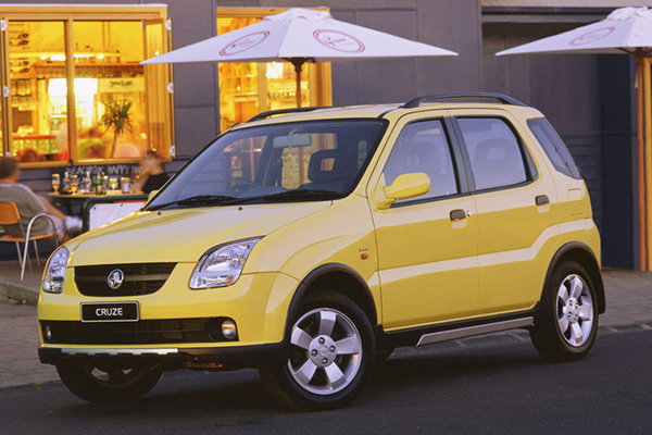
This is a Holden Cruze from 2002. It's a kind of beach buggy thing. It's pretty hideous. The rear of the thing has ghastly round tail lights. It's about as intimidating as a boiled potato. You might sometimes see re-branded Cruze(s) getting around as Suzuki Ignis(es).

hold_cruz_09
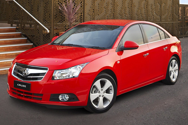
This is the Holden Cruze from 2009. It's an economical small car that boasts the looks and spaciousness of a larger car. It's actually kinda sexy, all things considered. It's a completely different vehicle, targeted at a completely different audience in a completely different market sector, and for a completely different purpose. It's clear that someone just kinda thought "Cruze" was a cool name, and it's a shame it was wasted on that Tupperware container on wheels they made in 2002 -- but wait, maybe no-one will remember that piece of junk. Yeah, lets use the name again.

The '09-onwards Cruze is also marketed as the Daewoo Lacetti, in a badge-and-name-change that gives it that ring of class it was initially lacking. The only thing cool about the Daewoo Lacetti is its occasional appearance on Top Gear as the "reasonably priced car", but unfortunately for the '09 Cruze/Lacetti, the car featured on Top Gear is an earlier model that bears no resemblance to the vehicle pictured above. It was also retired from the show and replaced by a Kia. That's just..........rude.

Case in point part deux: The Ford Kuga.

ford_kuga_13This is the 2013 Ford Kuga. It's a cool looking car. Mechanically, it's a four-wheel-drive (ish) thing constructed over the chassis of a Ford Focus. It's marketed in Australia as the smaller brother of the Ford Territory, and aimed at the 'soccer mom' demographic (ironic, perhaps, for the purposes of this article that it circles back around to the market sector the original Holden Cruze was potentially aimed toward).

This is great, except: In the non-rhotic Australian accent, "Kuga" is a homonym with --

ford_cougar-- 
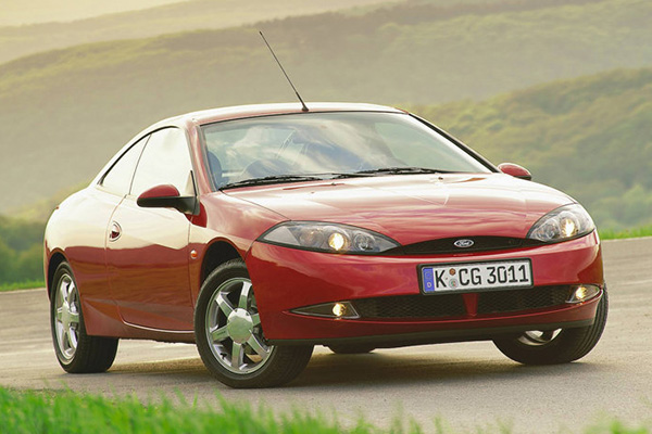
the Ford Cougar. This horrid thing is a mid-life-crisis-on-wheels from the late '90s to early '00s that was marketed in Australia in thankfully limited numbers.

I do not understand why the choice would not be made to use a more unique name for a car model. There are now undoubtedly loads of Ford Kuga drivers who, upon announcing the name of their new ride, are greeted with the looks of stunned incredulity well due to someone who's just announced they've bought a curved-up ludicrous looking skateboard with two doors and a hernia, until they realise the error of their pronunciation and start inflecting the "ah" in "Kug-aaaahh" like Hermione Grainger.

As an aside, Wikipedia has informed me that "kuga" is the Serb-Croatian word for "plague", and that Ford didn't opt to alter the name for its launch in those countries. Dunno about you, but I want to move to Zagreb and buy a black one.

Too much power: The Power Lord

Continuing a very old series of comic book back cover adverts, here's one of my favourites: He's The Power Lord. What's a Power Lord? I have no idea. I've never heard of them. I can surmise, though, based on what I see before me.

A Power Lord appears to be a man with the face of Bruce Campbell, who mutates (with considerable pain, judging by the stop-motion throes he appears to be flailing through) into a red and blue man with a Cardassian forehead and massive scratches from what I assume to be a lion. Or a tiger. Or perhaps a liger, even.

There seem to be a bunch of Power Lords. One of them is a bandy-legged dinosaur. Another appears to be the inspiration for the grunts from Halo.

In reality (or rather, after having done some research), I can tell you that the Power Lords were an action figure range (really?) from 1983, and the dude pictured above is Lord Adam Power. He carries the Power Jewel (ostensibly the rock wedged in his forehead) and a laser rifle.

The others have amazingly embarrasing names, from "Disguyzor: The Deadly Deceiver" to "Ggripptogg", who lacks a byline, but I believe if he had one, it would be "the spelling error".

Here's the Wikipedia article, so you can read up on the Power Lords, Adam, Disguyzor, Ggripptogg and my personal favourite: Drrench, from the planet Frigidor.

The '80s were awesome. You really can't make this crap up.

Follow up: jesus christ they're releasing new ones

Art Deco business card designs

Here's a couple of Art Deco inspired business card designs I was messing about with. I've blanked out my contact details not because I don't trust you, but because I don't trust that other guy. Boo, him. Hit the jumpy linky doodad for another colour scheme, if you like things like that. If you don't, that's fine too.

Vivid colours ahoy!

Slightly less vivid colours ahoy. But, still cool.


'90s Game Boy Adverts

I recently came into posession (again) of a massive quantity of video game magazines from circa 1992-1998. These had been buried in a wardrobe at my parents’ place. The purpose (or motive, really) of this article is that I’d intended to dig up as many of the old Game Boy adverts as I could find. The ones that followed the “Game Boy: More fun than..” routine. I got somewhat sidetracked and scanned the following gems also.

ancient_msn
This was from an article on rudimentary internet access in an obscure magazine called “Gamestar”. I thought it was rather quaint to see the Microsoft Network V 1.0 BETA in pictures. An image on the facing page bore the caption “God would have you believe that to get the best of the Net, all you have to do is access MSN”. Excelsior to see that nothing’s changed since 1995!

nms1_cover
This is the cover of my copy of the first edition ever of the Nintendo Magazine System. As it happens, my copy is far from mint condition. Some undefinable brown substance has defaced virtually the entire right-hand-side of the cover, visible plainly on Mario’s rabbit ear. Also, a few pages are missing and part of the magazine looks worse off than a bit of newspaper that has been used as garden mulch. But it’s MINE.

nms1_gameboy
This is a bunch of crap you could win, then stick on your Game Boy. Seeing as this is a Game Boy-based article, I thought it’d be appropriate to add this. Also, note the museum-quality usage of the word “dude”. Classy!

nms1_hotline
This is (what I assume to be) an official advert for the Nintendo Hotline, back when it was possibly the only 0055 number not to be associated with obese housewives masquerading as leggy prostitutes. Of particular note here is the rather splendid image of a cross-eyed Mario clearly suffering from a birth defect that I'm sure it'd be politically incorrect to name.

nms_gb_calculator
A flip-out Game Boy calculator for the discerning geek! Guaranteed to ensure you’ll be waddling home from school with your scrotum and the majority of your underwear intricately entangled in your arse-crack. I also saw an article about a Game Boy watch with rudimentary LCD games in it, but sadly the page had been basically destroyed by moisture, so I didn’t bother scanning it. Pity.

nms_gb_clearboy
Here’s a teasing lead-up to the “more fun than” Game Boy advertisements! The transparent Game Boy wasn’t around for long, as far as I can recall. Nice usage of x-ray images, but I can’t say I recall the Game Boy screen being illuminated so.

nms_gb_yawiga
I’m certain there’s actually some really intelligent wit behind this, but I’m struggling to see past the blatantly 1930’s-esque comedic racism. Maybe it’s shock value, or something. Still, what a nice yellow Game Boy. And here’s what you’ve been waiting for….

nms_gb_ferret
More fun than a ferret down your trousers. Genius! In an unrelated magazine, I found an interview with the Game Boy Boy, or James Rullis as his mum calls him. I’ll share random tidbits with you as we explore some more “More fun than..” imagery!

James Rullis Tidbit #1: James resigned from a hairdressing apprenticeship to star in the Game Boy adverts.

nms_gb_clipear
More fun than a clip on the ear! Note the amazingly clever juxtaposition of the expected clip, or slap, with a bulldog clip! Mastery of mirth, dear sir!

James Rullis Tidbit #2: When James auditioned, he was asked to mimic having a bulldog clip attached to his ear. When they filmed the actual commercial, he was shocked to find it was a real clip they stuck on his lug!

nms_gb_holehead
A hole…..in the head! Hee! In retrospect, I shouldn’t really knock these adverts so much. They’re emblazoned into my psyche, so I guess they worked pretty well. As a side note, am I the only one who notices a remarkable similarity between the Game Boy pixel-font and the Nokia pixel-font? And am I an incredibly geeky person for even mentioning that I noticed that? And does that last question even bear thinking about when you’ve just read an entire article about Game Boy advertising in the ’90s?

James Rullis Tidbit #3: After making the advertisements, James claimed he “got stared at a lot, got a lot of strange looks, and people whispered about him, wondering whether he was the guy from the ads”. And that quote was paraphrased poorly to keep it grammatically in-sync with the sentence it was crowbarred into. Also, James claims the adverts once encouraged a girl to ask him for a kiss! No information is provided as to whether a) a kiss ensued, b) the girl was attractive or not, or c) was indeed a girl at all!

The '90s were cool in a way no future decade ever has, and likely ever will repeat.

Exotic beverage: Pepsi Samba

Pepsi, now with more samba.

This stuff is mango and tamarind flavoured. Mango and tamarind. This does not sound pleasant. Mango is alright, I guess. Mango I can accept. Not sure about mango and Pepsi combined, but I'm okay with Mango. My only experience with tamarind, however, is an Asian "sweet" that consists of dried up balls of the fruit soaked in sugar and chili powder, producing a horrid, horrid, horrid burning mass of gross.

One of the few redeeming features of this drink is its television spot, a commercial featuring a pair of disembodied dancing legs, legs that belong to David Elsewhere, master illusionary dancer (there's a career none of us considered) and generally cool dude:

It's orange-er than regular Pepsi. Clearly there's some hint of tropical fruit about the colour.

For it was blue, with an orange top..

There's almost no smell. It smells like regular Pepsi, really, with a very very vague hint of that Tropical Sunkist crap they put out a few years ago. I'm under the assumption this is the same syrup, mixed with Pepsi. And tamarind.

Oh, it's gross. It tastes like Pepsi with soap in it. For anyone familiar with these drink reviews, it has the "we're trying to mask the taste of vitamin-B by adding overpowering fruit flavours" taste. Which wouldn't be a problem, except THIS ISN'T AN ENERGY DRINK, AND HAS NO VITAMIN B ADDED TO IT.

The aftertaste is horrid. It's still soapy. I'm having a hard time telling whether it's due to the base of this drink being regular Pepsi, which is usually pretty grim in its own right. Also, for some odd reason, there's a hint of eucalyptus or mint or something.

Considering this is based on Pepsi to begin with, it's not that bad, I guess. It's soapy, but it's kind of fruity. Tropical Sunkist was far, far better.