The latest videos across all of my YouTube channels:
Curiosity Mine, Exotic Beverage Reviews, Things to Make & Glue and Datazoid:


Hello, and welcome to whatever this is.
Hello, random internet passer-by. This is a website named after an offensive-sounding combination of punctuation marks, the colon (“:”) and the pipe ("|”). When properly assembled, these punctuation marks form an emoticon that indicates the emotion of apathy: “:|”.

This website is a bit of a dumpster fire, I’m sorry. It’s kind of my personal website, kind of a portfolio, kind of a humour website, kind of a review website and kind of none of the above because I’m really quite bad at sticking with a thing.
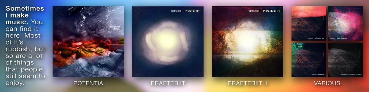
Sometimes I do stuff. Sometimes I create music, sometimes I create art, sometimes I make films. Sometimes I do nothing at all, and often those are the best kinds of sometimes.
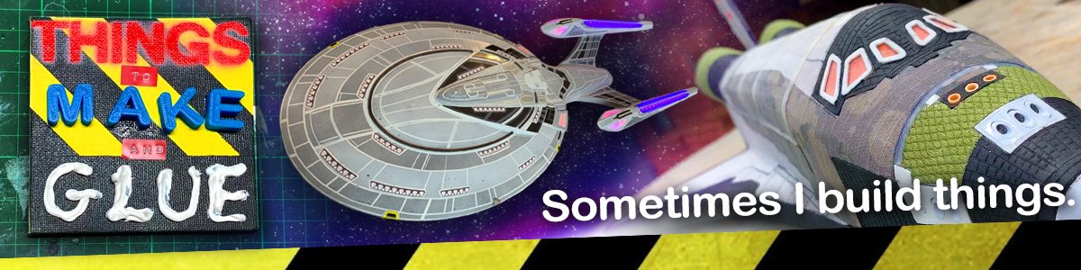
If you're looking for my half-assed attempts at building movie props, you'll find them under the builds link. Some of them are well written -- almost tutorials, if you will. Some of them are, shall we say, less useful.
In the words of Troy McClure, you may remember me from some things I once did.
About a thousand years ago, I made an image of a bunch of action figures Photoshopped to look like famous scientists. It went places on the internet, and it was fun. It was also quite the educational experience and taught me that no matter what you do online, you can never make everyone happy. The moral to that story is just do stuff and don’t take the fallout on board unless you genuinely need it (and even then you should be ruthless about filtering out the hate and flame and keeping only the constructive and useful). Regardless, you can find the image here, here and here if small plastic scientists that are mostly men (#lampshading) are in your wheelhouse. It looks like someone is making a jolly good effort to make these things real, so that’s exciting.
Slightly longer than a thousand years ago, I made an awful series of webcomics based on the searchstrings that were drawing visitors to the precursor of this website. So, effectively, I had a recursive and self-referential dataset on which I started making unamusing in-jokes. You can find them here. You may or may not find them entertaining, I take no responsibility.
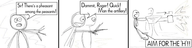
The comic below is a guest comic I contributed to the webcomic Roughing It, created by fraxyl. There is an archive of Roughing It in this imgur gallery. I include this comic here, as I believe it’s the finest piece of comedic writing I have ever achieved, and I have doubts I will ever surpass it.
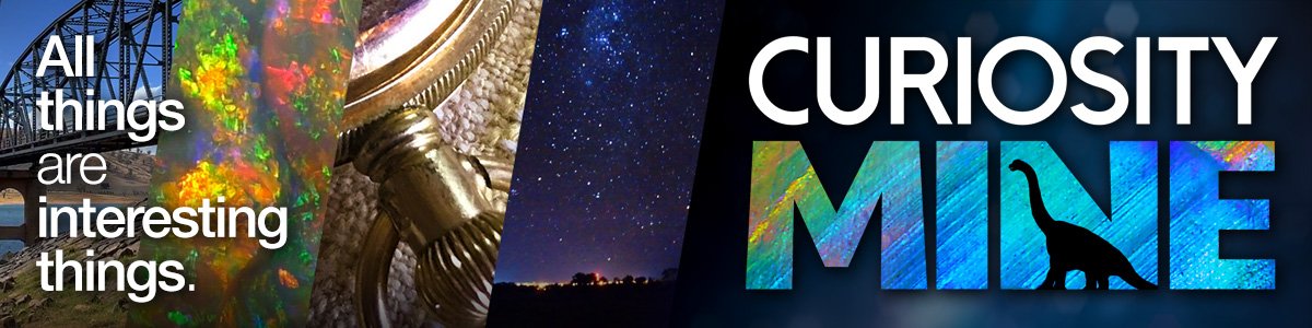
I make educational and hopefully interesting videos over at Curiosity Mine on YouTube. You should probably go check it out, and while you're there, you should probably subscribe to it. Heck, you can do that here, just as easily, there's a button thing over to the right. I also have a YouTube channel for my creative projects, Things to Make & Glue, which might also pique your interest. Or not. You do you. There’s also a YouTube channel for Exotic Beverage Reviews, which has been a long time coming, so you might want to check that one out as well. And while we’re at it, I have a personal YouTube channel on which I post mostly crap and very rarely. So there’s that, too.
Some of the latest things
You'll find more things on the blog. I passionately hate the word “blog”, but it is what it is. The blog doesn’t get updated very often, so please don’t hang around here expecting new content. You’ll be waiting a while. Maybe bring chips.


And these are some of the things I've built
Sometimes I build things. Sometimes I even remember to take photos of those things.


You can search for things in this search box, here
(It's like Google, except it only finds things in my craptacular website. Limitation is the soul of art, my friend.)