Observations about energy drinks

An example of a good energy drink.

A long time ago, when I was more enthusiastically reviewing my ridiculous collection of energy drinks, I received an e-mail from someone, asking something along the following lines: "Why do you drink and review energy drinks when you think they all taste like crap?"

Allow me to address this.

I don't think they all taste like crap. I think most of them taste like crap.

Energy drinks, by their nature, have a great tendency to taste terrible. This is because the key ingredients that give energy drinks their energiness taste, with few exceptions, like shit.

Caffeine is a very bitter tasting chemical. That's why most caffeinated beverages are extremely sweet (such as energy drinks), or have their own bitter flavour to mask the caffeine (like coffee or tea).

B-group vitamins, a group that includes our friends thiamine, riboflavin, niacin, pantothenic acid, folic acid and B12 (among several others) taste horrible. Have you ever been curious enough to chew on a Berocca tablet? That's b-group vitamins. They are not tasty.

Taurine is made from bile. Sorry to spoil that one for you, but it's true. It's mostly synthetic these days, but still. If someone tells you "that's not real vomit, it's synthetic vomit", I don't think you'll be okay with it going into your dinner. Needless to say taurine has a hideously unpleasant flavour, and contributes big time to the unique and apparently desirable flavour of Red Bull.

The trick for manufacturers of energy drinks is to create a flavour that either masks or compliments these unpleasant flavours. Most energy drinks take the "overpower it with something sweet and fruity" approach. Some take the "embrace the flavour, enhance it, make it salty and sweet" approach, like Red Bull. Others take a completely different tack, and throw in peculiar Amazonian berries and things you can't pronounce in the hopes of creating a unique flavour they can call their own. Sometimes this works. Most times it doesn't.

Limitations bear creativity. Without a box to think outside of, and envelopes to push, new flavours and concepts can't be created. The fact that energy drinks are made to suffer is what makes them fascinating to me. Sometimes I come across a good one.

It makes me happy.

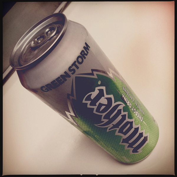
Energy drink: Mother "Green Storm"

It's green and stuff.

Mother "Green Storm" is a bit like recycled photocopier paper. You can't tell recycled paper is any different to regular photocopier paper unless you read the package first. Similarly, you can't tell that Mother "Green Storm" is made with natural caffeine unless you read the can. And even then, it makes no difference. Apparently natural caffeine is better for you than the synthetic stuff. Both will make you alert, but the absorption rate and side effects tend to differ. Supposedly, according to some sources that I don't care to link to, natural caffeine tends to have a gentler spike-and-crash rate. Who knows --

It tastes like regular Mother. If you're a fan of that, then you'll probably like this. If -- like me -- you're not a fan of the acrid taste of standard Mother, then you'll probably think it tastes like piss and vinegar with most of the vinegar removed.

The can also claims "high caffeine content", which is peculiar, as it actually has 0.4 milligrams less per 100ml than pretty much any other energy drink that's available. While it's not unusual for these drinks to claim a higher energy content than their competitors, which can be justified by higher sugar levels, claiming high caffeine content when it's...not, is just peculiar.

Sharktopus: A work of genius

...yeah.
...yeah.

This is going to be a remarkably brief review, but I'm still going to do my best to convey exactly how bad this film is. It's presented by its producer, Roger Corman -- famous for some semi-bad things like Death Race and the 1960s version of Little Shop of Horrors, and a film I've mocked previously, Time Under Fire.

Sharktopus has a fairly loose storyline, governed largely by the instruction to show, as often as possible, a literally unbelievable creature eating as many people as possible.

Eric Roberts (older brother of Julia) "stars" as Sands, the father of Nicole, reluctant creator of the Sharktopus. The creature is a military creation, intended as a tracking device, or at least that's the best I can figure from the film's limited exposition. It's given the code name "S11", by which it's constantly referred to, probably due to the realization that "Sharktopus" is the stupidest word ever coined.

Toss into the mix a Lara Croft knock-off news reporter and her stereotypical Mexican camera man (complete with inconsistent Sharpie tattoos that change from scene to scene), and a few scattered bit parts by terrible actors, and you have the closest thing to a story that Sharktopus has to offer.

I'm going to bullet-point some of the highlights, in no order in particular:

  • The majority of the film's intro and establishing shots appear to have been lifted from the holiday home videos of the crew. Every single one features dodgy hand-held camera shake, and several shots dim and brighten under auto exposure. Nice!
  • The bulk of the "actors" were clearly hired for their physique, and not their acting talents. With a couple of notable exceptions --
  • The bikini-clad young lady with the metal detector who gets dragged down the beach by the Sharktopus may possibly not have been born a woman.
  • Roger Corman's daughter makes an appearance as a bungee-jumper. It's worth noting that she was probably not hired for her looks, and definitely was not hired for her acting talents.
  • Some of the Shaktopus visual effects are decent, if let down by the ridiculous design of the (ridiculous) creature. Other shots, though, look like they've been rendered out on a Nintendo 64.
  • Eric Roberts (Julia's older brother) spends most of the film getting progressively drunk as a means of dealing with the ludicrous situation. I suspect that this may not be acting, and I can imagine Mr. Roberts probably had similar feelings about the ludicrous film he was making. I do hope he was paid well.
  • Kerem Bursin spends most of the film confused as to why his shirt keeps disappearing and reappearing, as continuity had clearly taken the day off while his scenes on the boat were filmed.
  • The spectators at the inexplicable dance scenario toward the end of the film are apparently totally blind to the shark/octopus hybrid that climbs atop the pavillion until it begins to eat people.
  • Almost all of the Jaws-style scenes in which a random beachgoer is killed by the monster are completely disjointed, and really serve no purpose to the storyline (although I'm willing to accept that they are the storyline).

All in all, I don't feel my time was wasted watching it, as it was entertaining for all the wrong reasons, but I'm afraid I can't, in good conscience, recommend it to anyone, as quite frankly it's a stinking pile of bilge, and shouldn't be cast onto the retinas of a human being under any circumstances. That said, I'm sat prepared to watch another Roger Corman entry tonight: Camel Spiders. I can only imagine it'll be awesome.

Hasta la vista: Fake Lego Terminator toys

I like Lego. Lego is awesome. I also like that Lego, the company, has made a moral decision not to create military-based playsets. This decision has left the market open for Lego’s opposition to fill the void, which has lead to such things as Mega Bloks’ Halo playsets, Kre-o’s Transformers and Star Trek licenses, and Brickarms, a company dedicated to making authentic Lego-sized weapons for your minifigs. A company I’ve never heard of, Best-Lock, has now produced a small series of military sets based on the Terminator franchise (possibly as a result of the franchise’s ownership being in a state of phenomenal flux as we speak). They’re not the greatest quality, but you can’t get any other Lego clone products with the Terminator name on the box, so let’s give them a chance.

Before I tear them apart, I’m going to be kind and point out that they were very cheap. I paid no more than three dollars for each set. Admittedly, this was from The Reject Shop, where all good products go to die, but I can’t imagine the retail price for them was significantly higher. Even at double the price, they’re dirt cheap for the quantity of Lego-compatible pieces they contain.

The (very) unassuming package.

The box is unassuming. I picked up two models, the Hunter Killer, and the Hunter Killer aerial. The company’s logo is quite disappointing. The choice of Arial Rounded as a font is questionable at best. The design of the package, in general, is chaotic and uncoordinated. It’s also not particularly colourful, which while appropriate for the franchise, is questionable for a toy package design.

Multiple Hunter-Killers.

The box for the Hunter Killer (the non-aerial variant) features a couple of artificial red laser beams.

Inside. (Jesus Christ, I'm doing an unboxing.)

Inside the boxes, the pieces are packaged in plastic bags with some stickers on a sheet. The instructions are loose inside the box.

Pieces. So many pieces.

All of the pieces in the set are cast in the same colour, a kind of gun-metal grey.
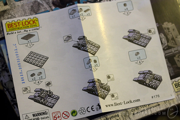
It's like IKEA, but with less allen keys.

The instructions are easy to follow, but are far from the quality standard of Lego instructions.

It's so close to Lego, but yet so far.

The pieces are interesting. They’re similar to Lego. Most of the pieces serve the same function as a comparable Lego piece. Many of them have slightly differing engineering, such as the round plate pieces, which have additional reinforcements on the underside. The small 90-degree fold pieces with two studs on each side seem unique to Best-Lock.

If nothing else, Lego’s competitors often stand a chance of producing a random significant piece that serves a purpose no official Lego piece was created for. The odds of this are decreasing daily, as Lego makes more and more unique pieces, particularly for its licensed sets (Lord of the Rings, The Lone Ranger, Teenage Mutant Ninja Turtles, etc, and -- of course -- Star Wars).

These pieces will be handy if you ever need to build a tripod-mounted gun cylinder...thing.

Here are some of the unique pieces you won’t find in Lego -- the gun turret comes in three parts, a tripod, the gun itself, and a small ammunition belt that clips on in a similar style to a minifig’s gripping hand. The round piece with the flared bottom connects to a piece with an upright, making a large, spinning turntable piece.

GET TO DAH CHOPPAH
GET TO DAH CHOPPAH

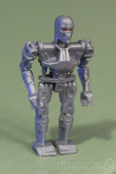
The Terminator figure is quite detailed. It’s also quite fragile. The arms are articulated at the shoulders and forearms, the legs only at the hip. The head rotates. The hands don’t grip anything particularly well, and placing the awkwardly shaped minigun into its pincers is more of a balancing act than a satisfying job.

I don't think he'll fit inside.

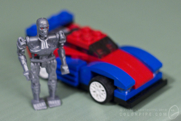
Here’s a size and quality comparison of the Terminator figure alongside a genuine Lego Creator set. While the creator set was never intended to be the correct scale for a minifig, you can still get a reasonable idea of the size of the scrawny Terminator in comparison to Lego pieces.

I think the Terminator is aiming at his own plane..thing.

This is the completed model of the Hunter Killer aerial, with the terminator swinging his minigun alongside. The pieces have a mottled sheen to them, as evident on the sloped pieces that make up the HK’s front end.

Quality workmanship.

You can see here that some of the pieces connect together quite poorly. Some of them simply don’t like each other, while some of them have obvious flashing problems from the way they’ve been moulded. You can see numerous moulding problems in this photo.

There's a certain level of "number five is alive" to this model.

This is the other Hunter Killer. The non-aerial one. If nothing else, the track system is very cool. It looks good, and within reason, it works as you push the thing along the table. The dog-leg in the tracks at the bottom, where it tucks up between the main wheels, is a bit of a design flaw. The piece holding the track up is simply a small cylinder with a cap on it, and it has a tendency to fly off when the track moves, or simply fall off periodically from the tension of the rubber track. The little cones that make up the turrets on either side of the machine don’t seem to click in particularly well, and fall off often, also.

The kits come with stickers to add panel detail and markings to the vehicles, but I haven’t added them as I’ll probably be taking the units apart again when I run out of shelf space. I’m quite confident that the stickers are actually intended to be structural, and will stop a lot of the connection problems with the main components of the vehicle bodies. I’m fairly sure Lego’s official sets do not employ load-bearing stickers as part of their design.

Final verdict for the Terminator Best-Lock construction kits: They were very cheap, the quality is no better than “okay”, and they’re a piece of licensed Terminator merchandise. I don’t feel that I’ve wasted my money.

End of an era: The Pokataroo Branch

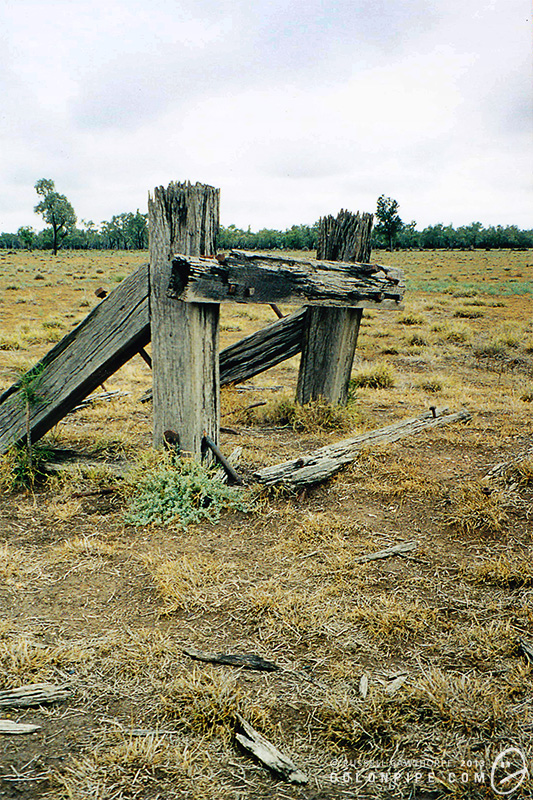
These are the last photos I took on film, with a craptacular Kodak camera. The old Pokataroo Branch of the north western railway in New South Wales terminated about five kilometres from where I used to live. The old railway station was opened in 1906 as Collarendabri, before being renamed to Collarendebri East, then finally Pokataroo in 1919. The line leading to Pokataroo station closed in 1974, after flood damage.

At the time these were taken, which I believe was 1998, the terminus was still visible. The buffer stop at the end of the line was still standing, the rural station platform rotted and leaning to one side. At the far end of the platform, the base of an old crane.

Close up of some rails and sleepers.

If you like, click "read more" for a couple of newer photos of the railroad remants around Pokataroo, including the crane base and the old rail bridge.

The old crane base near the Poktaroo platform.
Looking back toward Pokataroo township (approximately four houses) from the station's location.
The old Pokataroo rail bridge.
Looking toward Pokataroo atop the old rail bridge.

If you're into this kind of thing, you can find some information about the Pokataroo Branch on NSWrail.net. There're some cool photos if you click on the "photographs" tab, including some of the platform, and one from the '70s of the station building when it was still in-tact.

Also, I'm a nerd. Don't judge me.

The Jelly Bean Generator returns

Once upon a time, colonpipe.com was home to a craptacular generator of random jelly beans. It was crudely based on the idea from the Harry Potter books and films, wherein the heroes experience a brand of magical jelly bean that features every flavour known to man. If you click the link below, you'll generate a random bean. Hit the button at the bottom to pick another one. Go on, you know you want to.

The colonpipe.com Jelly Bean Generator

beanspromopic

If you have a suggestion for another flavour to add to the bean repertoire, post it in the comments!

The Simpsons: Tapped Out texture glitches

Hi! If you've come here looking for a resolution to a glitch or problem in The Simpsons: Tapped Out, I'm afraid I probably can't help you. I suggest you visit the splendiferous TSTO Topix and search there for your answer. I've been playing The Simpsons: Tapped Out on the iPad for some time, now. I rather like it. It's consuming huge amounts of my time and money.

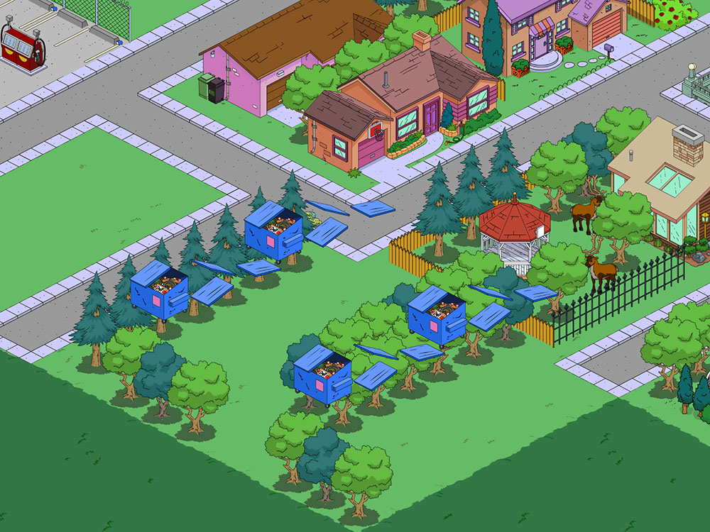
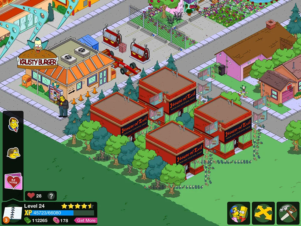
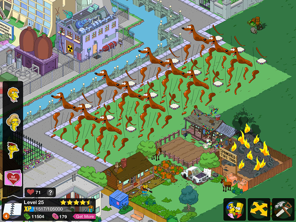
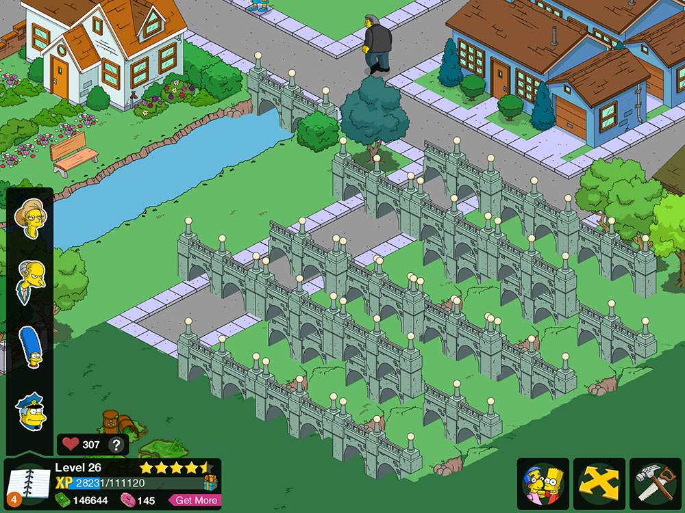
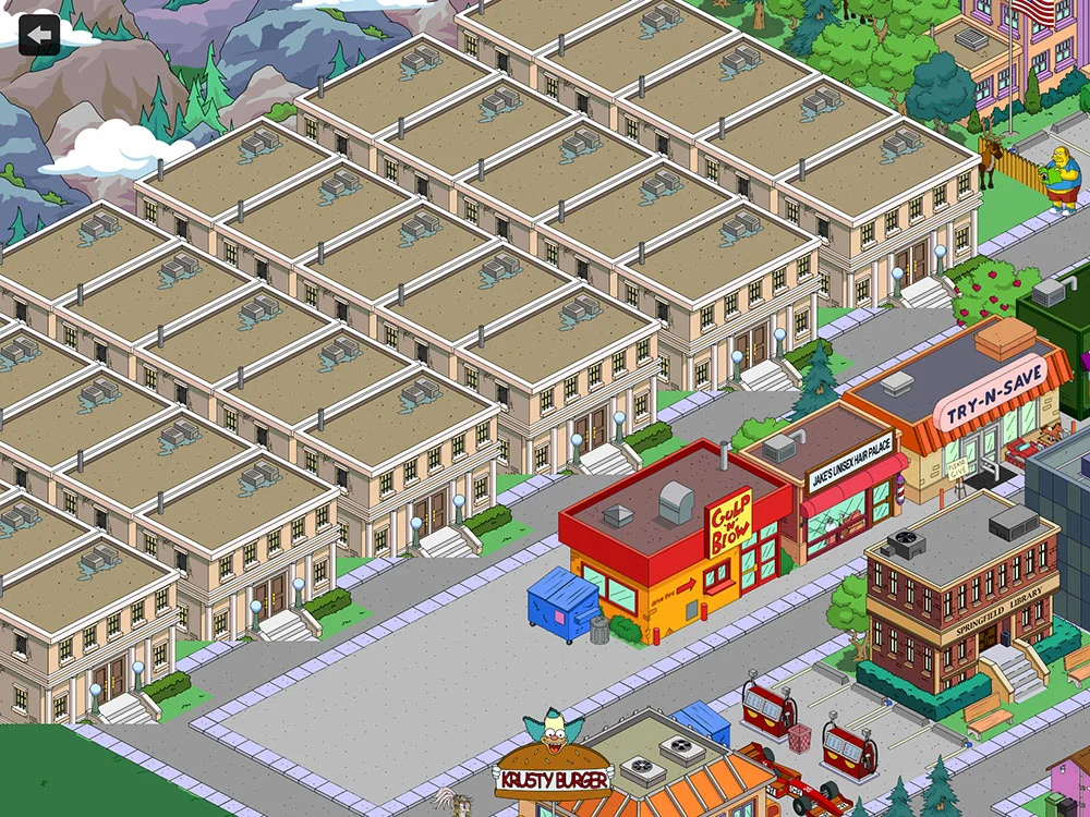
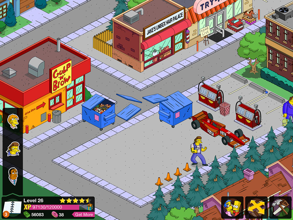
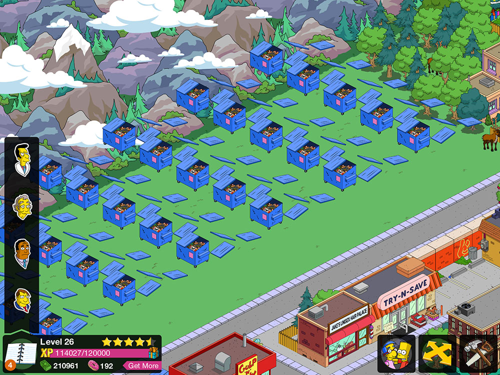
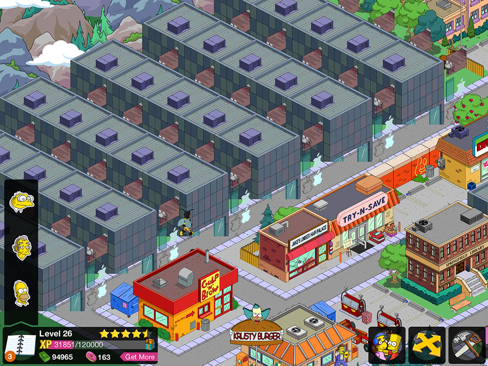
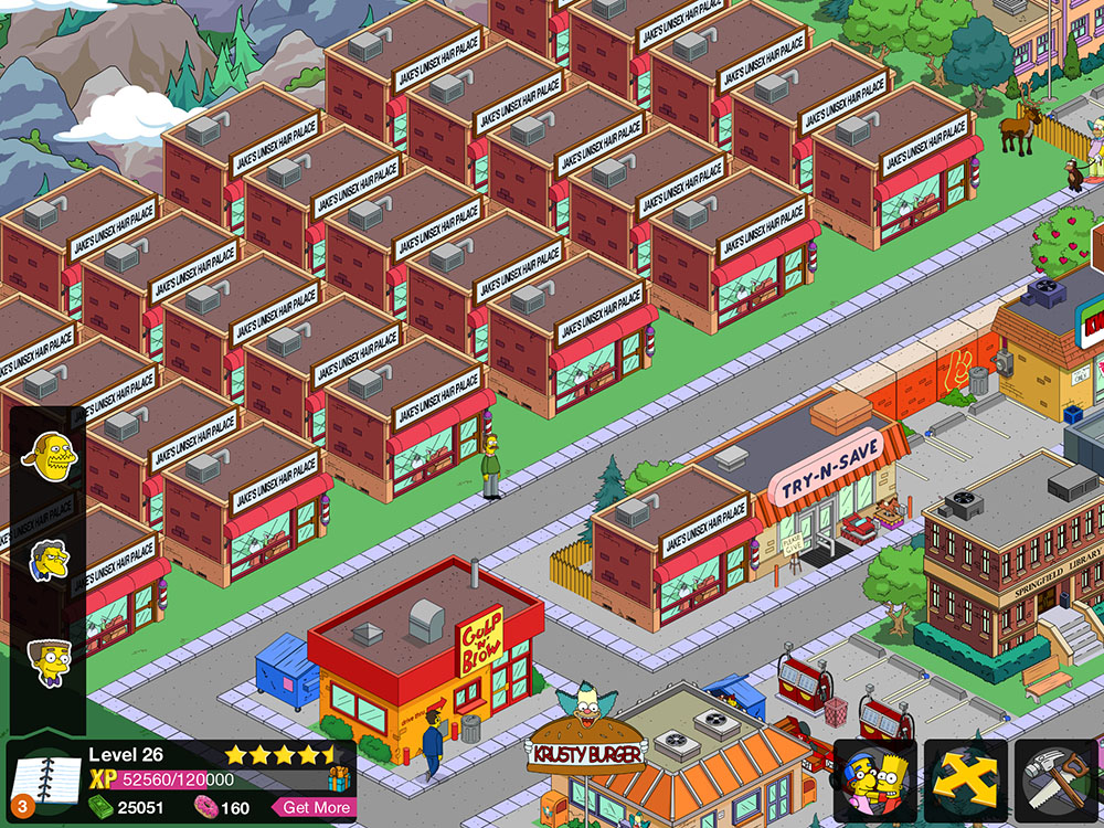
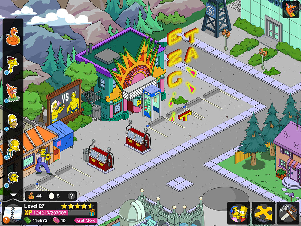
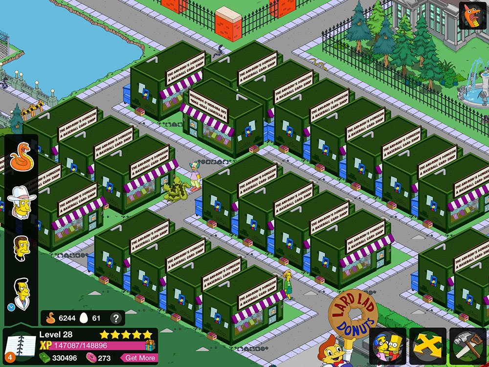
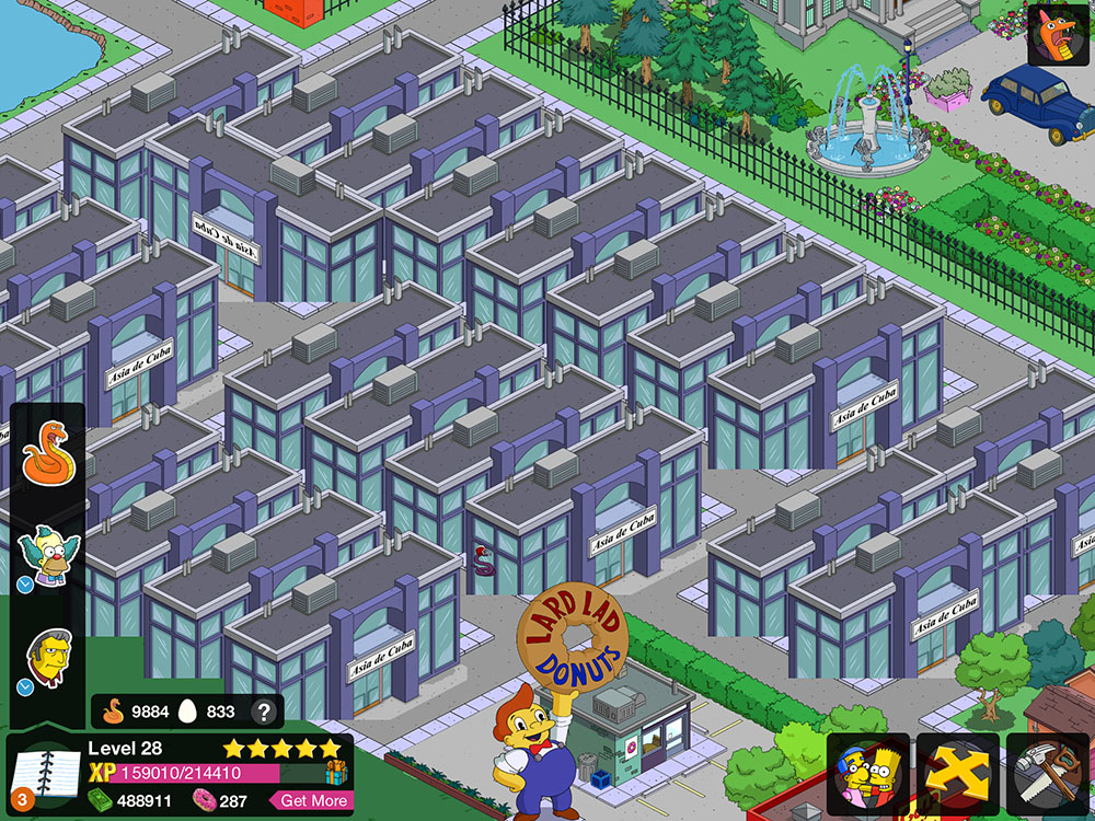
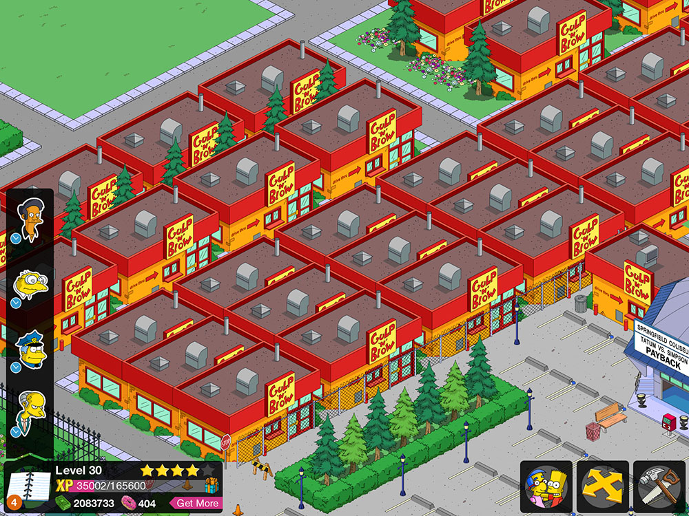
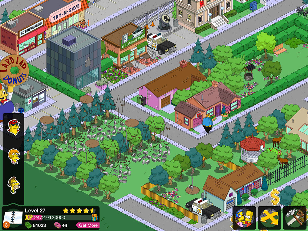
Occasionally, there's an odd glitch where a chunk of the graphics get swapped out for something completely different. I've been recording these glitches, and I present them below for your fun and enjoyment.

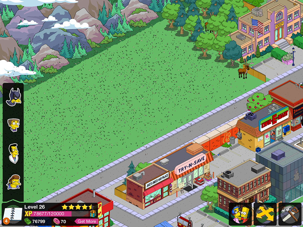
Here we see more Jakes Unisex Hair Palaces than you can poke a stick at.

Click the link below to see the rest. There's quite a few. Sorry. (Or not.)

Thanks for your time. I'm going to go do something more constructive, now. You probably should, too.

Bad automotive marketing decisions

There are a squillion possible things you can name a car. Generally, you take something that sounds vaguely foreign, and slap an "a" on the end. Cecil at The Straight Dope did a column a while ago (and by 'a while', I mean 'when I was one year old') on the subject. I do not understand the marketing logic behind the decision, then, to bring out a new vehicle with the same name as an older one. This is particularly puzzling when the new vehicle shares zero design lineage with the old one. It's not a two-thousand-and-whatever model of the same car, it's a whole 'nother car entirely.

Case in point, the Holden Cruze. Holden is an Australian car manfacturer. Half of the Australian population support them. The other half support Ford. I'll get to them in a moment.

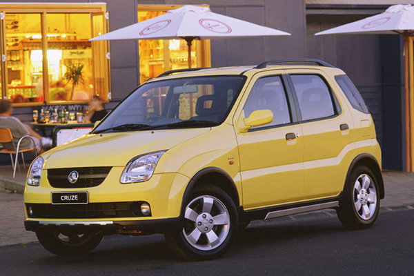
hold_cruzThis is a Holden Cruze from 2002. It's a kind of beach buggy thing. It's pretty hideous. The rear of the thing has ghastly round tail lights. It's about as intimidating as a boiled potato. You might sometimes see re-branded Cruze(s) getting around as Suzuki Ignis(es).

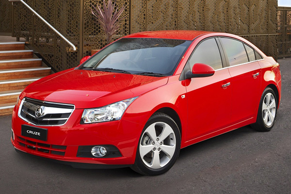
hold_cruz_09This is the Holden Cruze from 2009. It's an economical small car that boasts the looks and spaciousness of a larger car. It's actually kinda sexy, all things considered. It's a completely different vehicle, targeted at a completely different audience in a completely different market sector, and for a completely different purpose. It's clear that someone just kinda thought "Cruze" was a cool name, and it's a shame it was wasted on that Tupperware container on wheels they made in 2002 -- but wait, maybe no-one will remember that piece of junk. Yeah, lets use the name again.

The '09-onwards Cruze is also marketed as the Daewoo Lacetti, in a badge-and-name-change that gives it that ring of class it was initially lacking. The only thing cool about the Daewoo Lacetti is its occasional appearance on Top Gear as the "reasonably priced car", but unfortunately for the '09 Cruze/Lacetti, the car featured on Top Gear is an earlier model that bears no resemblance to the vehicle pictured above. It was also retired from the show and replaced by a Kia. That's just..........rude.

Case in point part deux: The Ford Kuga.

ford_kuga_13This is the 2013 Ford Kuga. It's a cool looking car. Mechanically, it's a four-wheel-drive (ish) thing constructed over the chassis of a Ford Focus. It's marketed in Australia as the smaller brother of the Ford Territory, and aimed at the 'soccer mom' demographic (ironic, perhaps, for the purposes of this article that it circles back around to the market sector the original Holden Cruze was potentially aimed toward).

This is great, except: In the non-rhotic Australian accent, "Kuga" is a homonym with --

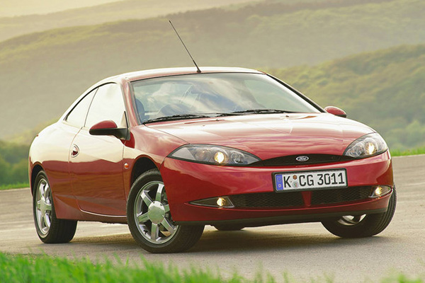
ford_cougar-- the Ford Cougar. This horrid thing is a mid-life-crisis-on-wheels from the late '90s to early '00s that was marketed in Australia in thankfully limited numbers.

I do not understand why the choice would not be made to use a more unique name for a car model. There are now undoubtedly loads of Ford Kuga drivers who, upon announcing the name of their new ride, are greeted with the looks of stunned incredulity well due to someone who's just announced they've bought a curved-up ludicrous looking skateboard with two doors and a hernia, until they realise the error of their pronunciation and start inflecting the "ah" in "Kug-aaaahh" like Hermione Grainger.

As an aside, Wikipedia has informed me that "kuga" is the Serb-Croatian word for "plague", and that Ford didn't opt to alter the name for its launch in those countries. Dunno about you, but I want to move to Zagreb and buy a black one.

Seeing colours: I am a synesthete

Synesthesia is a neurological condition wherein one associates abstract, intangible things such as numbers, letters, words, musical notes or chords with sensory information usually associated with something physical, like colours, tastes or physical sensations. The most common form of synesthesia is grapheme-colour synesthesia. In this condition, one associates numbers, letters or words with colours. I have this condition. I've always had it. I assumed it was normal. I thought everyone saw colours when they thought of numbers, letters and words.

Wikipedia's page on synesthesia is fairly in-depth. There's also a website called the Synesthesia Battery which has an online test you can take to determine if you're synesthetic or not. (I took the test, and its results weren't as conclusive as I'd hoped for my own experiences. I feel that the test relies more on the user being able to repeatedly recognise fairly similar colours with very little margin for error than actually acknowledging when two quite similar colours are selected. I'm sorry, my brain doesn't function in HSV values.)

This is my alphabet. I own it. Hands off.

Whack the link below to keep reading, if you're into numbers and colours, and the unnatural marriage thereof.

Brady Haran's Numberphile, one of my favourite YouTube channels, recently posted a follow-up to their previous video on the subject of synesthesia. I've embedded both episodes below for your perusal:

Talking about Grapheme to Colour Synesthesia with Alex from Bite Sci-Zed. Do you see numbers as colours? Leave a comment. Check Alex's channel at http://www.youtube.com/user/Lexie527 Check Numberphil's NEW TUMBLR: http://numberphile.tumblr.com Website: http://www.numberphile.com/ Numberphile on Facebook: http://www.facebook.com/numberphile Numberphile tweets: https://twitter.com/numberphile Google Plus: http://bit.ly/numberGplus Tumblr: http://numberphile.tumblr.com Videos by Brady Haran

And the follow-up:

More on number/color synesthesia, including your questions for with Alex Dainis. Supported by: http://www.squarespace.com/ (numberphile5 for discount) Blog with graphs: http://bit.ly/11yaWb8 Original video at: http://www.youtube.com/watch?v=dNy23tJMTzQ Alex's channel is: http://www.youtube.com/user/Lexie527 Huge thanks to Dave Wiley!

I notice that these videos tend to avoid the subject of grapheme-colour synesthesia for letters and words, but I suspect there's a conscious decision at play considering the YouTube channel hosting them is dedicated largely to numbers.

I've included my own synesthesia alphabet above, for fun. It seems to me that my perception of grapheme-colour tends to be related largely to the geometric shape of the characters, with the following specifics:

  • sharp angles seem to tend towards green and olive
  • right angles lean towards brown, with "F" and "T" being very specifically brown. "L" strikes me as green, though
  • Rounded shapes tend to take on a yellow hue
  • "A", as recounted by many synesthetes, is almost always represented as red
  • The three middle vowels are very neutral

My perception of numbers is more interesting:

Numbers ahoy!
Numbers ahoy!

There's less consistency, here. But, surprisingly, there's actually some logic, and much like Alex in the Numberphile videos, it seems to be largely factorial.

  • One and zero are neutral, much like the vowels in the alphabet
  • I have a suspicion that four is red largely because of its resemblance in form to the letter "A". If this is the case, my own mental association made this connection many years before Leetspeak was ever a thing
  • A similar thing no doubt applies to five and its resemblance to "S"

The factorial nonsense comes into play when you organise the numbers:

Two, four and eight are warm coloured numbers.

Three, six and nine are cool.

I've found limited practical applications for my "abilities". One of the few is that in data entry work, I find that I can error-check data fairly efficiently by relying on the colours associated with figures. If a figure is supposed to be the same in two different locations, it's plainly obvious to me if it's not the right "colour".

Larger numbers are generally a gestalt of the colours represented by the figures that comprise them, with the hues blending across the figure. Some specific really big numbers have weird habits: One million (1,000,000) appears blue, presumably due to the connection with the letter "M", and one billion (1,000,000,000) appears green, again because of the letter "B".

Musical notes and chords also have coloured connections for me, again largely governed by the letters that associate with them.

When notes become flat or sharp, they change their appearance slightly. Flat notes (or chords) become darker. E flat actually becomes darker than its default state, black, but I can't represent this in a picture because there's nothing darker than black! Sharp notes and chords take on a desaturated look, with an ethereal kind of rusted vomit colour that I've been unable to represent graphically. (Come to think of it, I'm appalled by my description of it, too. Rusted vomit? Nice.)

Minor chords reflect a paler, ice-cream texture. Other chord types, 7ths, augmented chords, diminished chords, etc, have their own peculiar qualities.

I find it exciting to think about the possibility that synesthesia may be the only quantifiable example of qualia at work. Qualia is a collective term for all the little things that happen inside your mind, that you can't directly share with another person. For example:

  • The age-old psychological litmus test: Do you see colours the same way I do? Is my red your blue? Does it matter?
  • What does a strawberry taste like to you?
  • What does a noise sound like to you?

Sensory information is fickle, and the idea that we all sense things the same way is largely untestable. The most frustrating (or perhaps relieving) thing about this problem is that it makes no difference in the end. If I see a stop sign as what I call "red", and you see it as what I call "blue" (but what you call "red"), it makes no difference, because we both call it "red" and stop at it.

Synesthetic responses could be the missing link for qualia. Many synesthetes report similar associations between colours and characters. Brady's second video (embedded above) includes a chart of reported synesthetic connections from his readers. It may be possible that this kind of information proves the existance, and uniqueness of qualia.

Oh, and Porcupine Tree have an awesome song from their 1992 album Up The Downstair entitled Synesthesia. You should go buy it from Burning Shed.