Once a nerd: Clarisworks flashback

I've recently started playing around with software emulation of old Mac operating systems. One of my first Macs was a Quadra knock-off* running System 7.5, so I was pretty happy to fire up Basilisk II and see what it could do. While my primary objective was to play Prince of Persia and Indiana Jones and the Last Crusade, I ended up booting up Clarisworks 3.0 for a bit of nostalgic desktop publishing.

When I was 14, I took it upon myself to publish a magazine/newspaper thing. It was a financial disaster, and it certainly did my social life no favours, but hey. It was something to do. Most of it, such as it was, was made in Clarisworks. Yay, Clarisworks.

clarisworks

* When I say "Quadra knock-off", it was a Performa 580CD. It was a weird model that sat in-between the standard Quadras (the "real" Macs of the time) and the utterly bizarre Macintosh TV. The Macintosh TV was meant to be a kind of bridge between the personal computer and home entertainment, kind of like the AppleTV would eventually become, but it was a total failure. It was even designed with a black casing, to give the illusion that it's an appliance, and not a beige computer. The Performa 580CD had the same casing as the Macintosh TV, but in standard beige, and somewhat similar AV capabilities (no built-in TV tuner, just AV inputs). Unfortunately, it had sod all processing power and storage space, so it was pretty useless at anything involving AV. Its video input capabilities were limited to 320x240 pixel footage at a stonkingly low frame rate.

Underrated NES games: Ufouria - The Saga

Ufouria (or U•four•ia, as the packaging insists it should be punctuated) is an acid trippy Japanese video game converted for English-speaking markets.

The original game, Hebereke (which means 'drunk' in Japanese) is virtually identical to Ufouria, with a few cosmetic changes and some alterations to the storyline as part of the translation. For now, we'll discuss the English version, and I'll show you a few of the changes in a little while.

You begin the game as Bop Louie, a white snowman-like character with a blue beanie hat. He can walk, jump, and squash enemies if you hold the down button while he's above them. He can't swim, and falls over every three steps if he tries to walk on snow and ice. Over time, he develops a couple of additional bizarre abilities, including his secret power of launching his head on a spring towards enemies, and the skill of suction-cupping up vertical surfaces.

All of the characters are able to throw little face-ball things that appear on occasions when you squash an enemy. They can be used as projectiles against other enemies, and are often the only weapons that will have any effect on the bosses, when you encounter them.

Most of the game follows a Metroid-like approach, wherein you can't progress to another area of the expansive world map without completing the right task and collecting the right item, allowing you to progress. Often, the item you need to obtain is one of the other three characters:

  • Shades is a ghost with a purple wing cap that can leap long distances, and gains the bizarre ability to bash himself in the back of the head with a hammer, causing his eyeballs to chase enemies around the screen. (Seriously. I'm not making that up.)
  • Gil is a kind of lumbering salamander creature that can't walk very well and can't jump very high, but can sink into water, and swim, y'know, properly. Eventually, he can cough up bombs. Because bombs.
He thinks he's found his friend, but he's wrong.

The enemies range from walking squirts of whipped cream, through birds that drop weights, strange little oriental creatures, wiggling green blobs, statues of frogs and strange grubs. There's not a lot of variety, but the general enemies don't really pose much of a threat, as the majority of the point of the game is problem solving.

The bosses are rather cool. The mid-bosses tend to be gigantic Homer Simpson creatures. Each one is more peculiar than the last, one with its head popping off mid-fight and flying around on a propellor, another in outer space, another underwater. A range of giant-sized cat bosses also exist, including one in a suit of armor, and a puzzler of a boss with a cat in a tube and a strange orbiting white orb. The remaining bosses are, of course, your friends. You must fight each one as you progress in order to knock some sense back into them, ultimately gaining them as playable characters after you've "won" the fight.

One of my favourite elements of the game is the animation. The overall quality of the graphics is so good, they could easily be from an early Super NES game. The only graphical glitch is a column of graphical blocks that flicker on the far leading side of the screen, depending on the direction you're heading, but they're easy to ignore, and not a fault unique to this game.

Speaking of faults, if I must name a few: The game is quite short, and it seems that certain gameplay elements have been tailored (poorly) to make it a bit longer. The characters don't move very quickly, meaning that you simply can't complete the game as quickly as you'd probably like. I feel the game could have benefited from a Super Mario Bros style "run" function when the B button is held down, but I understand that this mechanism would have probably wiped 20% off of the game's duration.

The music in Ufouria is astonishingly awesome, and is full of earworms that'll stick in your head for months. The main overworld theme and boss music are particularly great, but all of the atmospheric music is perfect and suits the game splendidly.

I mentioned earlier that the game was translated from a Japanese game, Hebereke. Here's what they changed:

Shades was known as Sukezaemon, but didn't undergo any changes in appearance. Gil didn't change looks either, but his name was originally........Jennifer.

The only remaining change, and undoubtedly the single most important, significant and life-altering:

I love Ufouria. Ufouria is awesome. It's not easy, but it's not hard. It's about an hour of play all told, so it's a manageable game to bust up any time you feel like completing something in its entirety.

Hasta la vista: Fake Lego Terminator toys

I like Lego. Lego is awesome. I also like that Lego, the company, has made a moral decision not to create military-based playsets. This decision has left the market open for Lego’s opposition to fill the void, which has lead to such things as Mega Bloks’ Halo playsets, Kre-o’s Transformers and Star Trek licenses, and Brickarms, a company dedicated to making authentic Lego-sized weapons for your minifigs. A company I’ve never heard of, Best-Lock, has now produced a small series of military sets based on the Terminator franchise (possibly as a result of the franchise’s ownership being in a state of phenomenal flux as we speak). They’re not the greatest quality, but you can’t get any other Lego clone products with the Terminator name on the box, so let’s give them a chance.

Before I tear them apart, I’m going to be kind and point out that they were very cheap. I paid no more than three dollars for each set. Admittedly, this was from The Reject Shop, where all good products go to die, but I can’t imagine the retail price for them was significantly higher. Even at double the price, they’re dirt cheap for the quantity of Lego-compatible pieces they contain.

The (very) unassuming package.

The box is unassuming. I picked up two models, the Hunter Killer, and the Hunter Killer aerial. The company’s logo is quite disappointing. The choice of Arial Rounded as a font is questionable at best. The design of the package, in general, is chaotic and uncoordinated. It’s also not particularly colourful, which while appropriate for the franchise, is questionable for a toy package design.

Multiple Hunter-Killers.

The box for the Hunter Killer (the non-aerial variant) features a couple of artificial red laser beams.

Inside. (Jesus Christ, I'm doing an unboxing.)

Inside the boxes, the pieces are packaged in plastic bags with some stickers on a sheet. The instructions are loose inside the box.

Pieces. So many pieces.

All of the pieces in the set are cast in the same colour, a kind of gun-metal grey.

It's like IKEA, but with less allen keys.

The instructions are easy to follow, but are far from the quality standard of Lego instructions.

It's so close to Lego, but yet so far.

The pieces are interesting. They’re similar to Lego. Most of the pieces serve the same function as a comparable Lego piece. Many of them have slightly differing engineering, such as the round plate pieces, which have additional reinforcements on the underside. The small 90-degree fold pieces with two studs on each side seem unique to Best-Lock.

If nothing else, Lego’s competitors often stand a chance of producing a random significant piece that serves a purpose no official Lego piece was created for. The odds of this are decreasing daily, as Lego makes more and more unique pieces, particularly for its licensed sets (Lord of the Rings, The Lone Ranger, Teenage Mutant Ninja Turtles, etc, and -- of course -- Star Wars).

These pieces will be handy if you ever need to build a tripod-mounted gun cylinder...thing.

Here are some of the unique pieces you won’t find in Lego -- the gun turret comes in three parts, a tripod, the gun itself, and a small ammunition belt that clips on in a similar style to a minifig’s gripping hand. The round piece with the flared bottom connects to a piece with an upright, making a large, spinning turntable piece.

GET TO DAH CHOPPAH
GET TO DAH CHOPPAH

The Terminator figure is quite detailed. It’s also quite fragile. The arms are articulated at the shoulders and forearms, the legs only at the hip. The head rotates. The hands don’t grip anything particularly well, and placing the awkwardly shaped minigun into its pincers is more of a balancing act than a satisfying job.

I don't think he'll fit inside.

Here’s a size and quality comparison of the Terminator figure alongside a genuine Lego Creator set. While the creator set was never intended to be the correct scale for a minifig, you can still get a reasonable idea of the size of the scrawny Terminator in comparison to Lego pieces.

I think the Terminator is aiming at his own plane..thing.

This is the completed model of the Hunter Killer aerial, with the terminator swinging his minigun alongside. The pieces have a mottled sheen to them, as evident on the sloped pieces that make up the HK’s front end.

Quality workmanship.

You can see here that some of the pieces connect together quite poorly. Some of them simply don’t like each other, while some of them have obvious flashing problems from the way they’ve been moulded. You can see numerous moulding problems in this photo.

There's a certain level of "number five is alive" to this model.

This is the other Hunter Killer. The non-aerial one. If nothing else, the track system is very cool. It looks good, and within reason, it works as you push the thing along the table. The dog-leg in the tracks at the bottom, where it tucks up between the main wheels, is a bit of a design flaw. The piece holding the track up is simply a small cylinder with a cap on it, and it has a tendency to fly off when the track moves, or simply fall off periodically from the tension of the rubber track. The little cones that make up the turrets on either side of the machine don’t seem to click in particularly well, and fall off often, also.

The kits come with stickers to add panel detail and markings to the vehicles, but I haven’t added them as I’ll probably be taking the units apart again when I run out of shelf space. I’m quite confident that the stickers are actually intended to be structural, and will stop a lot of the connection problems with the main components of the vehicle bodies. I’m fairly sure Lego’s official sets do not employ load-bearing stickers as part of their design.

Final verdict for the Terminator Best-Lock construction kits: They were very cheap, the quality is no better than “okay”, and they’re a piece of licensed Terminator merchandise. I don’t feel that I’ve wasted my money.

Ancient aliens, minus "That Dude With the Hair"

Here's some old artwork -- some aliens doing what they do best: terrorising a caravan and a small country town. These were painted with cheap acrylics on some vinyl tiles, and were meant to be part of a larger series, which would go on to include an adorable representation of cattle mutilation, a cute attempt at alien probing, and a cartoonish bunch of crop circles. Like most (if not all) of my projects, it remains - to this day - entirely unfinished.

Many years ago, I named this guy "Jeff".

I'm fairly pleased with how adequately I managed to achieve the look of a town, at night, from the air. As far as my relationship with paint stretches, this is fairly decent.

Feel free to comment, perhaps you'll encourage me to create some more. (Although the odds are against you, these guys fell on to their canvases circa 1999.

Energy drinks collection, a sample

I have some energy drinks. Currently, most of them reside in cardboard boxes in my garage, and I'm seriously hoping none of them have gained the evolutionary skills required to eat through their aluminium cans, because I'll one day be opening up boxes of metallicised molasses with guarana undertones and that does not sound like fun. Here are a few happy snaps of various shelves full of drinks from the last several years:

Ooh, Nokia phone camera quality.

Left to right, we have:

  • Battery (tasted alright, but just a knock-off of Red Bull)
  • Hype (elderberry flavoured drink, red in colour, didn't taste entirely like ass)
  • Jugular (tasted very much like Satan's anus, with overtones of death, feces and herbs)
  • Red Eye Power (Red Bull clone)
  • Speed (Lime, Raspberry and Cola, if memory serves. All pretty average)
  • BLOX (either a repackaging or a knock-off of Blue Ox, which tasted largely like disappointment. And ass)
  • Scooby Doo and friends -- not energy drinks, but cool packaging regardless. I'm afraid I don't recall the flavour of Scooby or Shaggy's drinks, but Catwoman was raspberry and Batman is clearly cola (with apple juice)
  • The bottle of home-brand methylated spirits in the lower left is unrelated to the energy drinks

Hit the jump, there be heaps more.

Nokia Nokia Nokia.
Nokia Nokia Nokia.

Continuing the collection, we have:

  • Irn Bru, at Dan's insistance
  • Columbian Cola, which unfortunately does not seem to have any suspicious ingredients
  • Hartz Energy from Tasmania, which I purchased for the obvious reason that it's BLUE
OH HEY slightly better quality

There's a Hemp trend on this shelf. Hemp, the original, is in the yellow and green cans on top. The black ones are Hemp Black Label, and the bottles are Hemp Gold. I don't recall actually getting around to trying these ones, and I imagine if they're still sealed in my garage that they probably taste like acrid crud by now. Perhaps they mellow with age. (Also, perhaps they don't.)

Yellow V, lemon flavour, was a temporary addition to the V lineup that I actually rather liked. Mother, on the other hand, has always had a reputation for tasting largely like shite, even though the new formulation seems to just be another Red Bull/Monster Energy clone in a gigantic can. At least it doesn't taste like the old formula.

Yep, still clearer. Nice flash, too.

Moving right along:

  • Pimp Juice, inspired by the Nelly song (angels and ministers of grace defend us) with its semi-cool packaging
  • Bennu Extra has some supremely elegant can design, which I like, but suffers from the unfortunate failing of tasting like degreaser
  • Hiro Vitality, a curious sports-energy health drink containing all sorts of strange things that have no business being in a beverage, plus guarana and a whopping 7 calories
Mmm, cans.
Mmm, cans.

Aaaaand there's more:

  • Buzz Me, a curious honey-based organic energy drink. If there's any drink that I'll bet money has gone horribly wrong in my garage, it'll be these. I suspect they're turning to mead as we speak
  • Ed Hardy Energy Drink. Jesus Christ, he's everywhere
  • Synergy -- not 100% sure, but I believe this one's sugar free
  • Pink: an energy drink targeted at the lay-dees, also sugar free because bitches don't need no sugar
  • Citron: Liquid Energy. Ten points to this one for it's metal-band-inspired packaging and extensive flavour range: Raspberry Splash, Tropical Azul, Original and Pineapple Passion
  • Spring Valley Smart Energy, with its spectacularly dubious option of Blood Orange and Chilli. It tasted largely how you'd expect. Like blood orange and inexplicable burning, with all the joy of vitamin B and guarana peeking out from below, mocking you and ensuring every belch thereafter will remind you of your sins
oh look, he's a nerd

But wait, there's more!

  • Samedi, a subcontinental contribution with cool packaging
  • Solo Strong: The Thirst Crusher with some guarana added to it
  • High Roller Energy, with its horrid can design
  • Bad Girl Power Drink, released some time after its brother, Bad Boy Power Drink. Aimed at the female contingent, I presume it's sugar-free, and is probably pink in colour
  • Mother, the original. Excuse me, whilst I lose the will to live
  • Elixa, with some astoundingly good can art
  • Angel, a low-carb, no-sugar disaster in a fairly cool can
  • Demon, made by the same folks as Angel, in three different flavours
  • Rock, a Red Bull clone that has since appeared in voluminous quantities in The Reject Shop

Y'know what the sad part is? There're still more of them. Many, many more. Stand by, there'll be a sequel.

Sydney's "Tangara" train in Lego, kind of

Here's an attempt at designing Sydney's "Tangara" train as a Lego model, using some wing-ding Lego modelling software for the Mac. The colours are based on the current (2008) trend for all of the trains to be represented in yellow.

Choo, choo.

In hindsight, I could probably have made it eight studs wide, rather than six, to give a bit more detail. I tried to stick with Lego's standard of six studs for a train, though.

Tiny trains: HO scale Sydney railway station

I, uh, don't have a model railroad. But that didn't stop me from undertaking a weekend project to make a tiny railway station. I've made them in 3D before, but the real world is another story. OLYMPUS DIGITAL CAMERA

The various bits are cut from thick card, the kind that photographic prints are delivered with, to keep them from bending in the post.

OLYMPUS DIGITAL CAMERA

Hit the "Read More" linky-dinky to, uh, read more. There're a heap more pictures.

OLYMPUS DIGITAL CAMERAHere's the superstructure of the building. The corners are reinforced with extra card to give them the illusion of columns of brickwork, to match the brick columns along each side. It was sheer luck that the card was the right thickness to look like added brickwork.

OLYMPUS DIGITAL CAMERA

I cheated with the exterior. The brick pattern is "texture mapped" by creating a brick pattern in Photoshop to the correct scale (HO, in this case, which is around 88:1). The folds are all scored so the thick photo paper bends nicely.

OLYMPUS DIGITAL CAMERAAll "textured". The pale blue wheelchair ramp box is popped out on a piece of card to give it depth. I built some fake shadows and staining into the texture map to give it some age and interest around the brick columns, doorways and windows. The network map and station signage is all to scale.

OLYMPUS DIGITAL CAMERAThe platform is not exactly long enough to be true to scale, but as I don't have a model railroad to put it in, that's kind of a moot point. The surface of the platform was a fluke -- it's very fine grit wet-and-dry sandpaper which was used to sand some items that had been painted in black paint. The glossy black paint had worn into the paper, making darker, shiny patches. It looks exactly like a gravel-on-tar surface that's been in the hot sun, allowing the shiny black tar to seep through the gravel. If I was to ever make platforms for a model railroad, I'd deliberately use this approach.

OLYMPUS DIGITAL CAMERA"Aerial" view, showing how remarkably decent the accidental platform surface turned out. The yellow lines are just strips of yellow paper cut very fine. The platform trim is white fine-grit sandpaper (no tricks, straight out of the packet) to give the illusion of texture, and the markings along the platform edge are made to scale in Photoshop and printed on photo paper. If I was to do this seriously, I'd have used matte photo paper for the things that really shouldn't be shiny.

OLYMPUS DIGITAL CAMERA

Daylight! The station is sitting on the roof of my car. The porch is made from matchsticks for support and some more of the same card I built the structure from. It's not beautiful, but it gets the job done. The lights are bits of bent wire with tiny blocks of card on the ends, painted silver. They don't light up, obviously.

OLYMPUS DIGITAL CAMERAMore detail from the platform edge. A lesson learned from this is that it'd probably be best, if I made another, to "inlay" the paper layers, rather than just gluing them on top of each other. It'd reduce the buckling and generally look better. The "2" in the yellow block is a car marker, to indicate to the train driver where to stop the train, and a bit of a joke on my part, as it's only scaled to be a two-car platform. (Ordinarily, a station of this kind would have room for at least six cars, more likely eight.)

OLYMPUS DIGITAL CAMERA

I guess this would be the view from the "other" platform, but -- of course -- there isn't one.

OLYMPUS DIGITAL CAMERA

As an added bonus, here's a tiny tiny tiny version of the old manual timetable displays that appeared on the station platforms. The real ones have a dozen or so rotating blocks with station names, this one only has four. Usually it's Strathfield marked in red, as it's a big interchange for several lines. As a joke no one will get, I've marked it as "Redmyre", which was the original name of Strathfield's station. As another joke no one will get, I've named my station "Bresnahan".

OLYMPUS DIGITAL CAMERA

Here it is, with a coin. It's very small.

Op-shoppery: Polymertex Scrabble

Any time I go searching on the 'net for something and I can't find it, I feel two things:

  1. I feel annoyed, because I wanted information and I didn't find it.
  2. I feel obligated to fill the gap with what little information I can contribute.

Back in November 2007 (this is a back-dated post), I was lucky enough to stumble across a complete set of Polymertex "Modern Plastics" Scrabble.

I think I need to get a Geiger counter for those letters.

I'll tell you what I know about it:

  • it's made in the Philippines
  • the company that made it, Polymertex, no longer exists
  • there's a Russian company by the same name, but I imagine that's coincidental
  • there's also a kind of Korean paint by the same name
  • the tiles are so green I suspect they may be radioactive
  • it's clearly very old, as Scrabble boards go. This site/question/thing suggests in a roundabout way that it might be from 1968, which fits pretty neatly with my own assumptions that it's probably from the '60s, early '70s at the latest..
  • based on information on this website, it's "possibly one of the rarest Scrabble sets I've seen", and from the response to the abovelinked Topix question, it's apparently "superb collectors item!!"
  • from the same website comes the suggestion that it could be a trade sample, I would assume from a plastics manufacturing company

Scrabble!

There are a few things that I want to know:

  • is it an actual, licensed Scrabble game, or is it a knock-off?
  • what's it worth?
  • why are the pieces so freaking green?
  • is it worth hanging on to?

Green Scrabble. Enjoy.

Triple word score on BOPDX.

Brisbane: The Musical

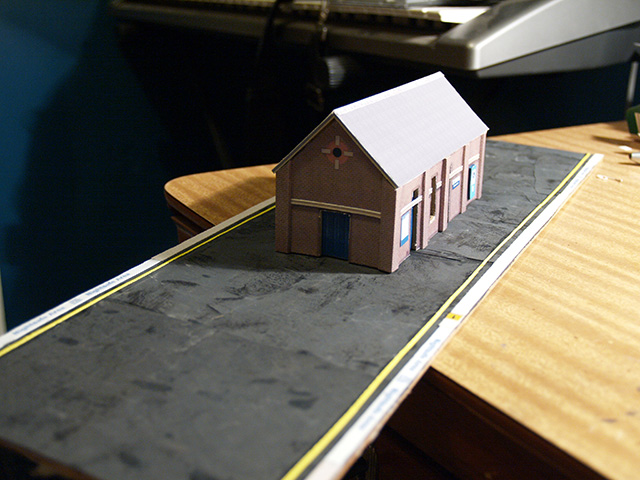
Here's a somewhat vague travelogue of my trip to Brisbane, and the three days during which I met Positronbob and Yahtzee. Click on the pictures for bigger ones. (Update, 2013: I've edited this a bit, largely because I feel I can write significantly better these days, and because some elements of the story are now either awkward or more embarrassing than I previously thought.) DAY ONE (Sunday)

Having determined where Positronbob was to be found, went and collected him. Drove to Kingston railway station, deposited car in car park. Took the train into the city, after bumming train fare from Positronbob. Can't remember if I ever paid him back. Probably should do something about that. Karma's a bitch, and all. Spent most of the duration of the train trip discussing online activities on the Home of the Underdogs Forum, a discussion arena attached to the old Home of the Underdogs abandonware website, which kind of disappeared from existance, but kind of reappeared in 2012, but it's so far removed from what it used to be that it doesn't bear thinking about.

Arrived in the city to discover that at some point between Kingston and Brisbane it had become very hot. Wandered out of South Bank station, where we were stopped in our tracks by the stultifying stupidity of this sign:

But...how...do...they...

Although on later reflection we realised the sign is probably there for the benefit of commuters passing on the road to the right.

On further reflection on the above realisation, we again noticed that even if the sign is for motorists, there's still the issue of how the blind people know where to cross.

It hurts my brain to think about it.

We ate at a small cafe near the Energex Arbour. The Energex Arbour is a massive winding footpath covered in with a hideous metal framework with weeds growing all over it. Eventually, I postulate, it will form an impenetrable forest of thorned and vicious plantlife, to be traversed only by warriors dressed in khaki and weilding machetes. As it stands, it's a poor attempt at even blocking out the sun.

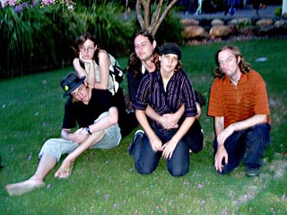
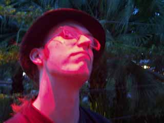
We waited under the Suncorp Piazza for Yahtzee to show. We kind of realised that we knew nothing about his appearance apart from some really old online photos, which lead us to wonder whether the photos were even of him at all. Perhaps he just typed a random name into Google Image Search and used whatever photos popped up.

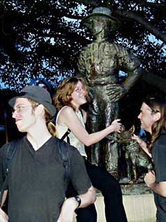
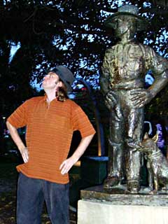
To cut a long story, uh, less long, we found him. And then we stood about. Awkwardly. For quite a while.

Then we ate. Again. Yahtzee ordered chips. We fed several of them to a hideously unattractive bird that was hovering about the table. Then her husband told us to stop. (Do you see what I did there?)

Brisbane is a complete arse of a city when it comes to things to do. Basically, once you cross the border from New South Wales into Queensland, the passtime of "do things" mutates into the passtime of "do not a jot". People in Queensland spend 99% of their available time doing nothing, and the remaining percent considering the option of doing nothing.  Having come to no conclusions whatsoever about what to do to pass the afternoon, we headed vaguely towards the city. I proposed this idea, as I recalled visiting the museum a few years earlier on the suggestion of a friend who informed me that there's a button on the wall that replicates the sound of a whale farting. The move was unanimous.

Brisbane Museum does not suffer from over organisation. There's no system to it whatsoever. One second you're staring at a dinosaur's femur, the next you're examining a tandem-bicycle-powered-fire-engine and wondering why these two exhibits share a room.

I believe the siren plays the theme to "Steptoe & Son".

Alongside the fire truck stood an array of cardboard cutouts.

IT'S A MIRROR IMAGE

OLYMPUS DIGITAL CAMERA

On the top level of the museum stood the beginnings of the "How To Make A Monster" display, which was to deal with animatronics and special effects. Sadly, it wasn't open yet. We asked a kind tourist to take a photograph or two for us. We didn't realise at the time that said tourist didn't speak a word of English. I was somewhat concerned when she started gibbering in some Asian language, and I hoped dearly that she did not think we were handing out complimentary cameras.

(I got my camera back, for the record.)

Moving away from the animatronics exhibit, we found....more animatronics. Around the corner was a stuffed leopard mounted atop a papier-mache rock. Unassuming, you may think, until you realise (under close scrutiny) that the cat has a half-eaten sausage roll jammed up its jacksy.

You're doing it wrong: Sausage rolls are generally to be consumed orally

But wait, there's more! (Animatronics. Not anal pastry.)

The next room featured a warning sign in a large font, reading something to the effect of "PARENTS: THE NEXT EXHIBIT FEATURES A VERY REALISTIC LIZARD WHICH MAY FRIGHTEN CHILDREN". And behold:

Murrr. Shudder. Thud. Crunch.

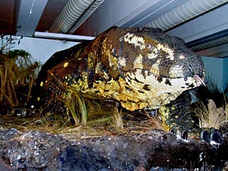
The sign did not lie. The creature was terrifying. It shuddered to life with none of the realism you'd expect from a battery-powered toy, hissing with pneumatics and hydraulics. It looks so natural tucked up against the ductwork, too. Yet more disturbing, though, is the rest of the exhibit. Surrounding the giant lizard is a large papier-mache dinosaur corpse with several Tasmanian devils feeding on it. One of them tugs back and forth on a chunk of rubber intestine, while another appears to perform oral sex on the dead reptile.

The rest of the museum paled in comparison. Several rooms containing spiders in jars. Several rooms containing randomly scattered fibreglass animal replicas. If nothing else, thanks to the marine-themed room, a new anthem emerged:

Dugong man, Dugong man Does whatever a dugong can Which is basically nothing As dugongs are large and stupid

CRAPPY SIGHT GAG

Additional kudos should be served to Brisbane Museum for featuring an entire wing dedicated to nothing but roadkill. I'm particularly enamoured by the realistic potato chips in the following photograph.

OLYMPUS DIGITAL CAMERA

And that, in short, sums up the Brisbane Museum. Here's one last photo, just to give you the entire Brisbane experience in a nutshell.

Sign reads "Please be patient while we get our new exhibits up and running". AND THEY PROVIDE A COUCH FOR YOU TO WAIT ON.

Having wandered aimlessly through the entirety of the poorly organised Brisbane Museum, we headed next door, to the Brisbane Art Gallery. Their official website is here, and it's actually fairly informative.

After surrendering our bags to the cloakroom nazis, and receiving a lecture on proper camera usage within the gallery (i.e., don't), we moved on. The entranceway consists of a staircase leading down to a white boardwalk surrounding a pool of somewhat greenish water with several billion silver balls bobbing in it.

OLYMPUS DIGITAL CAMERA

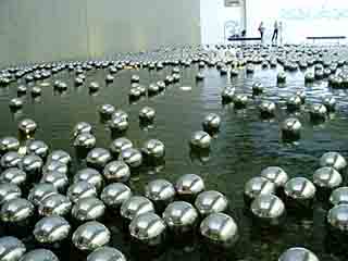
Now, this is an art gallery, so the purpose of everything within it is a matter of interpretation. HOWEVER. I think the idea here is that the balls are "powered" by the fact that people cannot resist manipulating and tossing them about, so they kind of swill in a vague spiralling motion about their pond. Closer examination revealed several points in said pond where the balls would form eddies, suggesting pumps beneath the surface were egging the spheres on. To be honest, I don't really care. It's art. And it looks expensive.

"I dare you to toss a ball!", whispered I. "Eh, okay." grunted Rhubarb. Ball ahoy.

The next room comprised a white passageway with a large square pillar amid, projected onto which was a large anatomical animation of a woman being dissected by a CT scan. We stared at it, giggled at her breasts and moved on.

Around the corner we were ambushed by a museum staff person armed with an array of battery operated cats.

Yahtzee gets friendly with a digital feline.

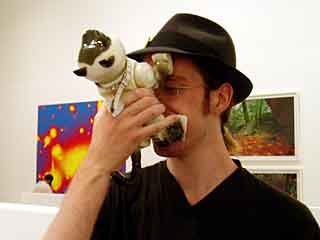
I had hopes that the cats were going to be of similar quality to the AIBO dogs from Sony that I'd seen a few years prior at Fox Studios in Sydney, but they appeared to be standard children's toys purchased at K-Mart. We attempted to get two cats to mate.

Oo-er.

Unfortunately, the cats "switch off" whenever their noses touch something, so their courtship was short-lived. I discovered that repeatedly stabbing at the button on the tip of the cats' noses causes them to meow in an increasingly angry fashion.

Behind the "Battery Cattery" (Jesus Christ) we found a series of fairly inane exhibits featuring telephones, which provided audio cues to the artwork. One of these exhibits, which appeared to be a piece of pipe plucked out of an air conditioner, featured a soundbyte of someone burping loudly. Genius.

In further extension of the household pets theme, we found a small cinema behind a wall at the back of the building. Six screens at odd angles had onto them projected footage that appeared to alternate between a camera strapped to a dog's head, and a car hurtling down a road in the snow. Once again, it's art. It's not supposed to make sense. Unless you're on drugs, or something. (Hey, it's Queensland!)

The rest of the gallery was fairly lacklustre. I'd like to know how one goes about getting the job of being one of the people who wanders about the museum shouting "DON'T TOUCH THAT" whenever someone gets closer than fifteen metres to a sculpture. The item in question was a massive chunk of welded metal that appeared to consist of former typewriter parts. It's welded. The best one could hope to do is to push it off its pedestal and perhaps break the floor.

Along one of the walls, in an innocuous looking darkened doorway, we found a small cinema, onto the wall of which was projected a film. At first, we had no clue what it was, apart from a small placard outside which read "One Minute Sculptures". I really have neither the want nor the need to further describe this phenomenon, as anything I add will only pale in comparison to Yahtzee's essay on the subject. Needless to say, our lives were enriched a millionfold, and will never be the same again.

Yahtzee attempts to fondle Erwin's bottom.

DAY TWO (Tuesday. Where did Monday go? No-one knows!)

I spent most of the morning in Surfers Paradise. There are a lot of reasons I dislike Surfers Paradise. One of them is grammatical. Y'see, it's missing a possessive apostrophe. It's something to do with naming conventions, in that suburb titles should not contain punctuation marks. Stupid naming conventions.

So. Surfer(')s Paradise. 9AM. Nothing is open. I guess the surfy culture doesn't wake up prior to midday.

Got back from the Gold Coast around lunch time. Went to collect Positronbob, with the plan being to go Christmas shopping at the Logan Hyperdome.

This evening we went bowling. Dan won the first round, I won the second. I can't remember who wound up with the scorecards, so you'll have to take my word for it. Truth be told, no one cares anyway. It's bowling. It's such an impractical sport to get good at. The only times I've ever bowled, the entire purpose of the game has been to see who can make the largest fool of themselves, and/or break a limb. DAY THREE (Wednesday.)

We basically started today with no clue whatsoever what we were doing. This is not at all unusual. I drove around most of the morning trying to figure out where Positronbob was, due to missing one pissy little side street and thusly becoming lost. This happens. Often.

I found him, eventually. Arranged to meet with Yahtzee in the city. Decided, in a rare moment of braveness, to actually drive into the city. The guy I was staying with suggested a spot for parking, and having glanced at a map I figured it was a fairly simple place to get to. So off we went. Found ample parking. Everything going well. This usually doesn't happen.

Met Yahtzee in the same location again, figuring that it worked quite well the previous time. Minced about looking confused and sounding unconversational. This is becoming a routine.

Everything's better with Wang.

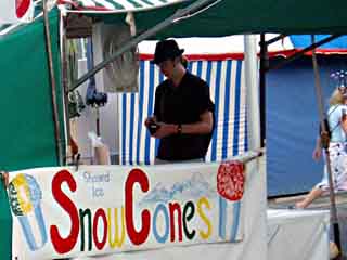
While snacking at one of the small cafes along the Energex Arbour, we also happened upon a freak occurance -- Santa Claus on his lunch break -- snacking merrily on a parcel of hot chips. It's nice to know it's Queensland fried foods that keep Jolly ol' St. Nick's arteries so joyously blocked.

Ho, ho, ho. Also, Lt. Uhura spots someone she knows.

And here's a brief summary of the rest of the evening, due to the fact that this all occured a month ago and I don't recall specifics:

Fireworks. Sat on grass. Watched someone in Brisbane desperately try to signal for Batman, but fail due to forgetting to put the bat-shaped mask over the spotlight. Nonetheless giving it a valiant effort with not one, but four spotlights waving about the sky. Presumably under the assumption that Batman, not seeing his signature bat-shaped-silhouette, may respond to a very adamant display of non-bat silhouettes. BATMAN. God damn you.

Wandered back to the car park under the impression that it closed about two hours prior, not overjoyed by the prospect of leaving my car buried beneath Brisbane until 6AM the following morning. Arrived at the vehicle to see this was indeed not so. Relieved.

Bid farewell to Yahtzee in a now predictably awkward fashion.

Returned to car again. Somehow managed to get out of extremely crowded car park without causing any personal harm or property damage. Took everyone home. Ran a red light. Scared the shit out of someone called Spock. All's well that ends well.

Back in the '90s: Kaleidoscope Schemes

This article is hideously backdated to reflect the time that it's content, the gallery below, was created. Sorry for the confusion. If you're curious, I'm writing this on June 9, 2013. This is about the oldest part of me that lives on the internet. Back in the late '90s, there was an interface enhancement for Macintosh computers called Kaleidoscope. It was essentially a version of the "themes" concept that Apple kind of introduced into their operating systems, but really didn't. You could download any number of new interface themes (or "schemes", as the creators called them) for your operating system. Some of them were pretty cool. I made a few of them. In hindsight, they don't seem to have strayed too far from the general appearance of the Mac OS (version 9, at the time). They looked like this:

All of these are still, inexplicably, available at the Kaleidoscope Scheme Archive. You can access my stuff directly here, though. If you're really excited by the potential of this awesome piece of 1990's tech, be sure to check out the "scheme spotlight" area, wherein the best of the best are framed and hung on the metaphorical wall.