I've recently started playing around with software emulation of old Mac operating systems. One of my first Macs was a Quadra knock-off* running System 7.5, so I was pretty happy to fire up Basilisk II and see what it could do.
While my primary objective was to play Prince of Persia and Indiana Jones and the Last Crusade, I ended up booting up Clarisworks 3.0 for a bit of nostalgic desktop publishing.
When I was 14, I took it upon myself to publish a magazine/newspaper thing. It was a financial disaster, and it certainly did my social life no favours, but hey. It was something to do. Most of it, such as it was, was made in Clarisworks. Yay, Clarisworks.
* When I say "Quadra knock-off", it was a Performa 580CD. It was a weird model that sat in-between the standard Quadras (the "real" Macs of the time) and the utterly bizarre Macintosh TV. The Macintosh TV was meant to be a kind of bridge between the personal computer and home entertainment, kind of like the AppleTV would eventually become, but it was a total failure. It was even designed with a black casing, to give the illusion that it's an appliance, and not a beige computer. The Performa 580CD had the same casing as the Macintosh TV, but in standard beige, and somewhat similar AV capabilities (no built-in TV tuner, just AV inputs). Unfortunately, it had sod all processing power and storage space, so it was pretty useless at anything involving AV. Its video input capabilities were limited to 320x240 pixel footage at a stonkingly low frame rate.
Much like a refrigerator that isn't set properly, this article will probably spoil things. If you don't like spoilers, don't read it. Simples.
Looper is a time travel story. I'm a sucker for time travel stories. I'm a sucker, especially, for original time travel stories. Looper, unfortunately, isn't really one of them.
Well, it is. And it isn't. It's original in that there's a high-concept, back-of-a-napkin, one-sentence elevator pitch storyline. It's not original in that the plot devices and events of the film are largely lifted from other sources. None of this is surprising when you discover the film was based on a story originally developed as a short, which was then greenlit as a feature film.
It's not, though, in the sense that most of the supporting plotline seems to have been borrowed from elsewhere. I don't have a problem with writers pilfering things from other writers. All of the best stories are built upon the stories that came before them. As a great many people have supposedly said, "Good artists borrow, great artists steal", and so be it.
Some specific parts of Looper that I felt were extremely reminiscent of other works:
man from future returns to kill child who will grow into future significant figure (The Terminator series, fitting as Garret Dillahunt from The Sarah Connor Chronicles appears as one of the Loopers)
time travel in weird, claustrophobic capsule (The Jacket)
Bruce Willis in peculiar time travel story (12 Monkeys)
character levitated by telekinesis, then exploded (one of the X-Men films, cannot recall which one)
There is one scene which is very original, quite gruesome, and ultimately completely illogical. In the scene, the future version of Seth, played by Paul Dano, who has traveled back in time to the present, attempts to reach his younger self, who is being tortured. As he approaches his junior, who is having parts of his body amputated, the elder Seth's limbs begin to disappear, leaving him a crippled, useless hulk at the door to the building. While the scene is effective and disturbing, it makes very little sense upon consideration. Each change to the younger character should affect the entire timeline of the older version. Old Seth may have lead a very similar life to this point without -- say -- a finger, but it's unlikely that he'd have survived for 30 years, travelled back in time, and made it to the door of the building without both legs, though.
All time travel movies have their paradoxes, though.
While it had a very slow and borderline b-grade start, Looper soon picked up pace and ended up a pretty cool movie. The makeup on Joseph Gordon-Levitt, applied to give him a more Bruce Willis-like appearance, was frankly disturbing, though.
I shall summarise: It's awesome.
This probably contains spoilers. If you're not into having things spoiled, then, uh, stop reading. Or don't. Your choice.
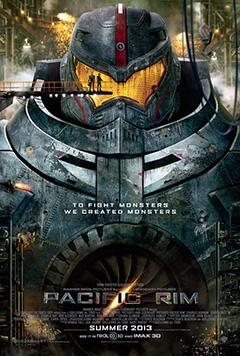
Pacific Rim is one of those films that takes an utterly ridiculous premise and puts all its chips in, producing something completely enjoyable. The premise, such as it is, is that there are a bunch of gigantic electric dinosaurs emerging from a hole at the bottom of the ocean, and man has built a bunch of enormous robots to fight them with. Because nothing else worked. Because there can't possibly be a simpler solution than gigantic super-complex machines that mimic the human form. It's a bit like The Core in this regard, in that it takes something ludicrous and plays it for all it's got.
I think the entire film can be summed up in one scene from the trailer: The giant robot walks calmly out of the ocean into the streets of Hong Kong, dragging behind it an ocean liner, whilst the enemy dinosaur grins at it from the far end of the street. After raising the ship like a baseball bat, the robot then swings the boat at the dinosaur's face -- all of this occurs to the film's theme music (all six notes of it), and they properly chose to play it, for the only time in the movie*, on guitar. Proper, old school, heavy-ass guitar. This is robot violence porn at its finest.
Everything about the film is massive, awesome and fun. It goes boom, and it goes boom a lot. There're explosions, missiles, electricity, dinosaurs, alien entrails and whacky scientists. The heroes are appropriately heroic, and the villains are massive and hideous.
I thoroughly enjoyed the film.
I feel bad, but I can't help it. It's expected of me. I have a couple of nitpicks. They're not big deals, though.
Hollywood is currently drowning in Australian actors. Everyone who's ever appeared in Home and Away or Neighbours seems to currently be starring in a superhero franchise (except Alf Stewart, who should be). Somehow, the creators of Pacific Rim couldn't find any actual Australians to play their Australian characters, so they settled for an American and an Englishman, both of which proceed with the most embarrassingly atrocious attempts at the Australian accent I've heard in a long while. There's also an "Australian" newsreader and interviewee, both of which sound terrible. Surely it wouldn't have been too hard to cast a couple of Australians as the Australians.
I also found the two whacky scientists were a bit too whacky for my liking. A good comedy duo has an idiot and a straight man, but these two were both the idiot. Sorry.
Also, the bends apparently don't occur in the future.
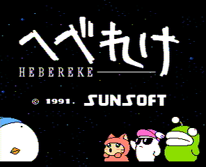
Ufouria (or Uâ¢fourâ¢ia, as the packaging insists it should be punctuated) is an acid trippy Japanese video game converted for English-speaking markets.
The original game, Hebereke (which means 'drunk' in Japanese) is virtually identical to Ufouria, with a few cosmetic changes and some alterations to the storyline as part of the translation. For now, we'll discuss the English version, and I'll show you a few of the changes in a little while.
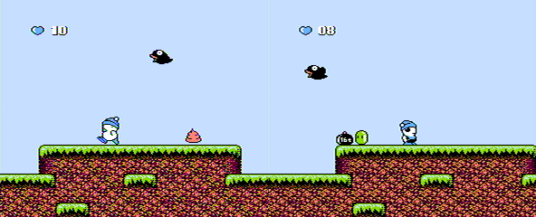
You begin the game as Bop Louie, a white snowman-like character with a blue beanie hat. He can walk, jump, and squash enemies if you hold the down button while he's above them. He can't swim, and falls over every three steps if he tries to walk on snow and ice. Over time, he develops a couple of additional bizarre abilities, including his secret power of launching his head on a spring towards enemies, and the skill of suction-cupping up vertical surfaces.
All of the characters are able to throw little face-ball things that appear on occasions when you squash an enemy. They can be used as projectiles against other enemies, and are often the only weapons that will have any effect on the bosses, when you encounter them.
Most of the game follows a Metroid-like approach, wherein you can't progress to another area of the expansive world map without completing the right task and collecting the right item, allowing you to progress. Often, the item you need to obtain is one of the other three characters:
Freeon Leeon is a tiny apricot coloured dinosaur that can walk on snow and ice, and can swim across the top of a body of water. His super power, once found, allows him to freeze enemies into little ice cubes that you can use as stepping stones. This comes in very handy in later levels.
Shades is a ghost with a purple wing cap that can leap long distances, and gains the bizarre ability to bash himself in the back of the head with a hammer, causing his eyeballs to chase enemies around the screen. (Seriously. I'm not making that up.)
Gil is a kind of lumbering salamander creature that can't walk very well and can't jump very high, but can sink into water, and swim, y'know, properly. Eventually, he can cough up bombs. Because bombs.
The enemies range from walking squirts of whipped cream, through birds that drop weights, strange little oriental creatures, wiggling green blobs, statues of frogs and strange grubs. There's not a lot of variety, but the general enemies don't really pose much of a threat, as the majority of the point of the game is problem solving.
The bosses are rather cool. The mid-bosses tend to be gigantic Homer Simpson creatures. Each one is more peculiar than the last, one with its head popping off mid-fight and flying around on a propellor, another in outer space, another underwater. A range of giant-sized cat bosses also exist, including one in a suit of armor, and a puzzler of a boss with a cat in a tube and a strange orbiting white orb. The remaining bosses are, of course, your friends. You must fight each one as you progress in order to knock some sense back into them, ultimately gaining them as playable characters after you've "won" the fight.
One of my favourite elements of the game is the animation. The overall quality of the graphics is so good, they could easily be from an early Super NES game. The only graphical glitch is a column of graphical blocks that flicker on the far leading side of the screen, depending on the direction you're heading, but they're easy to ignore, and not a fault unique to this game.
Speaking of faults, if I must name a few: The game is quite short, and it seems that certain gameplay elements have been tailored (poorly) to make it a bit longer. The characters don't move very quickly, meaning that you simply can't complete the game as quickly as you'd probably like. I feel the game could have benefited from a Super Mario Bros style "run" function when the B button is held down, but I understand that this mechanism would have probably wiped 20% off of the game's duration.
The music in Ufouria is astonishingly awesome, and is full of earworms that'll stick in your head for months. The main overworld theme and boss music are particularly great, but all of the atmospheric music is perfect and suits the game splendidly.
I mentioned earlier that the game was translated from a Japanese game, Hebereke. Here's what they changed:
Shades was known as Sukezaemon, but didn't undergo any changes in appearance. Gil didn't change looks either, but his name was originally........Jennifer.
The only remaining change, and undoubtedly the single most important, significant and life-altering:
I love Ufouria. Ufouria is awesome. It's not easy, but it's not hard. It's about an hour of play all told, so it's a manageable game to bust up any time you feel like completing something in its entirety.
This may contain spoilers. Your mileage may vary. You've been warned, I guess.
Don't get me wrong, I like Johnny Depp. Unfortunately for The Lone Ranger, there are times when he can ruin a movie. Mr. Depp has a well-known history of playing weird and whacky characters, from Edward Scissorhands to Willy Wonka to Jack Sparrow to the Mad Hatter. They're all much of a muchness, it's Johnny with a painted face and a twitchy personality. You could interchange them, and no one would notice. He's not a bad actor. He's a scene stealer.
In The Lone Ranger, Depp's Tonto thoroughly overshadows Armie Hammer's titular ranger -- admittedly by intention, as the story is based more around Tonto's history than Lone's -- unfortunately leaving the rest of the cast gasping for recognition. Among those you might not have noticed: Tom Wilkinson, William Fichtner and Helena Bonham Carter. A personal favourite underrated actor appears also, Leon Rippy as an ageing ranger.
I found the film enjoyable, but suffering from confusion as to what it intended to be. Parts of it are flat-out, blatant and hilarious slapstick. Some are built around fairly blunt insult humour. Certain scenes divulge into basic toilet humour. Others are thinly veiled commentary on racism and the treatment of the Native American people. Surrounding all of this is a simple story rooted in some pretty serious drama.
It's difficult to take a character like Tonto seriously when his dialogue switches from lighthearted conversations about the stupidity of a horse to lines like "Blood has been spilled, and the rivers will run red", all the while as he attempts to feed a dead bird some corn. This wouldn't be so bad, were it not for the scenes that set up his character's behaviour coming at least half way into the epic 149 minute running time.
There're also a few dischordant moments where an idea is set up to be quite sacred or respected, only to have the piss pulled out of it a few scenes later, usually by Depp's peculiar character. While it's hard to call any action "breaking character" for someone who's clearly not the full quid to begin with, it's a little awkward as a viewer to be fed what seems to be a subtle moral concept, then have it jerked away disrespectfully.
The Lone Ranger is enjoyable, chaotic, action-packed and a bit disjointed. It could certainly have been worse, and I don't feel like I wasted either my time or money by watching it.
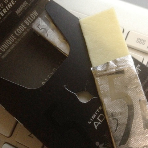
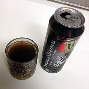
Here's a follow-up to my previous article about V Graphite, the tie-in with the The Wolverine film, which is due to be released within a week or so.
I realise this isn't a beverage. I'm sorry. You'll survive. Deep breaths.
So many incomprehensible thoughts come to mind when one is presented with a chewing gum named after a superhero's fingernails.
This is Wrigley's 5 gum in Adamantium flavour with the byline "A rush of citrus".
I've often wondered if the creators of 5 gum took their marketing strategy from Lynx/Axe deodorant, in that they've branded the product with a slick, mostly black design and chosen totally non-descriptive flavour names. I realise trends are made to be bucked, but there's something to be said for giving your customers some idea of what they're paying for. (Particularly as neither the gum nor the deodorant are cheap products.)
The package design is cool, but it's got a head start considering the established design is already really neat. This one is silver.
The gum itself is wrapped in silver foil embossed with the 5 logo. The gum itself is yellowish beige.
When 5 was originally released back in 2009, Wrigley took the unique (and admittedly quite gimmicky) stance of leaving the flavours a total mystery. Nothing was printed on the wrapping, and the names of each flavour were deliberately cryptic. Unfortunately (or perhaps fortunately), the flavours are now printed on the outer plastic wrap. This one is "A rush of citrus", the "rush" being the addition of pear. I had no idea pear was considered a speedy fruit.
Based on a five minute perusal of the Wikipedia page for 5 gum, it strikes me that 5 Adamantium is quite likely a rebranding of 5 Evolution, a citrus and pear flavoured variation released in Europe, but not Australia.
It tastes like a fruity chewing gum. Nothing amazing to report. It doesn't taste like Hugh Jackman (unless Mr. Jackman has a flavour akin to artificial lemon sorbet with a pear in it).
The flavour lasts a remarkable length of time, but I believe that's a staple of all of the 5 gum range.
What can I say, it's alright. It's not remarkable. It's....alright.
Other things I've learned today: I had no idea that Schmackos are made by the same company that makes Mars Bars. (And 5 gum.) Something new. Every day.
This is another energy drink review that I need to apologise for. Much like my review of Pimp Juice, this one is going to suffer from the fact that I didn't actually write anything down when I drank the damn thing several years ago. I took photos, though. That's something.
Pulse Live is as obscure as hell. I can't find much about it through googling, largely because it's completely obscured by Pulse, the more famous energy drink with vodka added. This drink doesn't seem to be affiliated with Pulse.
The bottle looks awesome. The label is transparent, and the artwork is really quite cool. It's a long-necked bottle unlike most bottles you find, so it stands out.
The drink itself is totally colourless. Not even a hint of yellow. (Although having said that, with age, it's turned slightly beige. I won't be drinking the out-of-date bottle any time soon.)
It smells and tastes exactly like lemonade.
That's about all I have to say about that.
Also, this is the last one of these stupid "I took photos five years ago, so now I'll write a review" reviews. I promise.
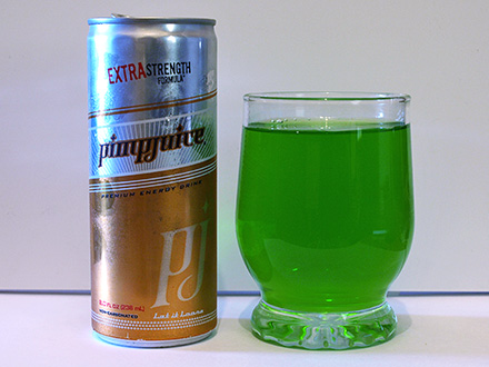
This is awkward not only because this drink is endorsed by Nelly, and is called "Pimp Juice". It'll also be awkward because I drank the damn thing four years ago. I was thoughtful enough to take photos, but evidently not thoughtful enough to make notes. You'd think I'd have known better.
Regardless, I shall press on.
While searching for any residue of a review I may have written when I sipped the stuff, the only text I can find on my computer relating to Pimpjuice is part of an IRC chat transcript from 2008:
Datazoid: I bought another three energy drinks whilst in Adelaide.
Datazoid: I shall add them to the pile of thirty or so I've yet to sample.
Datazoid: Most of which are rapidly exceeding their use-by dates.
Chubbs: Datazoid: will it make any difference
GremZzz: It might even improve them.
GremZzz: The sugar content will ferment and you'll get wasted.
Datazoid obtained "Hiro Vitality", which contains essence of brocolli, alfalfa and celery.
Datazoid: It's bound to taste of ass.
Datazoid: I also located Pimpjuice.
Datazoid: I had to ask for it by name over a counter.
Datazoid: "Please can I have some, uh, pimpjuice please."
Apart from that, here's what I can tell you: It's green. The can art is quite nice, if you're in to bling and all that.
The Pimp Juice website is horrible. It makes noises when you point to the menu items. It contains way too much Nelly. I have learned that the drink is apparently still being made, and now comes in a purple colour.
The green one was supposedly berry flavoured, but I have some memory of it tasting largely like water and vitamin B, with some sugary horridness overtop.
I believe this drink's sole redeeming factor is that it's GREEN.
I still have a full can of this stuff in storage, but as it's at least four years old there is no way known I intend to drink it. I'll leave that job to someone else.
Update, July 12, 2013: I'm getting loads of hits on this article (by loads I mean literally tens), so I'm going to put the killer question up front for those who're asking:
What does V Graphite taste like? It tastes like spectacularly artificial chocolate.
Now, back to the original article:
This energy drink is a tie-in with The Wolverine, which opens in July, 2013. I found a review on Lifehacker which claims the drink has a similar flavour to Mother, which I'm afraid has tainted my opinion of the drink before I've even tried it. I'm pleased to report, though, that I don't agree with this assessment.
The Lifehacker comments address an obvious question: Why "Graphite" and not "Adamantium" if this is a tie-in with The Wolverine? Logical answers are provided: Graphite was an existing flavour in New Zealand, newly introduced to Australia. Also, 5 gum has already staked claim to an adamantium flavour.
The can art is cool, but nothing outrageous. Wolverine appears in black and white. The "V" logo floats over a red patch. I guess they would have had to tread carefully, and would not have been able to include the usual torn slashes from Wolverine's claws, as they'd look a lot like to logo for Monster Energy.
The bizarre ingredient in this drink is and extract from the maca root (lepidium meyenii), which you can read about in tedious detail on Wikipedia. Among its more outrageous claims to fame, maca has been known to create and/or worsen goiters (don't click on that if you're eating), and to act as male aphrodisiac. I've seen female aphrodisiacs in energy drinks (Naughty Girl), and a generic aphrodisiac in Red Eye Passion (not yet reviewed, but it tastes like champagne).
The drink is brown. It's not as dark as cola, and it's a warmer brown than you'd expect. It's kind of like tea. It's well carbonated.
It tastes like chocolate. At least, it tastes like chocolate in the sense that the Lynx/Axe Dark Temptation body spray smells like chocolate. It's a totally artificial-tasting flavour. It's fifty percent really cheap chocolate (the powdery white kind), and fifty percent as though someone was given the job of simulating the flavour of chocolate from a barrage of completely unrelated chemicals. All told, though, it's quite palatable. Unlike V Black, which is supposed to be coffee-based but tastes largely like arse, V Graphite seems to be a fairly pleasant drink.
Oh, and it's had no effect on my libido thus far. Sorry.
A long time ago, when I was more enthusiastically reviewing my ridiculous collection of energy drinks, I received an e-mail from someone, asking something along the following lines:
"Why do you drink and review energy drinks when you think they all taste like crap?"
Allow me to address this.
I don't think they all taste like crap. I think most of them taste like crap.
Energy drinks, by their nature, have a great tendency to taste terrible. This is because the key ingredients that give energy drinks their energiness taste, with few exceptions, like shit.
Caffeine is a very bitter tasting chemical. That's why most caffeinated beverages are extremely sweet (such as energy drinks), or have their own bitter flavour to mask the caffeine (like coffee or tea).
B-group vitamins, a group that includes our friends thiamine, riboflavin, niacin, pantothenic acid, folic acid and B12 (among several others) taste horrible. Have you ever been curious enough to chew on a Berocca tablet? That's b-group vitamins. They are not tasty.
Taurine is made from bile. Sorry to spoil that one for you, but it's true. It's mostly synthetic these days, but still. If someone tells you "that's not real vomit, it's synthetic vomit", I don't think you'll be okay with it going into your dinner. Needless to say taurine has a hideously unpleasant flavour, and contributes big time to the unique and apparently desirable flavour of Red Bull.
The trick for manufacturers of energy drinks is to create a flavour that either masks or compliments these unpleasant flavours. Most energy drinks take the "overpower it with something sweet and fruity" approach. Some take the "embrace the flavour, enhance it, make it salty and sweet" approach, like Red Bull. Others take a completely different tack, and throw in peculiar Amazonian berries and things you can't pronounce in the hopes of creating a unique flavour they can call their own. Sometimes this works. Most times it doesn't.
Limitations bear creativity. Without a box to think outside of, and envelopes to push, new flavours and concepts can't be created. The fact that energy drinks are made to suffer is what makes them fascinating to me. Sometimes I come across a good one.
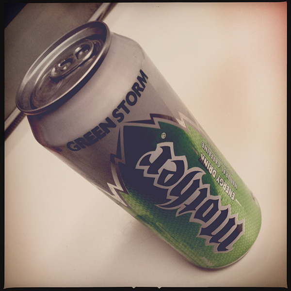
Mother "Green Storm" is a bit like recycled photocopier paper. You can't tell recycled paper is any different to regular photocopier paper unless you read the package first. Similarly, you can't tell that Mother "Green Storm" is made with natural caffeine unless you read the can. And even then, it makes no difference.
Apparently natural caffeine is better for you than the synthetic stuff. Both will make you alert, but the absorption rate and side effects tend to differ. Supposedly, according to some sources that I don't care to link to, natural caffeine tends to have a gentler spike-and-crash rate. Who knows --
It tastes like regular Mother. If you're a fan of that, then you'll probably like this. If -- like me -- you're not a fan of the acrid taste of standard Mother, then you'll probably think it tastes like piss and vinegar with most of the vinegar removed.
The can also claims "high caffeine content", which is peculiar, as it actually has 0.4 milligrams less per 100ml than pretty much any other energy drink that's available. While it's not unusual for these drinks to claim a higher energy content than their competitors, which can be justified by higher sugar levels, claiming high caffeine content when it's...not, is just peculiar.
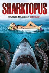
This is going to be a remarkably brief review, but I'm still going to do my best to convey exactly how bad this film is. It's presented by its producer, Roger Corman -- famous for some semi-bad things like Death Race and the 1960s version of Little Shop of Horrors, and a film I've mocked previously, Time Under Fire.
Sharktopus has a fairly loose storyline, governed largely by the instruction to show, as often as possible, a literally unbelievable creature eating as many people as possible.
Eric Roberts (older brother of Julia) "stars" as Sands, the father of Nicole, reluctant creator of the Sharktopus. The creature is a military creation, intended as a tracking device, or at least that's the best I can figure from the film's limited exposition. It's given the code name "S11", by which it's constantly referred to, probably due to the realization that "Sharktopus" is the stupidest word ever coined.
Toss into the mix a Lara Croft knock-off news reporter and her stereotypical Mexican camera man (complete with inconsistent Sharpie tattoos that change from scene to scene), and a few scattered bit parts by terrible actors, and you have the closest thing to a story that Sharktopus has to offer.
I'm going to bullet-point some of the highlights, in no order in particular:
The majority of the film's intro and establishing shots appear to have been lifted from the holiday home videos of the crew. Every single one features dodgy hand-held camera shake, and several shots dim and brighten under auto exposure. Nice!
The bulk of the "actors" were clearly hired for their physique, and not their acting talents. With a couple of notable exceptions --
The bikini-clad young lady with the metal detector who gets dragged down the beach by the Sharktopus may possibly not have been born a woman.
Roger Corman's daughter makes an appearance as a bungee-jumper. It's worth noting that she was probably not hired for her looks, and definitely was not hired for her acting talents.
Some of the Shaktopus visual effects are decent, if let down by the ridiculous design of the (ridiculous) creature. Other shots, though, look like they've been rendered out on a Nintendo 64.
Eric Roberts (Julia's older brother) spends most of the film getting progressively drunk as a means of dealing with the ludicrous situation. I suspect that this may not be acting, and I can imagine Mr. Roberts probably had similar feelings about the ludicrous film he was making. I do hope he was paid well.
Kerem Bursin spends most of the film confused as to why his shirt keeps disappearing and reappearing, as continuity had clearly taken the day off while his scenes on the boat were filmed.
The spectators at the inexplicable dance scenario toward the end of the film are apparently totally blind to the shark/octopus hybrid that climbs atop the pavillion until it begins to eat people.
Almost all of the Jaws-style scenes in which a random beachgoer is killed by the monster are completely disjointed, and really serve no purpose to the storyline (although I'm willing to accept that they are the storyline).
All in all, I don't feel my time was wasted watching it, as it was entertaining for all the wrong reasons, but I'm afraid I can't, in good conscience, recommend it to anyone, as quite frankly it's a stinking pile of bilge, and shouldn't be cast onto the retinas of a human being under any circumstances. That said, I'm sat prepared to watch another Roger Corman entry tonight: Camel Spiders. I can only imagine it'll be awesome.
I like Lego. Lego is awesome. I also like that Lego, the company, has made a moral decision not to create military-based playsets. This decision has left the market open for Lego’s opposition to fill the void, which has lead to such things as Mega Bloks’ Halo playsets, Kre-o’s Transformers and Star Trek licenses, and Brickarms, a company dedicated to making authentic Lego-sized weapons for your minifigs.
A company I’ve never heard of, Best-Lock, has now produced a small series of military sets based on the Terminator franchise (possibly as a result of the franchise’s ownership being in a state of phenomenal flux as we speak). They’re not the greatest quality, but you can’t get any other Lego clone products with the Terminator name on the box, so let’s give them a chance.
Before I tear them apart, I’m going to be kind and point out that they were very cheap. I paid no more than three dollars for each set. Admittedly, this was from The Reject Shop, where all good products go to die, but I can’t imagine the retail price for them was significantly higher. Even at double the price, they’re dirt cheap for the quantity of Lego-compatible pieces they contain.
The box is unassuming. I picked up two models, the Hunter Killer, and the Hunter Killer aerial. The company’s logo is quite disappointing. The choice of Arial Rounded as a font is questionable at best. The design of the package, in general, is chaotic and uncoordinated. It’s also not particularly colourful, which while appropriate for the franchise, is questionable for a toy package design.
Click "read more" to....read more!
The box for the Hunter Killer (the non-aerial variant) features a couple of artificial red laser beams.
Inside the boxes, the pieces are packaged in plastic bags with some stickers on a sheet. The instructions are loose inside the box.
All of the pieces in the set are cast in the same colour, a kind of gun-metal grey.
The instructions are easy to follow, but are far from the quality standard of Lego instructions.
The pieces are interesting. They’re similar to Lego. Most of the pieces serve the same function as a comparable Lego piece. Many of them have slightly differing engineering, such as the round plate pieces, which have additional reinforcements on the underside. The small 90-degree fold pieces with two studs on each side seem unique to Best-Lock.
If nothing else, Lego’s competitors often stand a chance of producing a random significant piece that serves a purpose no official Lego piece was created for. The odds of this are decreasing daily, as Lego makes more and more unique pieces, particularly for its licensed sets (Lord of the Rings, The Lone Ranger, Teenage Mutant Ninja Turtles, etc, and -- of course -- Star Wars).
Here are some of the unique pieces you won’t find in Lego -- the gun turret comes in three parts, a tripod, the gun itself, and a small ammunition belt that clips on in a similar style to a minifig’s gripping hand. The round piece with the flared bottom connects to a piece with an upright, making a large, spinning turntable piece.
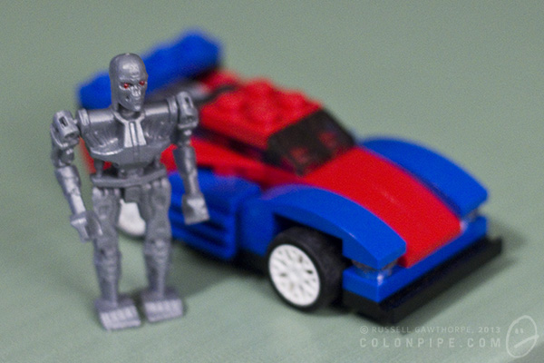
The Terminator figure is quite detailed. It’s also quite fragile. The arms are articulated at the shoulders and forearms, the legs only at the hip. The head rotates. The hands don’t grip anything particularly well, and placing the awkwardly shaped minigun into its pincers is more of a balancing act than a satisfying job.
Here’s a size and quality comparison of the Terminator figure alongside a genuine Lego Creator set. While the creator set was never intended to be the correct scale for a minifig, you can still get a reasonable idea of the size of the scrawny Terminator in comparison to Lego pieces.
This is the completed model of the Hunter Killer aerial, with the terminator swinging his minigun alongside. The pieces have a mottled sheen to them, as evident on the sloped pieces that make up the HK’s front end.
You can see here that some of the pieces connect together quite poorly. Some of them simply don’t like each other, while some of them have obvious flashing problems from the way they’ve been moulded. You can see numerous moulding problems in this photo.
This is the other Hunter Killer. The non-aerial one. If nothing else, the track system is very cool. It looks good, and within reason, it works as you push the thing along the table. The dog-leg in the tracks at the bottom, where it tucks up between the main wheels, is a bit of a design flaw. The piece holding the track up is simply a small cylinder with a cap on it, and it has a tendency to fly off when the track moves, or simply fall off periodically from the tension of the rubber track. The little cones that make up the turrets on either side of the machine don’t seem to click in particularly well, and fall off often, also.
The kits come with stickers to add panel detail and markings to the vehicles, but I haven’t added them as I’ll probably be taking the units apart again when I run out of shelf space. I’m quite confident that the stickers are actually intended to be structural, and will stop a lot of the connection problems with the main components of the vehicle bodies. I’m fairly sure Lego’s official sets do not employ load-bearing stickers as part of their design.
Final verdict for the Terminator Best-Lock construction kits: They were very cheap, the quality is no better than “okay”, and they’re a piece of licensed Terminator merchandise. I don’t feel that I’ve wasted my money.
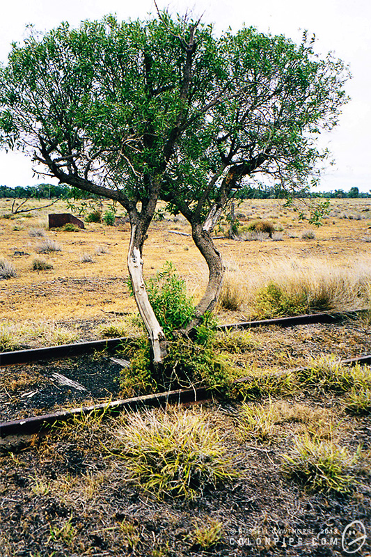
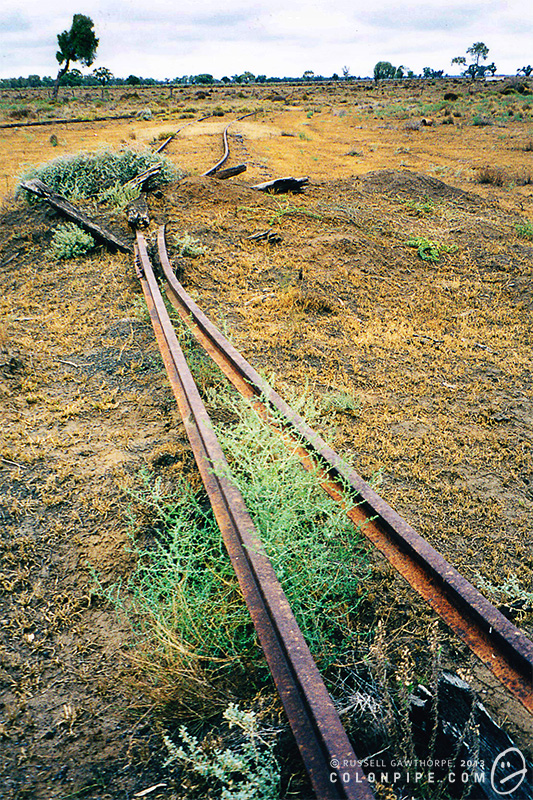
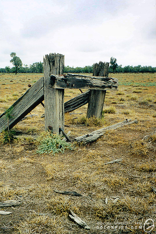
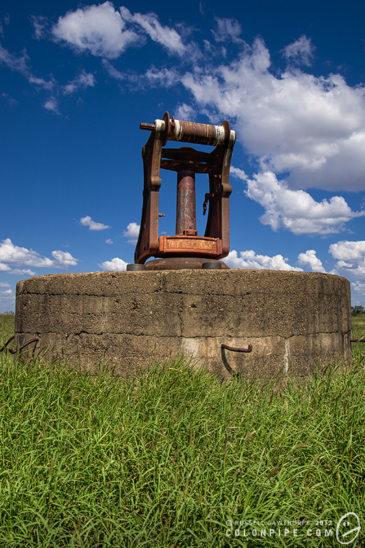
These are the last photos I took on film, with a craptacular Kodak camera. The old Pokataroo Branch of the north western railway in New South Wales terminated about five kilometres from where I used to live.
The old railway station was opened in 1906 as Collarendabri, before being renamed to Collarendebri East, then finally Pokataroo in 1919. The line leading to Pokataroo station closed in 1974, after flood damage.
At the time these were taken, which I believe was 1998, the terminus was still visible. The buffer stop at the end of the line was still standing, the rural station platform rotted and leaning to one side. At the far end of the platform, the base of an old crane.
If you like, click "read more" for a couple of newer photos of the railroad remants around Pokataroo, including the crane base and the old rail bridge.
If you're into this kind of thing, you can find some information about the Pokataroo Branch on NSWrail.net. There're some cool photos if you click on the "photographs" tab, including some of the platform, and one from the '70s of the station building when it was still in-tact.
Once upon a time, colonpipe.com was home to a craptacular generator of random jelly beans. It was crudely based on the idea from the Harry Potter books and films, wherein the heroes experience a brand of magical jelly bean that features every flavour known to man.
If you click the link below, you'll generate a random bean. Hit the button at the bottom to pick another one. Go on, you know you want to.
More music, because I do that kind of thing. Fake guitar with some (fake) piano and (obviously fake) wailing synth and what-have-you. It's almost coherent. Almost.
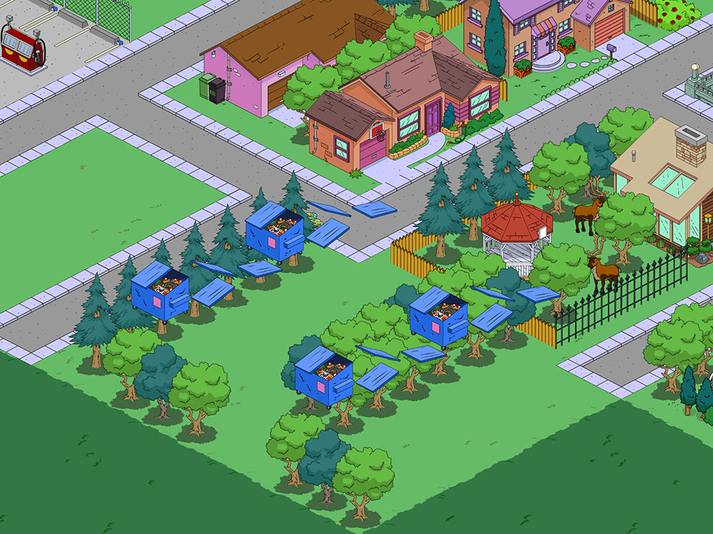
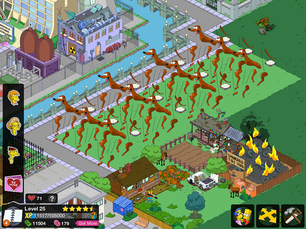
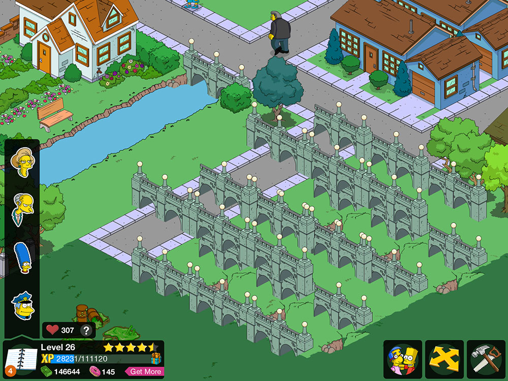
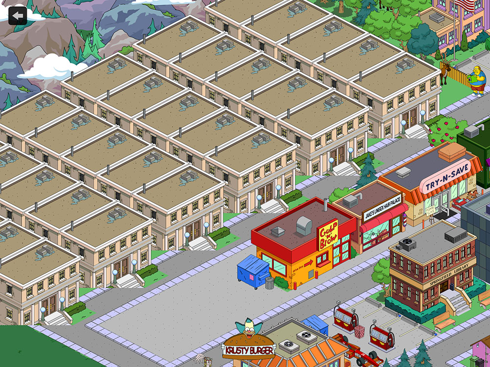
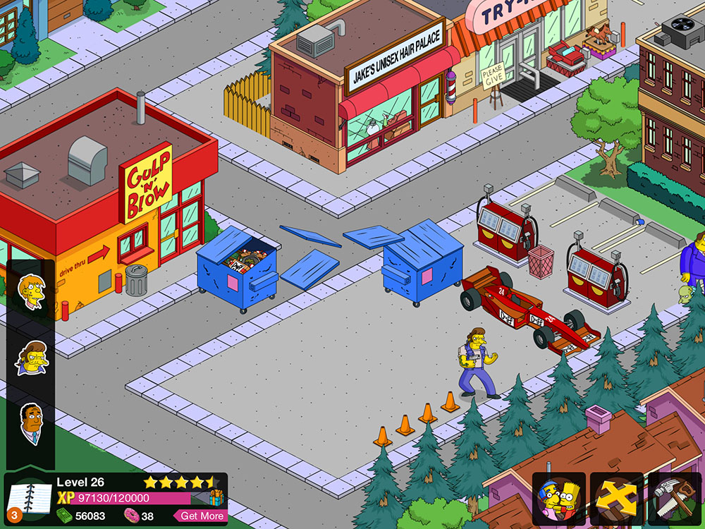
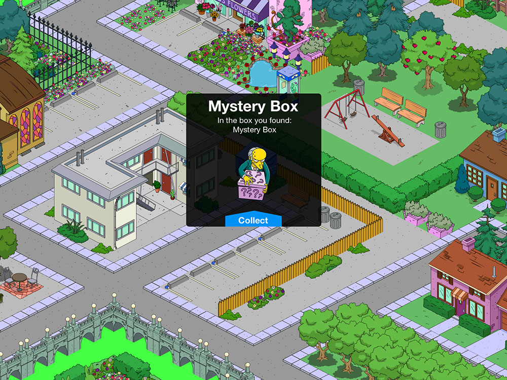
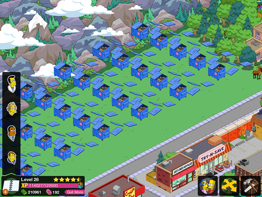
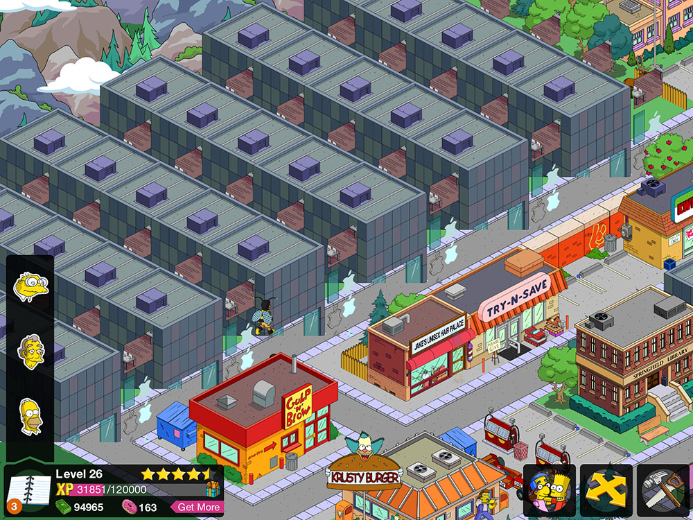
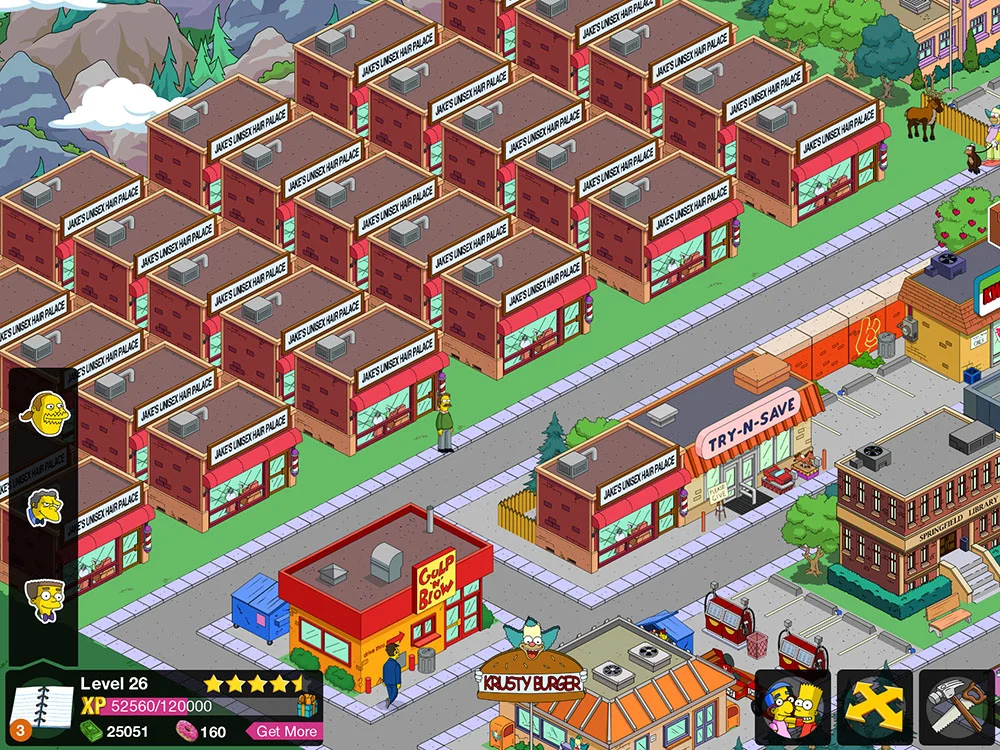
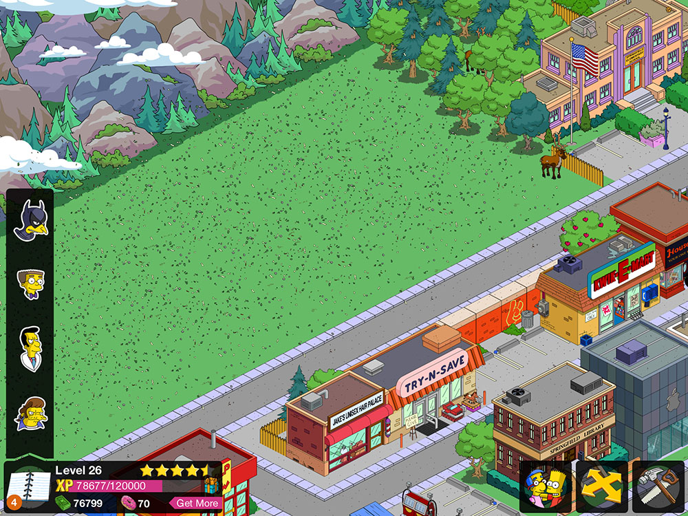
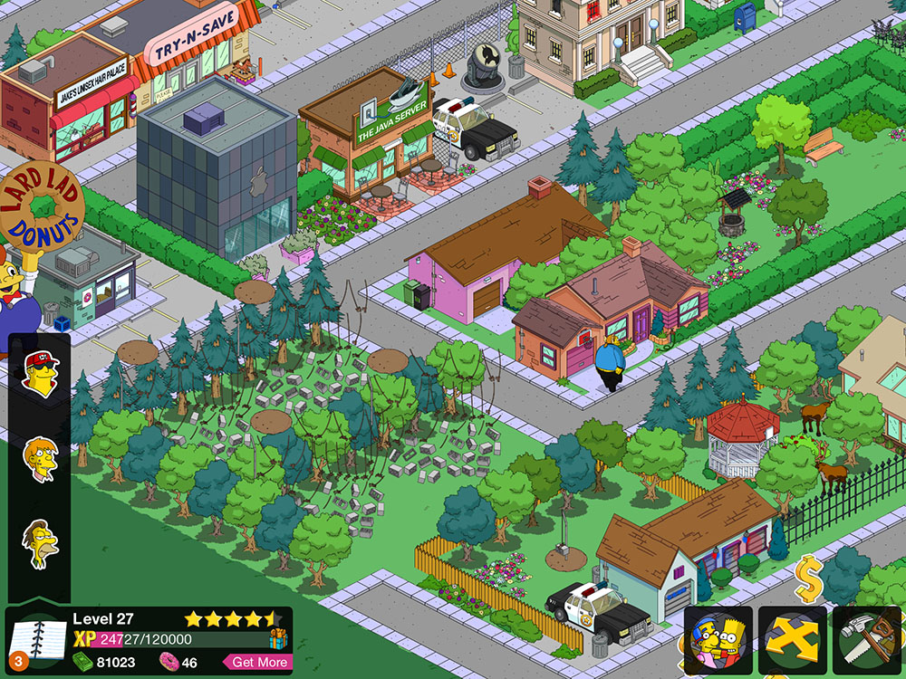
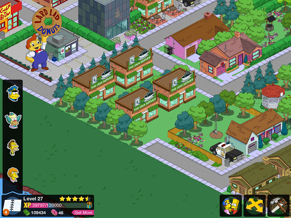
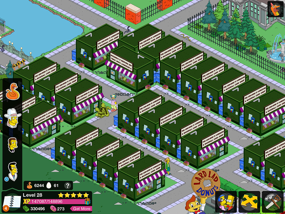
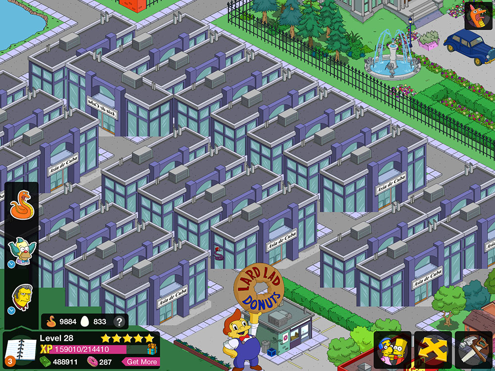
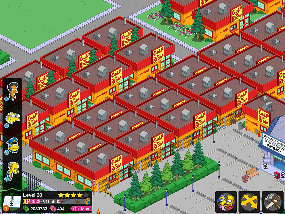
Hi! If you've come here looking for a resolution to a glitch or problem in The Simpsons: Tapped Out, I'm afraid I probably can't help you. I suggest you visit the splendiferous TSTO Topix and search there for your answer.
I've been playing The Simpsons: Tapped Out on the iPad for some time, now. I rather like it. It's consuming huge amounts of my time and money.
Occasionally, there's an odd glitch where a chunk of the graphics get swapped out for something completely different. I've been recording these glitches, and I present them below for your fun and enjoyment.
Click the link below to see the rest. There's quite a few. Sorry. (Or not.)
Thanks for your time. I'm going to go do something more constructive, now. You probably should, too.
There are a squillion possible things you can name a car. Generally, you take something that sounds vaguely foreign, and slap an "a" on the end. Cecil at The Straight Dope did a column a while ago (and by 'a while', I mean 'when I was one year old') on the subject.
I do not understand the marketing logic behind the decision, then, to bring out a new vehicle with the same name as an older one. This is particularly puzzling when the new vehicle shares zero design lineage with the old one. It's not a two-thousand-and-whatever model of the same car, it's a whole 'nother car entirely.
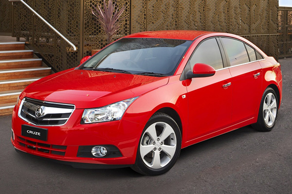
Case in point, the Holden Cruze. Holden is an Australian car manfacturer. Half of the Australian population support them. The other half support Ford. I'll get to them in a moment.
This is a Holden Cruze from 2002. It's a kind of beach buggy thing. It's pretty hideous. The rear of the thing has ghastly round tail lights. It's about as intimidating as a boiled potato. You might sometimes see re-branded Cruze(s) getting around as Suzuki Ignis(es).
This is the Holden Cruze from 2009. It's an economical small car that boasts the looks and spaciousness of a larger car. It's actually kinda sexy, all things considered. It's a completely different vehicle, targeted at a completely different audience in a completely different market sector, and for a completely different purpose. It's clear that someone just kinda thought "Cruze" was a cool name, and it's a shame it was wasted on that Tupperware container on wheels they made in 2002 -- but wait, maybe no-one will remember that piece of junk. Yeah, lets use the name again.
The '09-onwards Cruze is also marketed as the Daewoo Lacetti, in a badge-and-name-change that gives it that ring of class it was initially lacking. The only thing cool about the Daewoo Lacetti is its occasional appearance on Top Gear as the "reasonably priced car", but unfortunately for the '09 Cruze/Lacetti, the car featured on Top Gear is an earlier model that bears no resemblance to the vehicle pictured above. It was also retired from the show and replaced by a Kia. That's just..........rude.
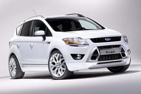
This is the 2013 Ford Kuga. It's a cool looking car. Mechanically, it's a four-wheel-drive (ish) thing constructed over the chassis of a Ford Focus. It's marketed in Australia as the smaller brother of the Ford Territory, and aimed at the 'soccer mom' demographic (ironic, perhaps, for the purposes of this article that it circles back around to the market sector the original Holden Cruze was potentially aimed toward).
This is great, except: In the non-rhotic Australian accent, "Kuga" is a homonym with --
-- the Ford Cougar. This horrid thing is a mid-life-crisis-on-wheels from the late '90s to early '00s that was marketed in Australia in thankfully limited numbers.
I do not understand why the choice would not be made to use a more unique name for a car model. There are now undoubtedly loads of Ford Kuga drivers who, upon announcing the name of their new ride, are greeted with the looks of stunned incredulity well due to someone who's just announced they've bought a curved-up ludicrous looking skateboard with two doors and a hernia, until they realise the error of their pronunciation and start inflecting the "ah" in "Kug-aaaahh" like Hermione Grainger.
As an aside, Wikipedia has informed me that "kuga" is the Serb-Croatian word for "plague", and that Ford didn't opt to alter the name for its launch in those countries. Dunno about you, but I want to move to Zagreb and buy a black one.
Synesthesia is a neurological condition wherein one associates abstract, intangible things such as numbers, letters, words, musical notes or chords with sensory information usually associated with something physical, like colours, tastes or physical sensations.
The most common form of synesthesia is grapheme-colour synesthesia. In this condition, one associates numbers, letters or words with colours. I have this condition. I've always had it. I assumed it was normal. I thought everyone saw colours when they thought of numbers, letters and words.
Wikipedia's page on synesthesia is fairly in-depth. There's also a website called the Synesthesia Battery which has an online test you can take to determine if you're synesthetic or not. (I took the test, and its results weren't as conclusive as I'd hoped for my own experiences. I feel that the test relies more on the user being able to repeatedly recognise fairly similar colours with very little margin for error than actually acknowledging when two quite similar colours are selected. I'm sorry, my brain doesn't function in HSV values.)
Whack the link below to keep reading, if you're into numbers and colours, and the unnatural marriage thereof.
Brady Haran's Numberphile, one of my favourite YouTube channels, recently posted a follow-up to their previous video on the subject of synesthesia. I've embedded both episodes below for your perusal:
And the follow-up:
I notice that these videos tend to avoid the subject of grapheme-colour synesthesia for letters and words, but I suspect there's a conscious decision at play considering the YouTube channel hosting them is dedicated largely to numbers.
I've included my own synesthesia alphabet above, for fun. It seems to me that my perception of grapheme-colour tends to be related largely to the geometric shape of the characters, with the following specifics:
sharp angles seem to tend towards green and olive
right angles lean towards brown, with "F" and "T" being very specifically brown. "L" strikes me as green, though
Rounded shapes tend to take on a yellow hue
"A", as recounted by many synesthetes, is almost always represented as red
The three middle vowels are very neutral
My perception of numbers is more interesting:
There's less consistency, here. But, surprisingly, there's actually some logic, and much like Alex in the Numberphile videos, it seems to be largely factorial.
One and zero are neutral, much like the vowels in the alphabet
I have a suspicion that four is red largely because of its resemblance in form to the letter "A". If this is the case, my own mental association made this connection many years before Leetspeak was ever a thing
A similar thing no doubt applies to five and its resemblance to "S"
The factorial nonsense comes into play when you organise the numbers:
Two, four and eight are warm coloured numbers.
Three, six and nine are cool.
I've found limited practical applications for my "abilities". One of the few is that in data entry work, I find that I can error-check data fairly efficiently by relying on the colours associated with figures. If a figure is supposed to be the same in two different locations, it's plainly obvious to me if it's not the right "colour".
Larger numbers are generally a gestalt of the colours represented by the figures that comprise them, with the hues blending across the figure. Some specific really big numbers have weird habits: One million (1,000,000) appears blue, presumably due to the connection with the letter "M", and one billion (1,000,000,000) appears green, again because of the letter "B".
Musical notes and chords also have coloured connections for me, again largely governed by the letters that associate with them.
When notes become flat or sharp, they change their appearance slightly. Flat notes (or chords) become darker. E flat actually becomes darker than its default state, black, but I can't represent this in a picture because there's nothing darker than black! Sharp notes and chords take on a desaturated look, with an ethereal kind of rusted vomit colour that I've been unable to represent graphically. (Come to think of it, I'm appalled by my description of it, too. Rusted vomit? Nice.)
Minor chords reflect a paler, ice-cream texture. Other chord types, 7ths, augmented chords, diminished chords, etc, have their own peculiar qualities.
I find it exciting to think about the possibility that synesthesia may be the only quantifiable example of qualia at work. Qualia is a collective term for all the little things that happen inside your mind, that you can't directly share with another person. For example:
The age-old psychological litmus test: Do you see colours the same way I do? Is my red your blue? Does it matter?
What does a strawberry taste like to you?
What does a noise sound like to you?
Sensory information is fickle, and the idea that we all sense things the same way is largely untestable. The most frustrating (or perhaps relieving) thing about this problem is that it makes no difference in the end. If I see a stop sign as what I call "red", and you see it as what I call "blue" (but what you call "red"), it makes no difference, because we both call it "red" and stop at it.
Synesthetic responses could be the missing link for qualia. Many synesthetes report similar associations between colours and characters. Brady's second video (embedded above) includes a chart of reported synesthetic connections from his readers. It may be possible that this kind of information proves the existance, and uniqueness of qualia.
Oh, and Porcupine Tree have an awesome song from their 1992 album Up The Downstair entitled Synesthesia. You should go buy it from Burning Shed.
Hello! Please find below another sample of new scientists. These guys will be included in Heroes of Science Volume III, should I ever get around to finishing it.