I, uh, don't have a model railroad. But that didn't stop me from undertaking a weekend project to make a tiny railway station. I've made them in 3D before, but the real world is another story.

The various bits are cut from thick card, the kind that photographic prints are delivered with, to keep them from bending in the post.

Hit the "Read More" linky-dinky to, uh, read more. There're a heap more pictures.
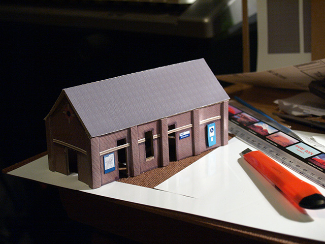
 Here's the superstructure of the building. The corners are reinforced with extra card to give them the illusion of columns of brickwork, to match the brick columns along each side. It was sheer luck that the card was the right thickness to look like added brickwork.

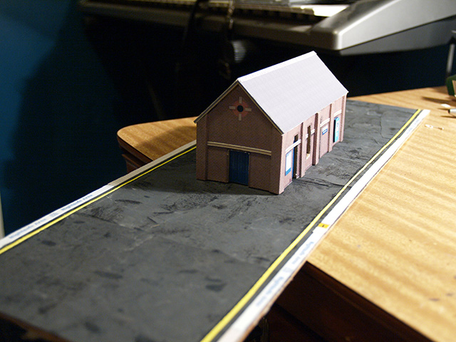
I cheated with the exterior. The brick pattern is "texture mapped" by creating a brick pattern in Photoshop to the correct scale (HO, in this case, which is around 88:1). The folds are all scored so the thick photo paper bends nicely.
 All "textured". The pale blue wheelchair ramp box is popped out on a piece of card to give it depth. I built some fake shadows and staining into the texture map to give it some age and interest around the brick columns, doorways and windows. The network map and station signage is all to scale.
 The platform is not exactly long enough to be true to scale, but as I don't have a model railroad to put it in, that's kind of a moot point. The surface of the platform was a fluke -- it's very fine grit wet-and-dry sandpaper which was used to sand some items that had been painted in black paint. The glossy black paint had worn into the paper, making darker, shiny patches. It looks exactly like a gravel-on-tar surface that's been in the hot sun, allowing the shiny black tar to seep through the gravel. If I was to ever make platforms for a model railroad, I'd deliberately use this approach.
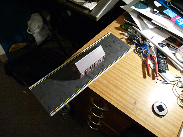 "Aerial" view, showing how remarkably decent the accidental platform surface turned out. The yellow lines are just strips of yellow paper cut very fine. The platform trim is white fine-grit sandpaper (no tricks, straight out of the packet) to give the illusion of texture, and the markings along the platform edge are made to scale in Photoshop and printed on photo paper. If I was to do this seriously, I'd have used matte photo paper for the things that really shouldn't be shiny.

Daylight! The station is sitting on the roof of my car. The porch is made from matchsticks for support and some more of the same card I built the structure from. It's not beautiful, but it gets the job done. The lights are bits of bent wire with tiny blocks of card on the ends, painted silver. They don't light up, obviously.
 More detail from the platform edge. A lesson learned from this is that it'd probably be best, if I made another, to "inlay" the paper layers, rather than just gluing them on top of each other. It'd reduce the buckling and generally look better. The "2" in the yellow block is a car marker, to indicate to the train driver where to stop the train, and a bit of a joke on my part, as it's only scaled to be a two-car platform. (Ordinarily, a station of this kind would have room for at least six cars, more likely eight.)

I guess this would be the view from the "other" platform, but -- of course -- there isn't one.

As an added bonus, here's a tiny tiny tiny version of the old manual timetable displays that appeared on the station platforms. The real ones have a dozen or so rotating blocks with station names, this one only has four. Usually it's Strathfield marked in red, as it's a big interchange for several lines. As a joke no one will get, I've marked it as "Redmyre", which was the original name of Strathfield's station. As another joke no one will get, I've named my station "Bresnahan".

Here it is, with a coin. It's very small.