In case you've ever wondered, here's the history of colonpipe.com, in convenient image format. This should answer a bunch of questions you didn't know you wanted to ask, including:
- Has Russ ever had good design abilities? (Hint: no)
- Has the website ever contained good, quality content? (Hint: no)
- How many php-based randomising scripts can one actually use to create the illusion of a dynamic, interesting website? (Hint: all of them)
Many of the images below are from archive.org's Wayback Machine, which seems intent on preserving every embarrassing thing the internet has ever done.
Hit the jump to explore the history of a website that probably shouldn't be recorded --
Dark Spark: 2001.

I'm afraid this is all that's left of my original website, from circa 2000-ish. I recall it had some kind of funky background behind it, and a banner/side menu combination that somehow fit together. It looks like archive.org didn't care to archive those images or files.
I believe the quote from Mark Twain, top right, obscured by white text on white thanks to the absent background images, was "Better to remain silent and be thought a fool than to open one's mouth and remove all doubt".
Back then, my website was called "Datazoid's Reality", and was hosted on webspace provided by my dial-up internet provider. This was a big deal in 2000, though.
For some reason, I felt that my website needed an all-genre-encompassing science fiction introductory passage, it appears.
Design wise, I have noticed:
- I haven't yet learned the value of CSS, particularly for taking the damned underlines away from links once in a while.
- I've actually used "valign="middle"" on the little red triangle bullets to center them. Not bad.
- I remember making the little "Made with Macintosh" .gif, and thinking that it looked cool all desaturated like that.
- The little gold balls that bullet-point the articles are actually rendered images, I made them in some dodgy 3D program. This was a big deal in 2000.
Other things:
- I had a Global Freeway e-mail address. Global Freeway was a "free" internet provider that served you with a little application that would pop banner ads up on your screen. They never claimed to provide service for Macintosh computers, but I was pretty delighted to get my installation CD in the mail and discover that just inputting the login details was enough to give a Mac user internet access. Really bad, unreliable internet access, at that. But internet access. And without the ads, to boot.
- "See y'all around"? When did I move to Texas?
- I believe Josh sent me the scan of the ant farm keyring.
- Guestbooks. I remember those. Good lord. The dark ages.
- The block of grey crap that looks like an un-loaded image in the top left corner is actually a bunch of letters that spell out "D A T A Z O I D" and would dangle beneath your mouse pointer, in a way that couldn't possibly annoy anyone, ever. Thanks to the cleansing power of the modern internet, they now do nothing. (Either that, or archive.org doesn't archive extremely questionable Javascripts.)
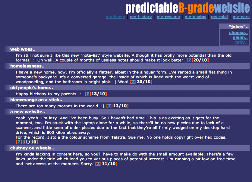
What The Hell Is This: 2002.

This one didn't last long. Unfortunately, the colour scheme must have stuck in my head, because it'll come back to bite me later on in this article.
Same website as above, ultimately, but with a spectacularly bland colour scheme and very little graphic elements. Maybe it was ahead of its time. (Maybe it wasn't.)
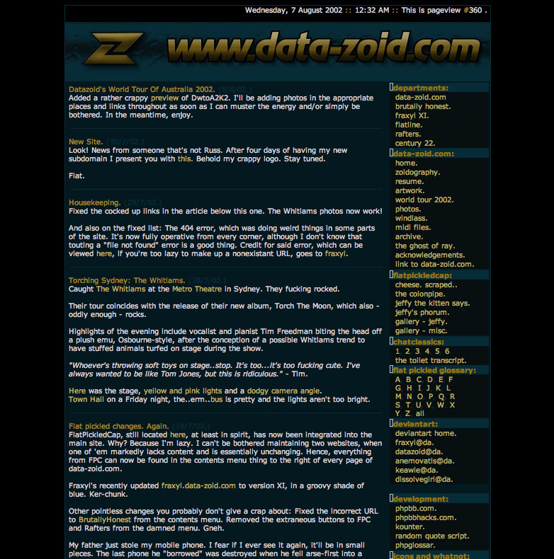
Dot Com Boom: 2003.

In 2003, I splurged on a domain name (or two). At this particular time, I was using data-zoid.com, after I was thwarted from "datazoid.com" by a legitimate business in California.
All good websites in the early noughties required a splash screen -- something we wouldn't dare think about anymore. This particular one, which I believe has had its html slightly cocked up as the giant "Z" should fill the white (blue?) space to the right of the various logos, resulting in a much shorter window, graced the entrance to the dot com.
The departments on the left were largely other people to whom I farmed out some webspace, in this case it was Mike, Chris, Derek and the old Rafters forum. Clicking the giant "Z" logo brought you to...

..the website proper. I believe that I either had a very badly calibrated monitor, or zero understanding of contrast. Possibly both. Some of the images have disappeared from this, resulting in the little end caps from the menu titles turning into white boxes. Oops.
Turquoise and gold was probably not the wisest of all colour choices.
Not sure why I included the standard HTML-include date and time at the top. Looks kinda cool, though, I suppose. Also, pageview counter. Who uses those anymore? Who cares about those anymore?

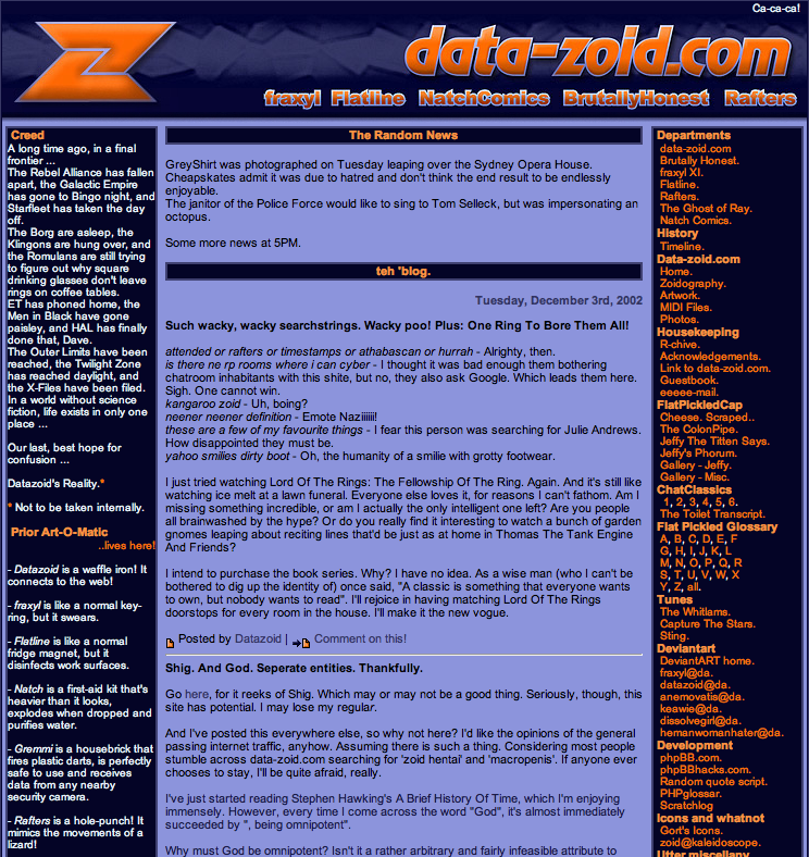
At some point in 2003, I changed the colours. In hindsight, it was for the best. In hindsight, it's still horrible, with a capital "HORR".
What we're looking at here, is the result of a man who just purchased Photoshop. The gradients, bevel-and-embosses, drop shadows and strokes on the title banner alone should be enough to make me take this image, snap it into quarters and flush it. Repeatedly.
Regardless, it's history, and I can't erase it from archive.org. It's essentially the same design as above, having gained a left column of information, no splash screen because the sub-site buttons are now below the banner, and a colour scheme that I cannot recall the inspiration for but suspect perhaps it started with "Tel" and ended in "stra".
It kind of grows on you.
The Prior Art-O-Matic still exists, by the by.
Now We're Getting Somewhere: 2003.

Finally, towards the end of 2003, I made something work. Contrast adjusted! Colours palatable! Overly complex use of tables to create a html layout, achieved!
This is probably my favourite "look" for colonpipe.com. At some point, I changed the link colours from green to blue, but all in all, it's workable. I've actually re-used the little graphics for "post" and "comment" from this layout (albeit enlarged to 200%).
The colonpipe graphic in the logo was designed by fraxyl, and has been used pretty extensively since this design.
This appears to be the point in time when I began my obsession with 88x31 web buttons, thus explaining the army of them in the right-hand column.
This was also when I began experimenting with using a php-based random generator. The quote in the top bar was generated from a file of some 1,800 short quotes I'd collected from specific people on internet forums. Primarily Chris. The one displayed here is most definitely one of his.
"The Random News" used a half-dozen randomisers to generate parts of each paragraph, creating a similarly-constructed but esoterically madlibbed news article each time the page was refreshed.
Also, 99% of my updates back then related to searchstrings and the site's statistics. I was either destined to bore the sweet bejeezus out of every single one of my visitors, or I'd accidentally stumbled upon creating the most meta website in existence.
It's Got Nothing To Do With Your Bumhole: 2010.

Prior to this design, there was another Wordpress-based appearance. Unfortunately, I've lost all record of it. It was white, and that's about where my memory of it chooses to erase itself. I can only imagine it was horrible, and the less we speak about it, the better. Even archive.org didn't care to record much about it, and doesn't have the CSS sheet saved. Oh, well.
This is the first colonpipe design since I actually started to take some pride in my work as a designer, and I believe it shows. The title graphic (still in use today, in some capacity) was properly rendered, and I put considerable effort into making the typography both appropriate and pretty sexy-looking. (Well, sexy for Arial Rounded, anyway. You can only expect so much.)
Content-wise, I'd boiled the entire site down to be a "best of" compilation of what had come before. This is about the point at which I realised that what had come before was largely filler, and that there was very little of colonpipe.com of which I was actually proud, and a stonkingly massive amount of it of which I was both embarrassed and terrified, to the point that I found myself retreating to a corner with the longest broom I could find, poking ineffectually at it when it drew near.
The Red Curtains: 2012.

Not a new design in itself, this one was just a swap-out of the background graphic. I decided -- for some reason -- to replace the stars and galaxy with a red curtain. Perhaps it lent an austere air of comedy club, suggesting wit of the calibre of Jerry Seinfeld or Larry the Cable Guy. Or perhaps it didn't. Either way, it was not to last long.
Pixelpipe: 2013.

There's every probablity that you're looking at this design right now. However, if it's in the future, maybe you're not. Or maybe you are. Or...who knows. At any rate, this is the design of the site at time of writing. You can see the graphics for "post" and "comments" borrowed from the earlier design. You can see the bars of social media share buttons that I loathe, but tolerate for their expected necessity. You can also see a tagline that I'm actually pretty happy with. (At least it doesn't use the word "bumhole", which has to make it better, right?)
Thanks for sticking around.


